30 Beautiful Flyers for Design Inspiration in 2026
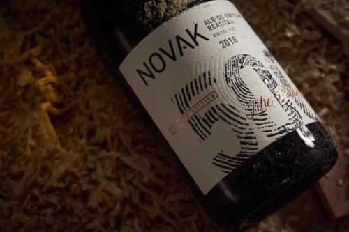
30+ Elegant Wine Label Design Examples for Inspiration
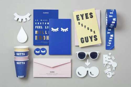
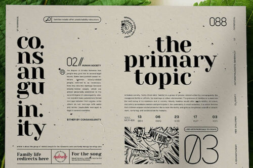
20+ Beautiful Examples of Brand Presentation for Inspiration
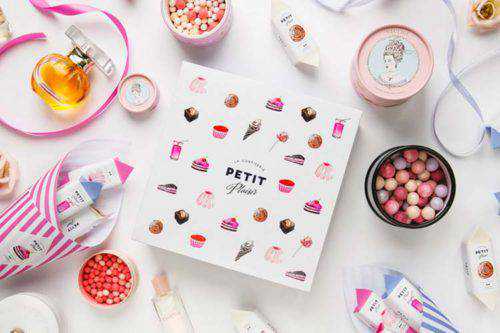
The Yummy Visual Identity of Food Brands
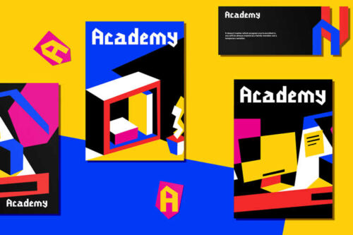
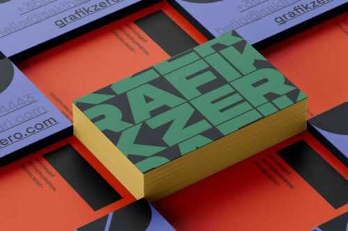
The Beauty of Bright Colors & Geometrical Shapes in Brand Identity
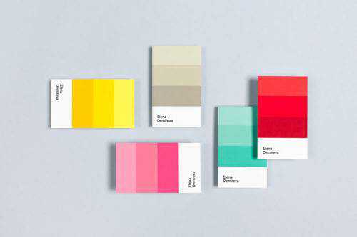
10 Beautiful Minimal & Name-Centric Business Cards
30 Beautiful Examples of Minimal Web Design for Inspiration & Ideas
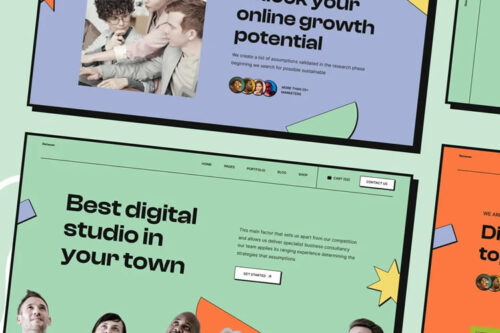
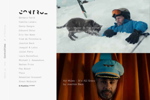
40 Beautiful Examples of Clean Web Design for Inspiration & Ideas
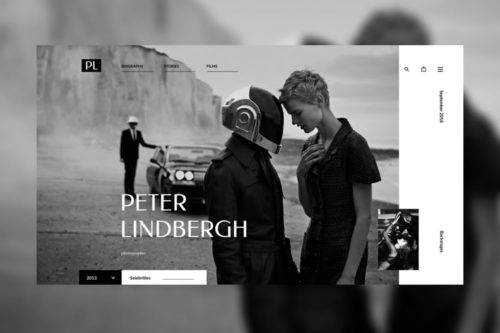
20+ Photographer Portfolio Websites for Web Design Inspiration & Ideas

40+ Creative Examples of 404 Pages in Web Design for Inspiration & Ideas
