 Download 10 Free
The funny thing about current web design trends is that they are both helpful and detrimental. Trends set the standard for design elements and styles that are popular for a specific era, so keeping up with current trends means that web designers and developers are better able to create a modern look for clients. And new trends usually come with advances in design styles and code, which can really improve your range of skills, even if you don’t use it in the same way as everyone else.
But trends can also produce an online world in which every new design simply looks like a copy of the last. In their peak, trends tend to be the weakest, mostly because everyone overdoes the style. Even worse, some web designers seem to overlook the cons of each individual trend, possibly justifying with an attitude of "everyone else is doing it so it must be okay." Designers and developers who remain conscious of good design principles, though, can help steer the trend to a more balanced use.
So, in an attempt to lead this year’s web design trends into beautiful harmony with important principles such as usability and readability, let’s take a look at some of the most popular trends of this year. The following discussion includes some real life examples, and an analysis of the advantages and disadvantages of each trend. My hope is to help designers make educated decisions on when, where, and how to use a trend in web design projects, and, ultimately, keep the online world diverse and elegantly usable.
Parallax Scrolling
Although parallax scrolling has been around for a long time in video games, it didn’t appear on the web until 2011. The web design trend creates an illusion of 3D depth due to background elements moving at different speeds than foreground elements. Some designers believe that parallax scrolling is fading away, which is true to some extent. We don’t see many long scrolling sites chock-full of parallax emerging these days. However, as with any trend, it is still alive and well but simply no longer overdone. Recently, design platforms like WordPress and Webydo have taken measures to ensure that parallax scrolling is available in themes and code-free templates, which is a good sign that parallax scrolling will continue to be popular for quite some time.
Many confuse fancy scrolling with parallax. True parallax scrolling, as Rob Palmer describes, involves an initial point of reference (content overlay), a stationary background image, and a moving foreground object. As the user scrolls, the background moves slightly as the content overlay moves into or out of view, but the object on top of the foreground also moves and at a different speed than the background and overlay. The moving foreground object is the key to what makes it parallax, rather than just scrolling involving HTML/CSS animations and such.
- Pros – interactive and, therefore, engaging; aesthetically appealing; works best for presenting information or products in a novel style.
- Cons – can be very slow loading, especially on slow or mobile devices; SEO issues; too much can annoy users; unusual direction of movement can be confusing.
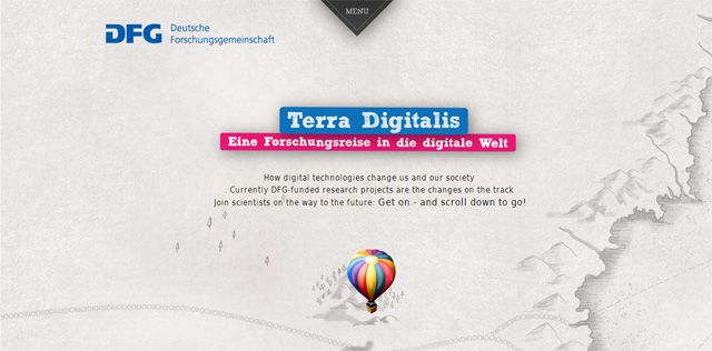
The above Terra Digitalis site demonstrates perfectly how parallax works best for presenting information or products in a novel style. If you plan to use parallax, be sure to first come up with a story for your website, otherwise parallax will interfere with and distract from your message. The point of a parallax effect is to engage and hook visitors enough so that they keep scrolling to see what else happens. Now, if the only thing that happens is a bunch of interactive elements that don’t follow a story-like message, then visitors may only remember how "cool" the effect was but forget what the site is for.
Interestingly, this website also shows how some designers solve one main problem that occurs with parallax scrolling – the problem of the effect not working on mobile devices. Visit Terra Digitalis on your phone, and you’ll see that the parallax effect is still there but with less detail. Instead of the hot air balloon "floating" all around on the page as it does on the desktop version, it remains in the middle of the screen when viewed via phone.
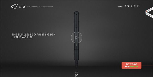
The Lix Pen website uses parallax scrolling simply but effectively. Notice how the hand holding the Lix Pen moves slightly against the background as you scroll down the page. This website solves more than one con that often occurs with this trend: overdoing the effect and SEO issues. Because the parallax effect is only in the story part of the website (at the top), we can read the rest of the details without becoming distracted. Also, limiting the parallax to the first part of the page allows for the meta descriptions and title tags required for SEO purposes.

This final example of parallax shows how the effect does not have to be limited to an upward motion. It can move downward (my favorite example of which is Seattle’s Space Needle site below) or sideways, as the HotDot website above demonstrates. An unusual direction of movement can cause problems of confusion, since we expect for a screen to move upward as we scroll downward. However, in the case of HotDot, the sideways movement is still natural since it moves in the direction that most languages read: from left to right. The Space Needle website works because it tells the story of the Needle from the ground up, as if moving in a glass elevator.
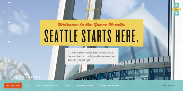
The other negative side to both the HotDot and Space Needle sites is that they take a moment to load. Now, both do include an appealing loading icon, but some audiences can still be too impatient to wait for the page to load. This is where you simply need to know your audience. Both of these websites, especially the Seattle Space Needle, have an audience looking for an experience, so the slower load time is probably worth the wait to the target market.
Infinite/ Long Scrolling
The infinite scrolling trend is appropriately named as some websites that incorporate it seem to never end. And if we want to get literal with the terms, infinite scrolling is used for sites that really do never end, while long scrolling sites actually have an end to them. This trend was huge in 2013 and still seems to be a very popular design this year as well. Often sites with parallax use a long scrolling layout simply because all of that room is needed to properly implement the parallax. Let’s see the good and the bad and some solutions of this trend.
- Pros – perfect for user-generated content (such as Twitter), story-like designs, or single-page websites; can be engaging; scrolling can be easier than lots of clicking.
- Cons – no end can mean users get frustrated without a sense of closure; can be misleading in that users sense an end that never arrives; can have navigation issues.
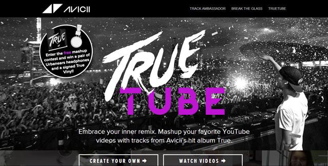
An Avicii fan site, Truetu.be allows fans to create a mashup of YouTube videos with songs from Avicii’s True album. The homepage of this website is a true infinite scrolling site that includes all of the videos created using True Tube. So, as users scroll down the page, more videos load. The videos boxes are organized in full screen layout, which looks amazing, but the scrolling is misleading. If users scroll fast enough, they will reach the footer, but the footer quickly disappears as more videos are loaded on the page. The other frustrating part is that clicking on videos means they open in another page. Going back to the homepage refreshes the browsing so that users lose their place in the list and have to start at the very top of the page again.
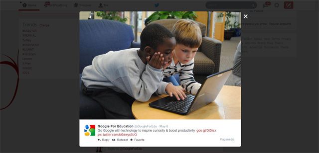
Yogev Ahuvia on Smashing Magazine points out that Twitter is the best example of infinite scrolling that works. The list layout infinitely grows in real time so that users can easily scroll through a large number of tweets quickly. When users click on a tweet, it expands on the screen so that users can close the tweet once finished interacting and start scrolling again from the exact spot they left off.
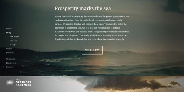
No matter if you go with infinite or just a long scrolling site, though, always provide navigation buttons. Many long scrolling sites are using a fixed header and navigation menu to make it easy for users to access other sections once they get tired of scrolling, such as with Twitter. Some websites also provide a navigation menu along the side that shows the progress of the user as with The Offshore Partners site below on which the side navigation further breaks into sub-menus while scrolling.
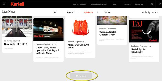
Some infinite scrolling sites solve the problem of user exhaustion by providing an optional end. For instance, the Kartell Live News page below provides a "Show More" button once the page loads a specified amount of articles.
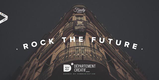
Another new and interesting layout that has emerged recently in the long scrolling trend is shown in the following portfolio site. Once users reach the end of the site, they are immediately back at the beginning again in a circular infinite scroll technique. The experience is surprising, engaging, usable, and still provides a sense of ending to prevent the overwhelming of users.
Flat Designs
Although flat design has been around for a while, Windows 8 and iOS 7 are what made flat design into a the booming digital trend it is now, replacing the realistic style of skeuomorphism found all over the web in just a matter of months. Most would agree that what characterizes a flat design (and what distinguishes it from a normal minimal design) are the lack of 3D, non-realistic icons, limited gradients, lack of drop shadows, bold color schemes, pretty but readable fonts, and a layout often based on a grid – although not every flat design will contain all of these design elements. In a digital world on the verge of serious information overload, the flat design trend was muchly needed at the time that it appeared. Despite its mostly positive vibes, this trend actually does have a few cons:
- Pros – clean design makes it easy to navigate; overall look and feel is modern, trendy, and honest; fast loading; excellent for responsive designs; content is the focus.
- Cons – difficult to infuse character, originality, charisma; sometimes difficult to distinguish which elements are clickable.
Now that flat design has drastically changed the look of most digital designs, some are wondering if this trend has gone too far, although these discussions are quite heated. Oliver McGough argues on Usabilla that flat designs tend to have problems with extreme minimalism, too literal mobile-first design emphasis, and the fear that many designers seem to have of breaking from this hugely popular trend. Take a look at the comments below this article, and you’ll see what I mean by "quite heated" discussions.
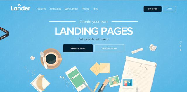
A beautiful example of flat design, the Lander app website page uses highlights and text prompts so that users easily know what icons are clickable.
Even if McGough goes a little too extreme in the points that he makes (aren’t the designers to blame, not the trend, in fearing to break from the norm?), making sure to add personality is in general an excellent design rule. And it is always important to make sure that users can easily tell if an item is clickable, no matter if the design is flat or not. The Lander App website page above does an excellent job of solving both of these criticisms. The scattered icons resembling the top of a desk immediately catches the eye upon opening the page. Scrolling down, users find highlights and text prompts that let them know which elements are buttons.
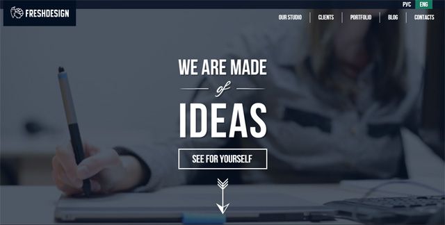
Other designs mix a bit of skeuomorphism into what would be considered a largely flat design, in an attempt to both add originality as well as provide visual cues to site visitors. And some websites, such as the Fresh Design website below, bend the flat design rules ever so slightly to stand out. This one adds a small drop shadow to some of the title fonts.
Responsive Designs
With the huge increase in use of mobile devices across the globe, websites are scrambling to make themselves available to users on any device. Responsive designs are quickly becoming one of the most popular options for mobile accessibility since the website seamlessly adjusts according to the screen size. And something that I can’t help but point out anytime I mention responsive design is the fact that Google prefers this layout for mobile optimized designs. Even so, the layout doesn’t work for everyone (which is why Google has two other recommended layouts in addition to responsive):
- Pros – easy to maintain due to only one site design; favored by Google; based on a grid layout, so clean and easy to use; provides users with a similar experience no matter the device used to access the site.
- Cons – initial cost to transition an already established website can be high; doesn’t provide a customized experience for each device.
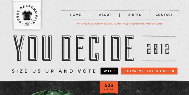
The best way to decide if you need a responsive design is to look at your audience and why they would be accessing you from another device. Responsive designs are perfect if users will primarily access your site for information, although ecommerce sites can benefit from a responsive design if their inventory is not too heavy nor too deep. The ecommerce website for Dress Responsively, shown below, transitions beautifully from PC to mobile. The site also loads very quickly despite being an online store. (If you are having trouble with load speed of a responsive design, you may want to try one of these tricks for speeding up the load time of your responsive site.)
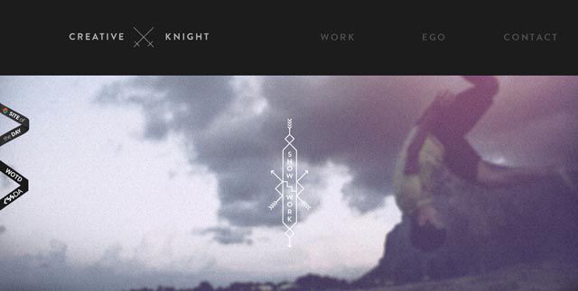
The following responsive site for Creative Knight is an excellent example of a fairly heavy design that drops some of the slow loading elements on smaller devices. For instance, it retains the animated static background of the header but has no need for the scrollable effects in the mobile view.
One more point to consider for those looking at an expensive transition from a non-optimized mobile design to a responsive design: consider your audience. If a good amount of visitors use your site on their mobile devices, then it is probably worth the cost for a transition. In an article on Econsultancy, Chris Lake discussed 14 brands that benefitted from switching to a responsive design. In his analysis, he found out that most of them experienced between a 50% and 100% conversion increase! Those numbers are enough to make any stingy accountant give the green light for a responsive design transition.
Unique Typography
Back in the ancient days of computers and browsers, only a few fonts were "safe" to use for web design (boring fonts such as Georgia and Verdana) because fonts and styles were controlled entirely by each browser. Designers tried to work around this problem by using turning fonts into images, replacing fonts with Javascript and Flash (sIFR method), or other hacker replacements. Also, advances in HTML and CSS allowed for the method of displaying unique fonts but only as long as that font was installed on the user’s computer; otherwise, a fallback font was displayed.
Then with the release of CSS3 came a new solution added in the @font-face property that allows for custom font downloading. The only problem that can occur with @font-face are licensing issues. Because most commercial licenses do not allow the transferring of font files from one user to the next, @font-face violates these terms of use. For a long while, this hurdle prevented wide usage of @font-face, until the emergence of font sites that solve the illegal issues.
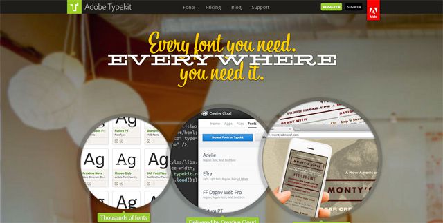
TypeKit, for instance, is a web font provider by Adobe that takes care of all of the licensing issues that can occur with custom fonts and the @font-face property. With a plan, you can download fonts, put together an editable kit, and then embed the kit into your code or blogging platform. Good ole’ Google also came to the rescue for the @font-face licensing issues by offering web fonts completely for free as open source. The list has grown rather large since Google first offered this resource since designers from all over the world are a part of this project. And Google provides a free API service for easy use of these fonts. Even so, web fonts require a few considerations:
- Pros – adds a branded look and personality; can be used in titles, headers, and even body font; open source providers like Google and the Font Squirrel’s WebFont Generator make unique web font use free and easy.
- Cons – readability issues are sometimes overlooked; licensing violations have to be considered.
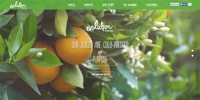
Using interesting fonts is easy to do correctly. If you check and double check to make sure that @font-face use is allowed in the terms of use, then you don’t have to worry about breaking the law (and a little bit of extra time making sure is worth the ease of mind and also the wow factor of a unique font). Evolution Fresh (above) uses a script-like font throughout the site, including in body text. However, this script font is readable enough that it works. And Evolution Fresh made a smart decision in keeping text to small paragraphs and short descriptions, which prevents exhaustion in readers who may still struggle with the odd font design.

The Why Go Wild website above uses some incredibly unique typography for its headers and titles. But when it comes to body text, the designers wisely chose fonts like Museo 700 to keep fonts both appealing but more readable than title fonts.
Full Screen Image Backgrounds
Personally, one of my favorite web design trends are full screen backgrounds, especially the ones with photographs or videos. Often full screen illustrations provide for a stunning effect as well, though. And even colored backgrounds look pretty amazing with some awesome graphics or custom typography. There are just a few pros and cons to consider before jumping in to a full screen design, even as impressive as the design can be:
- Pros – stunning effect; helps viewer feel fully immersed in the site; interactive elements feel like a video game; videos feel like a movie; excellent choice for portfolios, food industry, fashion industry, and more.
- Cons – high quality photographs often mean slow load times, especially for mobile devices; an off-topic background can distract from the website’s message.
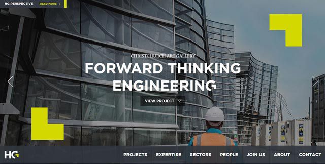
The Harrison Grierson engineering and design consulting agency displays brilliant full screen photographs of its projects on its website. The impression is long-lasting, impactful, and sends the message that this company knows its stuff. The site loads very quickly too, even on mobile displays. While the mobile version is not responsive, it does an excellent job of retaining the overall look and feel of the desktop version.

This beautiful web design is actually not full screen. It fooled me at first with only a slight strip of the background showing on either side of the image. This is an excellent example of how to "fake" a full-screen design but keep the entire thing very light. In fact, this is probably why the design is seamlessly responsive. Quick loading, the image appears immediately upon visiting the page. As a vineyard and wine producer, Lightfoot and Wolfville present quite the impactful image that appears almost exactly identical from desktop to mobile. It even uses a slight bit of parallax scrolling in the heading, which I noticed was wisely removed when I visited the site on my phone. The pulsing buttons overlayed on one section of images bring up a description for each of the pictures that tell a bit more details of the farm’s story. Even the message from Peter Gamble gives users the option to listen or read it. Best of all, as a long, single page design, the designer wisely included a pop out navigation menu (and I love that it is pop out so that it never interferes with the near-full-screen design).
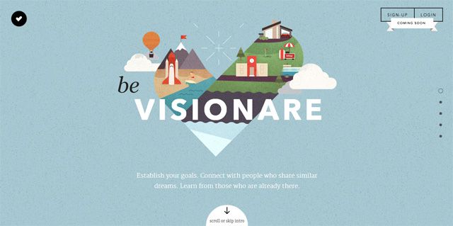
The Be Visionare website above is an excellent example of a beautiful full screen illustration. As you scroll down the page, the background remains full screen, and each section contains a graphic and message directly centered in the page. The site is quite a bit more complicated on the desktop version compared to the mobile version, but even so all of the necessary information is still included on the mobile design. They just wisely left out all of the HTML animations and many of the extra text and illustrations included in the intro.
Video Backgrounds
Placing videos on websites has grown in popularity since recording quality videos is much cheaper and easier these days. YouTube makes it extremely easy for anyone to simply add an embed code and drop a video onto their site. And stock image sites such as Getty Images provide royalty-free videos at a small cost compared to hiring a videographer for a custom video. Many websites are using full-screen video backgrounds in the header of the site, while others simply place a large video that catches the eye. Some make the video play automatically, while others allow users to make the choice of hitting play or scrolling first.
- Pros – keeps text to a minimum; excellent for showing extra details; full-screen videos are like watching a movie; can more easily appeal to visitors’ emotions than other methods.
- Cons – can cause loading problems; can distract from the message; some visitors may not watch the video; text overlay may disappear against the video background.
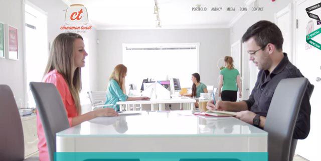
The Cinnamon Toast website above uses a full screen video background that plays on a fast-forward loop in the header. The design keeps text at the top of the video so to be easily seen in spite of the very busy video, and text that does appear once users start scrolling is placed within a colored box for easier reading. This highly active video actually works for this agency, as it gives the impression that it is full of hard-working partners. Now, the site does load slowly, probably due to a few other animations on the site. But the mobile version eliminates the video, replacing it with just a screenshot image of the video.
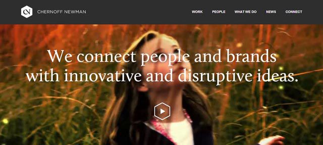
The Chernoff Newman website has an interesting implementation of video. Upon loading (and it loads rather quickly for the large amount of videos included), the background video automatically starts playing, which is actually a video created from several of the videos they did for clients. Clicking on the play button shows a video reel of snapshots of their work. All of their videos, beside the introductory full screen video, are actually embeds from Vimeo, which is one way they saved on bandwidth. Another interesting point to note is that text and animated images on the home page do not load until the user scrolls down the page.
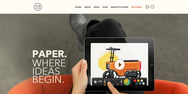
On the web page for the Paper App from FiftyThree, a Vimeo video is embedded, but the interesting part is that it is seamlessly integrated into the full-screen background. This style of video embed is becoming much more common, although it is still a fairly new design style within the video trend. Scrolling down the page reveals plenty of text description for those who don’t want to watch the video.
HTML/ CSS/ Javascript Animations
Flash used to be the best option for animation on a website, until HTML5 came along, that is. HTML using CSS and Javascript for animations solved several problems that occur with Flash: mobile incompatibility, the need for users to have Flash installed on their computers, and slow loading. With HTML5 animations, a whole new world of possibilities opened up for web designers. Many argue that CSS3 provides for faster animations than Javascript, but some have found Javascript to be much faster, especially with more complicated animations. Either way, the point is that designers have been using animations on websites more and more now that a light, versatile option has arrived. Just keep in mind the following advantages and disadvantages:
- Pros – light; works on mobile; create simple to complicated animations; makes a site interactive and/or engaging; impressive; adds personality to a design; compatible with major browsers.
- Cons – too much animation can be overwhelming or distract from a message; an overabundance can cause slow load time.
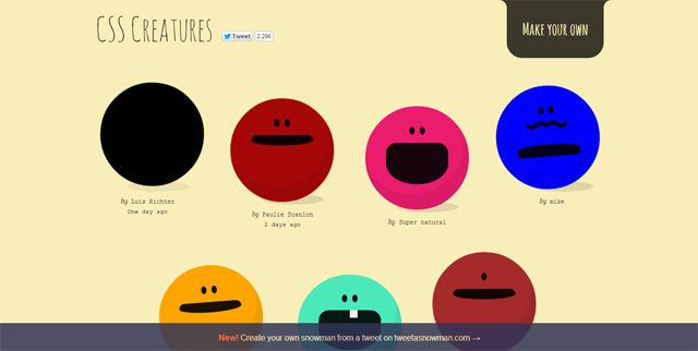
The CSS Creatures site displays creatures made entirely from HTML5 and CSS3, which goes to show just how creative you can get with CSS animations. In fact, create your own by tweeting your creature’s personality, color, and other details (like a tooth or mustache) to @CSSCreatures.

This animated site loads quite quickly despite the large amount of animated interactions that go on, but the developers were clever in that each animated story loads individually and only if clicked on. This way, only the main part of the page loads initially. The website uses a combo of CSS and Javascript to make parts of the illustrated stories clickable. Once you click on the specified object, other chapters of the story unfold. This loading in stages is an excellent way to keep what is actually a heavily animated site fast loading.
This website shows just how badly too much animation hurts usability. For one, it takes one too long to load. Rather than the normal jump from 0% to 60% to 80% to load, it actually loaded from 20% to 21% to 22%, etc. Much too slow for my liking! Also, the animation is choppy and disruptive, probably because there is so much going on at once that nothing works quite right. Weird lines move around, the entire screen "floats", and it’s hard to tell what is clickable. With everything going on, it took a while for me to figure out what the company actually does: shockingly, it is an independent creative agency that specializes in new media.
Less Text Content
All of the trends mentioned above (and more) have produced another new trend: that of less text content. With so many other options for informing readers other than text, many websites are opting for limited written descriptions. Instead, they use animation, videos, or icons, and then fill in with short text descriptions.
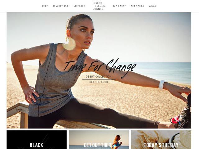
For instance, this sports clothing line uses mostly stunning photos, rather than a ton of content, to engage visitors. Even their blog includes limited text with lots of large and beautiful photographs, which makes sense for their audience as a provider of fashionable women’s sports clothes and accessories. I imagine that this website experiences both the pros and cons of limited text:
- Pros – breaking up text with graphics, boxes, animation, and more creates a unique experience that keeps the user interested; easy to skim if well-organized; clean look and feel.
- Cons – can have SEO problems due to lack of text content; not enough text can make message too ambiguous.
If your home page limits text, then make sure to put more text on other pages, such as the About pages. Or make sure to include a blog on the site. Don’t forget, too, to optimized the page with proper title tags and other important SEO elements so that search bots can better decipher the content, even if you don’t include much text.
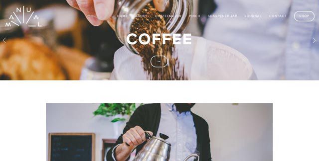
And always make sure that you include enough text so that users know exactly what the website offers and wants them to do next, like on the Manual website above. The home page contains large photographs illustrating their products along with brief description links, which lead to product pages full of detailed text descriptions.
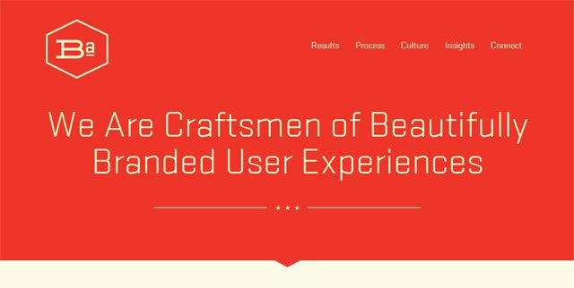
The BrandAid Design Co (which is a brilliant play on words for the company name, by the way) has a very minimal site design that mostly incorporates icons, large photos, and brief text descriptions. The entire look is very refreshing and easy to navigate.
What Do You Think?
Trends are always an important part of any design, at the very least to simply give a foundation on which to start. And you can always follow trends but still remain unique in your design and approach. Never compromise audience preferences, usability, the message of the website, or other important factors, no matter what design you create. This is why knowing advantages and disadvantages of current web design trends is so important: you will be able to make more educated decisions in your projects.
Do you agree with the pros and cons of the trends above? Did I miss any important considerations? Feel free to share your thoughts in the comments below!
Related Topics
Top