What exactly makes someone say a website has “nice typography”? It’s more than a matter of just using nice fonts. Good typography is all about perfecting the small details.
In this post I’m going to analyze 10 websites that are primarily driven by typography. I’ll write about the typographic details that make the designs great and I’ll also mention some things I think could make the type on the sites even better.
Joel Owen Schierloh
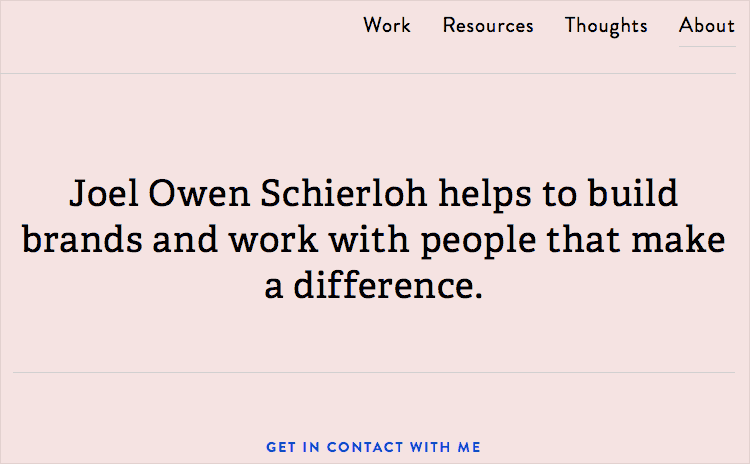
Joel’s site uses the ever-popular Brandon Grotesque paired with the slab-serif Adelle. The smaller bits of uppercase Brandon Grotesque have a slight amount of letterspacing added which is always a nice touch when setting uppercase, especially at smaller sizes.
I also like how on the project detail pages the type is set in two columns. I’ve seen similar portfolio designs where the description copy spans the entire width of the project images which can hinder readability with too long of a line length.
GOOD Magazine
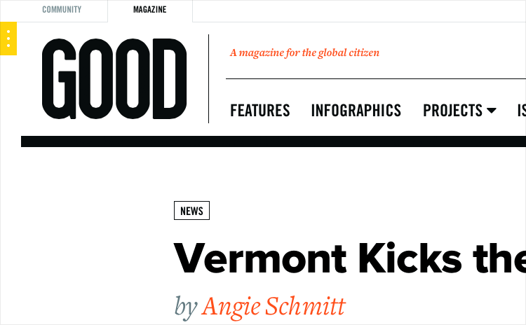
GOOD Magazine uses Proxima Nova and Freight Text as their two primary typefaces — both are typefaces that have seen a huge surge in popularity over the last year or two. A third typeface, Trade Gothic, is used for the nav and small labels. A fourth typeface, Guardian Egyptian, is used as well for pull quotes. Four different typefaces is a lot to use for one site, however, as long as the use is consistent it can still work well.
To me personally the use of Proxima Nova feels a little out of place. The condensed Trade Gothic is a good fit as it mirrors the custom type in the GOOD logo. However, something more in the “gothic” style like Benton Sans would perhaps fit in a little better than Proxima Nova.
Leader Bag Co
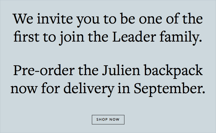
The classy Freight Text is the primary typeface used on Leader Bag Co’s website — the perfect typeface to entice parents to buy a $425 diaper bag. Freight actually includes a special display version, Freight Display, which is meant to look a little more refined at large sizes.
The large headline type might look a little nicer set with that rather than with the text cut, which is designed for setting body copy. The quirky geometric sans-serif Brown is set entirely in uppercase (with slight letterspacing), contrasting nicely with Freight.
Strichpunkt Design
Univers is the main typeface used on Strichpunkt Design’s site. On first glance, Univers appears to look a lot like Helvetica. However, looking more closely you’ll notice many differences in characters like the “a”, “G” and “K”. Whether you notice the differences or not, it still immediately gives the design a more distinctive feel than the ubiquitous Helvetica.
Century Schoolbook is interspersed throughout, but I would have loved to see it used even more because it makes such a nice combo with Univers. There are small amounts of Trade Gothic mixed in as well, but perhaps one of the condensed cuts of Univers would have made more sense.
Jardan Furniture
Apercu is one of the trendiest web fonts of the moment. On my side project, Typewolf, it is the number one most featured font. Jardan Furniture combines Apercu with Miller, a beautiful Scotch Roman typeface, which I think makes for a very interesting font pairing.
My only complaint about this site is the white text set on top of the photos — in some places, especially on the homepage, the text is almost unreadable as it completely blends in with the background. I’d be willing to be that in the design mockups dark photos were used that contrasted nicely with the white type, then after design approval other photos got added that didn’t quite work as well.
Quinn
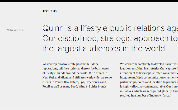
Quinn combines Proxima Nova with PT Serif, a free font available from Google Fonts. The light weight of Proxima Nova looks wonderful set at a large size like this. However, I feel like some of the other type on the site runs a little on the small side.
Especially the body copy type set at 12px. Body copy sizes of 16-18px are more common on the web, so anything significantly smaller than that can feel tiny. I also think the Proxima Nova set in uppercase could maybe benefit from a little added letterspacing.
Saboc
Saboc uses Neutraface as the sole typeface on their site. Neutraface has a similar feel to Brandon Grotesque but is used much, much less on the web so it feels very refreshing to me.
I think this style of typeface makes a great match for the fun and simple illustration style used on the site. The body copy is center-aligned which can sometimes feel awkward on the web, however, for this style of site with small amounts of copy I think it works well.
John Wilson
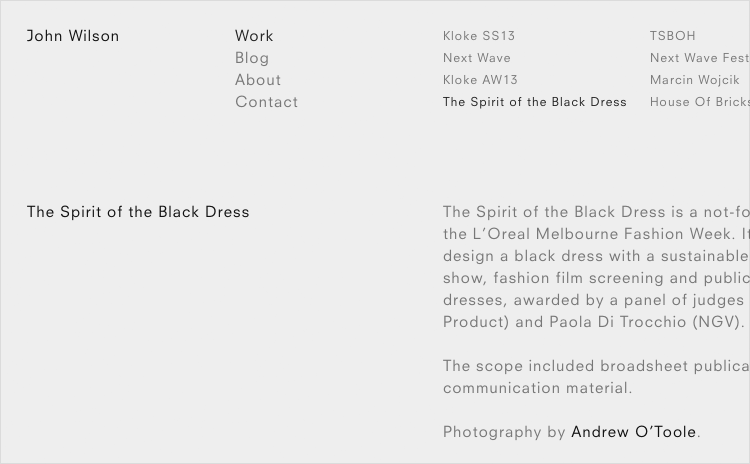
Calling the type on John Wilson’s site minimal would be an understatement. Neuzeit is the sole typeface and it’s used in only a single weight and mostly at a single point size. Rather than using a bold weight of Neuzeit, the site instead just uses the book weight in a darker color.
This type of minimal design looks easy to pull off but actually requires the typography to be spot on for it to work well. Neuzeit is the perfect typeface for this — it’s a strong geometric sans-serif with several unique characteristics such as the bar on the uppercase “J”.
Neybox Interactive
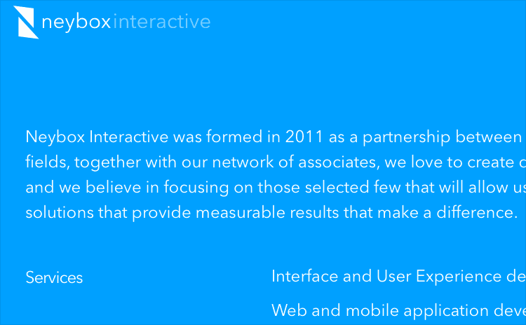
Neybox Interactive is another nice example of a site sticking with a single typeface. Avenir has become an extremely popular typeface on the web — it was actually voted the top favorite font in a survey I did of leading designers.
It looks great on this site set in white against a colored background. My only criticism is the line length of the body copy on the blog section. The width keeps expanding with the size of the browser window so on a large screen (like mine) the copy is harder to read.
Code and Theory
Code and Theory use the condensed version of Gotham, one of the most popular typefaces of the last decade. The condensed version isn’t quite as popular so it makes the design feel a bit more distinctive. The display version of Miller is used for some of the large headlines.
Miller also has a text version meant for setting body copy, however, Code and Theory chose to use the standard font Georgia instead. Georgia actually has many of the same Scotch Roman characteristics as Miller so it makes an excellent match with the added benefit of not needing to load an additional web font.
Concluding
Hopefully the above 10 examples show how important small typographic details can be. Paying attention to details like these will almost certainly improve your next website design project.
Related Topics
Top