 Download 10 Free
Web designers are largely responsible for curating new trends in layouts and graphic design for the web. This part of the job description is often masked behind a thin veil of secret tasks, but requirements are always the same. When it comes to creating website layouts, it’s important to keep true to certain design theories.
User experience is a key issue and one which shouldn’t be blatantly disregarded during the layout design process. As designers, we must focus a lot of energy on creating and building new structures which will enhance the overall website experience. I’ll be going over a few ideas regarding design and the needs of individual users.
Construct a Template Definition
We won’t be defining any new terms here or require a dictionary. Instead, this is a monumental first step towards a very intuitive design system. Create a small design sketch before even attacking any digital graphics to figure out just how you want things to look.
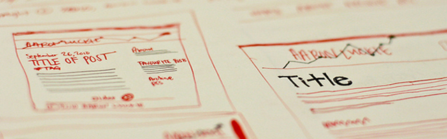
This sketch goes by many names – prototype, wireframe, mockup, or even simply website sketch. Actually, you’re taking a mental snapshot of the “bare-bones” architecture your layout will hold and drawing it out for a visual image. This will help during the early stages of figuring out content placement and how much room is needed for a site.
Layouts at this stage shouldn’t require much detailed work. User experience isn’t going to decline sharply, varying from a 2 to a 3-column layout. A rough sketch or semi-formed idea is more than enough to get the ball rolling.
Keep It Simple Stupid (KISS)
This is a phrase shared amongst motivated entrepreneurs and holds especially true in creating websites. A website’s design is only as useful as how many users can figure out how to use it.
Developing for simplicity greatly drops the chances of confusion among your site visitors. The modern web is full of Internet users with very little or no patience to wait around. They expect to fly through your site to find or do whatever it is they want.
Sensitivity towards this issue may show a few prominent ideas. Expandable layouts for mobile and wide-screen users are always a big plus. You may also consider which page elements are the most necessary and see how different users interact with your pages. Analytics data can show a lot about a current website’s design – although this isn’t particularly helpful until after launch.
Allow Room to Scale
Websites that allow for fluid layouts are the most brilliant when speaking in terms of scalability. By “fluid,” I mean defining a containing wrapper to hold a certain percentage of the page’s total space, regardless of monitor resolution.
When CSS first started to grow in popularity, this was how many layouts were built. Currently, we still see designers using percents to manage spacing and page size, although min and max-width properties have allowed for much richer customizations.
This layout style works best without loads of graphics and fancy page techniques. You shouldn’t expect to create a blank white page with static text, either. But working on expanding on the user experience means leaving white space for the site to breathe and expand comfortably.
You may also consider using ems as a unit of measurement. Using this technique, you can create elastic layouts, which expand based on the size of your text and how it’s rendered in the current browser. When implemented correctly, these layouts will be much more user-friendly than plain percentages.
There are plenty of resources online to read and further study up on different units of digital measurement. Pixels are, of course, the most commonly known amongst designers, but a pixel-perfect layout only renders well in situations that are tailored to those exact measurements.
Not Everything Will Trace Perfection
Unless you are willing to spend many sleepless nights coding and testing for bugs week after week, it’s highly unlikely you’ll develop the perfect website layout. Designers must adapt to changing trends, and although the current web holds standards compliance in high regard, it’s not everything.
The best way to build user-sensitive layouts is to play with tests and functions. Check out some ideas for other websites which scale naturally. CSS and HTML code are all frontend, and all websites display this directly. Use this to your advantage to figure out what pieces will fit well into your layout puzzle.

Odds are, though, that you’ll never find the perfect solution. This is probably because no such product exists. There will always be a few users running Internet Explorer 6 or browsing from an ancient Windows Mobile phone. Test and iterate layout fixes for the majority of visitors, and you’ll kill off most, if not all, of your major bugs.
Layout design is truly an art in itself. The initial stage of creation is powerful and takes a lot of energy to work with. Once you’ve obtained a solid idea, it takes a while to code it out and build a strong foundation on which to fit your website.
One of the best ways to keep yourself in the know is by setting up a small contact or report page. Allowing your visitors to send you design suggestions or bug reports will help solve many problems without requiring a large amount of running around. Hold your users’ opinions to the highest caliber, and you’re sure to implement scalable, UX-rich web layouts.
Related Topics
Top