The evolution of typography in web design has been hampered by technological limitations. The lack of browser support for CSS in the pre-2000 era, and later, unavailability of a wider range of fonts limited typographical adventures to a handful of font choices. Every web designer willing to experiment and push the boundaries in typography has had to contend with the lack of support for any fonts save the dreaded quintet of Times New Roman, Georgia, Arial, Verdana, and Tahoma.
Fortunately, over the past year, developments such as the retirement of IE6, almost universal support for the @font-face CSS rule, and wide-scale adoption of various web font service bureaus have facilitated the flourishing of an unprecedented burst of creative energy in web typography. After almost two decades of typographical slumber, designers are finally embracing the full range of font choices on offer. Predictably, the future holds great promise for budding typographers.
While the eventual growth of web typography is difficult to prognosticate, certain web typography trends have emerged over the past year:
1. Large Fonts
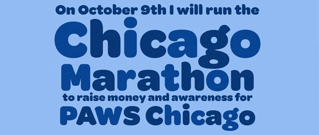
Propelled by the popularity of larger monitors and a distinctive move away from the erstwhile practice of limiting font-sizes to the standard 12px, larger fonts are now ubiquitous across the web. The greater screen real estate offered by 19”-21” monitors, and the crisp, high-definition screen resolution on tablets such as the new iPad (which reduces blurriness) have made larger fonts the default choice in most design projects.
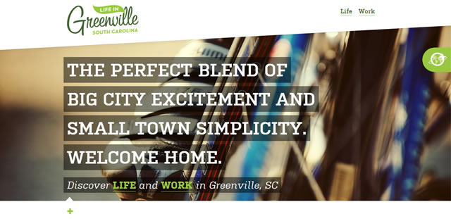
Larger fonts are not only easier to read, but also work exceptionally well as stand-alone design elements, especially with appropriate fonts.
2. Low Contrast Text
‘Dark text on light background’ has been the default choice for every web designer over the past two decades. The argument in favor of this high-contrast combination is significant: improved legibility and readability. Yet, 2012 has seen a decided move away from this tried and- tested combination into lower-contrast text combinations, even at the cost of legibility.
One argument in favor of such a move is that reduced legibility actually compels greater cognition and concentration – the eyes are forced to work harder to read the text, which, subsequently, increases the chances of the text actually being read than being glossed over. Further, lower contrast text facilitates design choices that wouldn’t otherwise be available in standard black-on-white text.
Whether you agree with the above hypothesis or not, you will find an increasing number of sites experimenting with low contrast text, at least partially, if not site-wide.
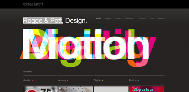
3. Mixed Weight Fonts
The average designer assumes ‘font-weight: bold;’ to be the upper limit of a font’s thickness, forgetting that the font-weight can be entered numerically up to a value of 1000, of which, ‘bold’ equates to a value of just 600 with most fonts.
Over the past year, designers have been experimenting with mixing font weights in the same design, often to quite dramatic effects. Different letters and words are often assigned different ‘font-weight’ values, ranging from 100 to 1000 (in increments of 100 – 100,200,300, and so on). This effect works particularly well in sans-serif fonts, such as Futura, Neue Helvetica, etc.
4. ‘Wedding’ Fonts
Wedding fonts – aka, fonts with excessive curls, extra glyphs and flourish – are the flavor of the year, typically used on more female-oriented websites. With the growth of design centric sites such as Pinterest and Fab with a decidedly female-centric bent, fonts with flourish will become more ubiquitous, perhaps even bringing the much loathed ‘handwriting fonts’ back into vogue.
5. Increased White Space
The minimalistic design ethos that embraces whitespace has penetrated the deepest reaches of the internet. Suffice to say, the same design ethos has overflowed into font-spacing as well. For years, the ‘letter-spacing’ was a largely ignored CSS attribute. But in 2012, and beyond, as ‘more whitespace, less noise’ becomes the norm, so will the use of the ‘letter-spacing’ attribute to increase the space between characters to dramatic effect.
Related Topics
Top