Startups have, for the last few years, focused heavily on having beautifully designed landing pages. When software design is a big part of the company, it’s only natural that there’s also an emphasis on great design for the marketing site. The landing product pages for hardware products, on the other hand, often feel like they’re an afterthought, and it’s not as often that you find a marketing page for a real-world, physical product that’s had as much care and attention put into it’s design.
And of course, that’s a huge shame – as we all know, great design should be everywhere that a potential customer can find you – from the product itself, to it’s packaging and all the way to the marketing site and advertising. The bottom line is a well-designed landing page can increase the hype and sales for a physical product.
We’ve brought together some examples of thoughtfully designed landing pages for hardware products. Each one does an impressive job of showing off the product, with copy that fits well and helps build demand for the hardware.
Leap Motion
Leap Motion is a device that allows you to use gestures to interface with your computer, without having to touch the screen. The landing page does a great job of showing off the ‘Minority Report’ style interface, and they’ve used big, bold imagery to both show off the device in detail, and also show it in use.
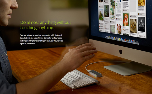
The copy is also beautifully written, and is clear, concise and engaging. For example, “Do almost anything without touching anything” is a short, clever and instantly understandable heading to describe the product.
Google Glass
Google Glass is a complicated product to explain, as it can do so much, but the landing page to show it off is incredibly simple.
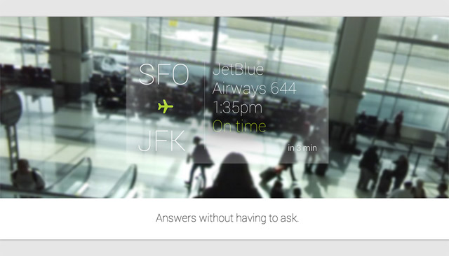
As always, Google has chosen to use large, bold imagery and copy that perfectly explains the benefits (“answers without having to ask”) instead of using dry features and tech specs.
Fitbit Aria
Fitbit Aria is a wifi enabled scale that builds up a picture of your weight, body fat percentage and BMI over time.
The product itself is beautifully designed, and the designers have gone to great lengths to truly show it off on the landing page.
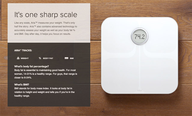
The hardware itself is shown from all angles, and they even show it in use. On top of that, they show screenshots of the software that the Aria uses, and do a great job of explaining the benefits of using the system.
Nest
The Nest thermostat takes a relatively unsexy product – the home thermostat – and reinvents it with beautiful design at it’s core.
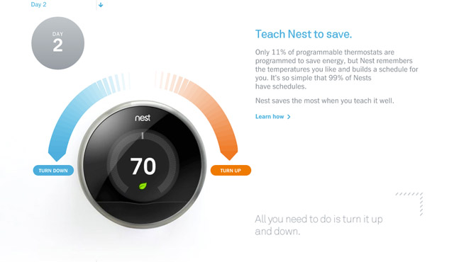
It looks amazing, it’s clearly easy to use and the entire user experience has been considered from start to finish. The same is true for their marketing page, which needs to convince people of the benefits of switching to a Nest, and uses clever animation to show the hardware in action and gives a rough tour of your first 30 days using the product.
Pen Type-A
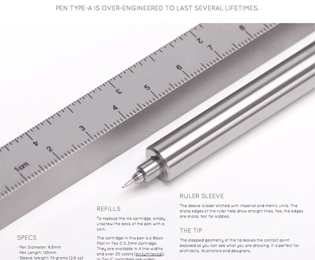
Pen Type-A is an ambitious product to take an everyday object – the pen – and obsessively engineer it to create something that will last several lifetimes. While the typography on their landing page could potentially do with some work, the page does a great job of showing off the design and ethos behind the product.
Square Register
Twitter founder Jack Dorsey’s latest startup Square has earned a lot of respect for disrupting the payment industry. While their main product is the software itself, they’ve had some experience shipping actual hardware azzs well in the form of the card reader – and they’ve recently started partnering with other firms to sell physical products that support companies who use Square, such as a cash draw and customer facing, secure iPad stand.
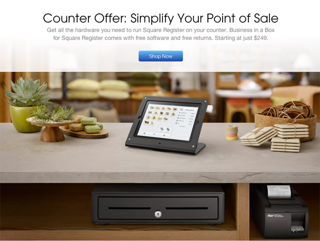
The landing page they’ve used follows the same theme as Square’s regular marketing pages for their software – the copy explains the benefits over the features (e.g. “Secure your iPad to your counter. Swivel the stand so customers can sign with their finger”), and they’ve used an easy-to-read font size along with plenty of white space to help separate out the content.
Little Printer
Little Printer is an innovative, if somewhat expensive, desktop printer that connects to the web, and automatically prints small custom newspapers for you throughout the day. It can sync with apps like Foursquare, Google Tasks, Instagram and The Guardian, amongst many others, to create a custom newspaper just for you.
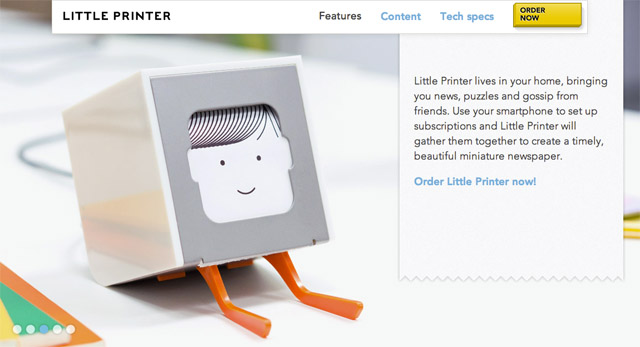
The marketing page is stunningly designed, with descriptive sales copy perfectly matching the product imagery. The close up shots of the hardware itself are of incredibly high quality that show off the quirkiness of the product. As an aside, the chunky “Order Now” button looks extremely satisfying to press.
Tesla Model S
The Model S is Tesla’s take on a high performance electric car, and could be a crucial turning point in the success of the company. It’s important that they get all of the marketing materials right to help promote the car, and they’ve gone into a ton of detail with the landing page.
For a product like this, there will always be two main readers – people who want to read every word and dig into the tech specs, and people who want to skim read.
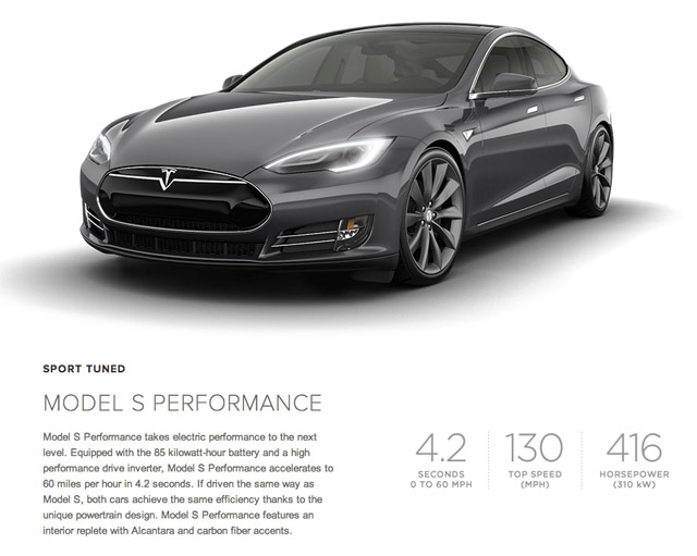
Tesla’s landing page appeals to both, with copy that informs and pull out quotes and important tech specs (“416 Horsepower”, “4.2 seconds 0 to 60”) that are easy to read at a glance. The large, detailed photos help to showcase the car and work well to highlight the intricate details as well as the overall car design.
Apple
A focus on aesthetics runs through Apple and, as a result, their hardware landing pages have been beautifully designed for years. The iPhone 5 landing page, shown above, uses concise, clever copy paired with close-up imagery of the hardware. Further down the page, they explore individual features of the phone – and each of these is separated out with white space and, again, paired with an image to help illustrate that new feature.
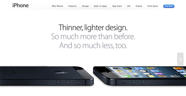
Everything on the page either draws you to examine the hardware in more detail or to buy it either online or in-store. It’s a formula that Apple have perfected over the years, and they don’t just reserve it for their most publicised products.
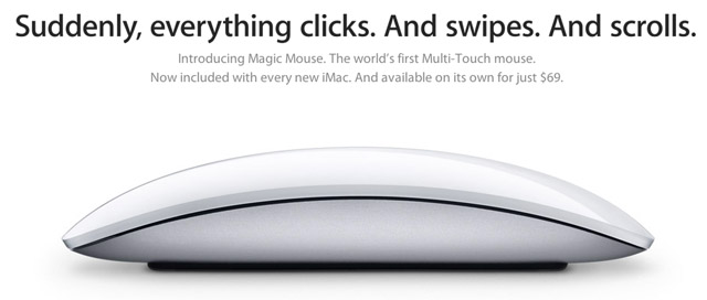
The landing page for the Magic Mouse – part trackpad, part mouse – uses the same style, with snappy, sharp headings and expertly written descriptive copy, coupled with extremely high quality, beautiful imagery to help sell the hardware.
When it comes to designing a landing page that helps to showcase hardware, it’s hard to beat Apple – but adopting a similar, razor sharp focus on getting the details right can help to create excitement for your product and, ultimately, can lead to more sales.