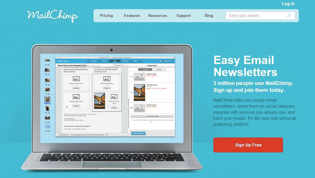
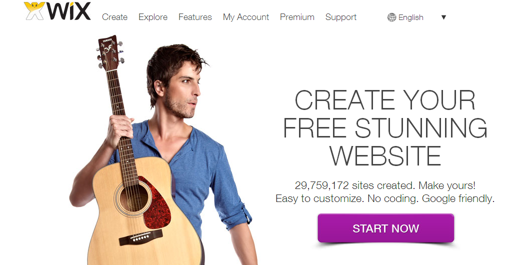
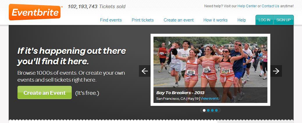
“The button”- the online heart of every campaign and landing page and the final gateway to lead generation. A call to action button plays a central role in convincing visitors to take the next step and connect with us. The action we desire them to take can be anything from signing up to a mailing list, purchasing a product or a service, downloading a white paper, or any other request aligned with our business goals.
Many different factors go into creating a successful call to action button and the difference between a hit or miss can be as subtle as the shade of color you choose or even the font.
So where do you start? Check out these quick, yet effective pointers that will help get you on your way:
Call to actions are traditionally associated with landing pages. However, capturing the attention of potential customers is vital in many other places, such as websites, email newsletters, videos and even blog posts. Just because you have already converted visitors into leads by signing them up for a webinar, doesn’t mean you can’t continue to market additional related content to them, like a free consultation. The most effective practice is to continue the conversation with customers by offering them further services or a free trial of a product.
A website homepage, as a most frequently visited page, presents a huge opportunity to drive traffic to a specific location. In many instances, a homepage should have more than one call to action, to drive different desired actions for separate target audiences.
Moreover, a website should have uniform call-to-actions spread across all web pages in order to increase the chances people will take another step through the door.
Words that matter
A button that entices people to click has to be a short and concise phrase, with no information clutter. For example:
“Click to find out on how you can get up to 50% off of home insurance”
The above is a little bit too much information. If your website or ad copy explains clearly what you offer, all your call-to-action button needs to say is:
“Get it here”
Many marketers like to add a sense of urgency into their CTA buttons, using words like “quick,” “today,” and “now.” These words call for immediate action, and reinforce the notion that clicking the button will provide a benefit institently. However, it’s also important to make the call to action button fit within the context of the site. For some target audiences, a phrase like “Buy Now” may be too aggressive. Make sure the language you use is suitable for your target audience.
Most importantly, let your potential customers know exactly what they’re going to achieve by clicking on a button, whether it’s “Add to Cart,” or “Free Download” make sure they have no surprises when they get to the next page. A call to action button that doesn’t properly tell the user where she’s going will result in a high bounce rate.
Lastly, be SEO aware. In order for search engines to read your buttons, they should contain readable text via CSS3, and add keyword rich alt tags, it’s important to avoid using a simple image replacement.
Size and color
In our present information packed world, users most often scan through pages with their eyes, without putting too much effort into reading. If they see something that could be valuable while scanning, they’ll put in the extra time to stop and read.
This means we have to emphasize the content we want the users to notice. The bigger your call to action is, the more likely it is that people will stop to see what you offer.
The colors you use should be bold and contrasting, making sure your button appears clickable.
Placement
It’s never just about the button – the entire “environment” where you place it is critical.
Eyetrack studies shows that the eye’s path tends to start in the upper left area of a page. It’s also dictated by simple logic. In the English language, we start reading from left to right and from top to bottom. This would be the best location for your most critical content, or the content you want the user to see first.
The call to action should be placed above the fold, and make sure the button stands out by giving it some white-space, making the area appear uncluttered.
Related Topics
Top