Are your forms converting? Have you tested them? How would you even go about testing the effectiveness of your forms?
Well, it’s quite easy with A/B Testing, which is a fairly straightforward process. You perform A/B testing by creating two versions of your form (one being the original as a control) and splitting your visitors equally between them. When your forms reach a statistically confident number of conversions, you then pick the winner. The winner will be the control form for the next test, and you can continue this process indefinitely.
Doubtless, there are always the best practices of web form design to fall back on in order to maximize effectiveness. Still, in order to help you in your process, I’d like to share a comprehensive list on what to test in your online forms, from the most general to the most specific. Let’s check them out.
Design
Layout
A decluttered page is a proven method of focusing attention. There are multiple layouts available for use in web forms (such as 1, 2, 3 or 4 columns.) More columns will cause frustration, and it’s also best to keep your form down to one for your mobile visitors’ convenience.
Label Alignments
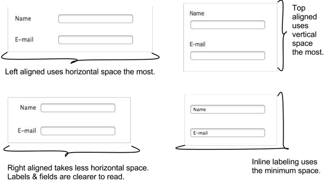
There are 4 possible alignments to give your field labels: top, right, left, and inline. When testing alignments, keep in mind the language that your visitors speak, as well as the width and height of your form. Be extra careful when using inline labels.
Colors
This is really tricky. To best test your colors, you should be familiar with some basic aesthetic principles, such as contrasting and complementary colors, etc. Although you may like the color red, that doesn’t mean your visitors will. By testing colors, you can make your form grab their attention without being too extreme or gaudy.
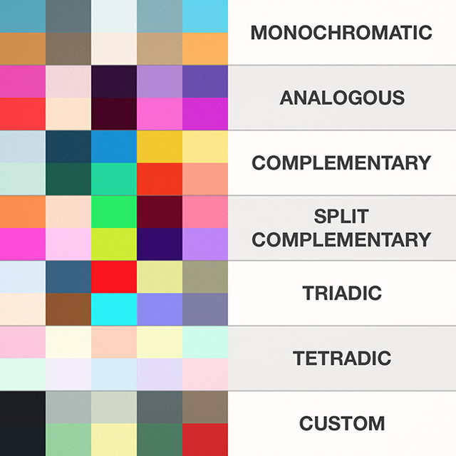
Image Source: Site Para Empresas
Fonts
This seems like an obvious thing. “Use web safe fonts when unsure.” You should also keep in mind that font sizes should also be tested within certain age groups, like those in the range 65+.

Image Source: isotipo.net
Content
Headline
The headline quickly describes what your form is all about. Your form’s goal can be to collect leads, however, you shouldn’t just put something like “Sign Up”. The visitor needs to know what he or she stands to gain by signing up! For example, which of these will have the highest conversion rate?
- “Sign Up Form”
- “Free E-Book”
- “Sign Up & Get Free E-Book”
Length
The most important trait of a good web form is that it is absolutely no longer than it needs to be. Experiment with removing unnecessary or intrusive questions. Is your site the kind of site that needs to ask a home address? Could shortening your form result in more cooperation?
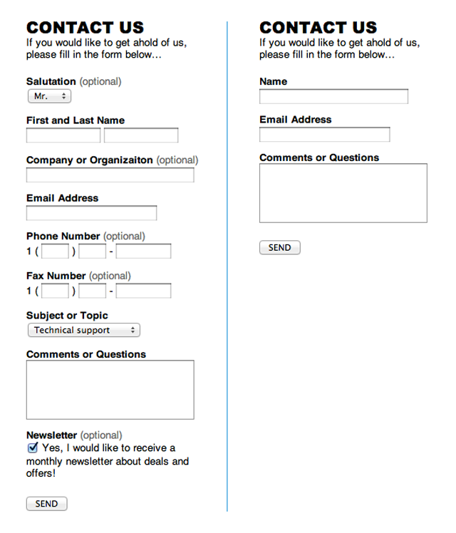
Image Source: VisualLizard
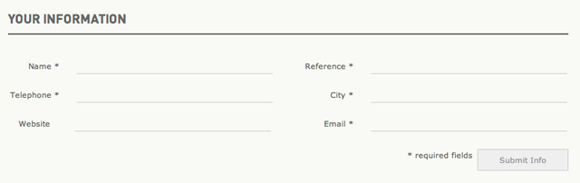
Submit Button
Your form’s final step should be tested carefully. Does making the “Submit” button bigger/smaller or a different color change your results? What should the text read to get your users excited about sharing their input? Use text that’ll contribute to defining your form’s purpose to the user. If you’re giving away a free e-book, for example, try having the submit button read “Get Free E-Book.”
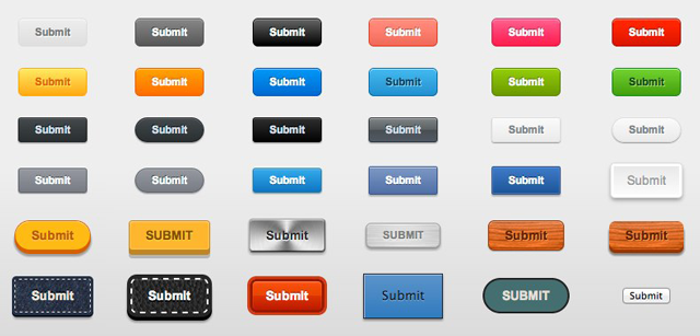
Image Source: JotForm
Hints, Tips, & Sub-Labels
Does guiding your user through the process help? If you have labels already, you could also test what happens when you remove them or modify them. In the same vein, do hint boxes beside form items help or hurt?
Captcha
Nobody likes captchas except a form’s creator. I know you don’t want to get spam or waste your submission limit, but it’s important that you test the form without one. That way,you can see if you really do get any spam (i.e. is the captcha necessary?) and whether or not omitting it improves your conversion rates.
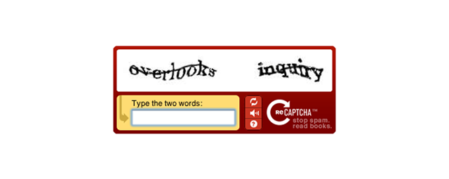
Image Source: Captcha.net
Context
Relevancy
This of course is obvious, you should put specific forms on their relevant pages. A “Contact Us” form should be on a Contact page. Different types of forms can be used on different parts of your site.
Dynamic vs. Static
You can test having your forms pop up when visitors complete a certain action on your site against placing it in a static location on your page.
Some A/B testing tools you can use for your forms
There are a variety of online tools available to facilitate A/B testing and each have instructions on their respective sites about how to start testing your forms. Some of the sites on this list offer their services for free, while others require you to pay.
- Google Analytics Content Experiments
- Visual Website Optimizer
- Experiment.ly
- Optimizely
- Unbounce
- XanderMarketing
- ABTasty
- Convert
Wrapping it Up
Testing is a cumbersome process for each web element and when it comes to online forms, it deserves more attention due to its position as the backbone of user generated data. By testing the form elements above with the help of A/B testing services, you can improve the conversion rates dramatically and get one step closer to perfecting your web forms.
Top