 Download 10 Free
Sure, there’s some time left before high definition becomes universal, but looking at the statistics, it’s not that far off.
As HD displays grow more affordable, so too does the popularity of HD sites. But while it’s no big feat for your users to go to a store and buy an HD device, designers have to put in a lot more work on their end.
Let this article be your primer for implementing HD backgrounds into your site. Here we’ll explain the three most popular types of HD backgrounds, and the best practices for each. But first, let’s start with the basics.
Defining High Definition
When we talk about HD, we refer to a device that contains more than twice as many pixels as one with standard definition. Resolution is measured in how many pixels exist within an inch of screen – this unit is interchangeably referred to as dots per inch (dpi) or pixels per inch (ppi). To put things in perspective, a typical standard definition screen boasts 72 ppi, while high definition screens are anything more than 200 ppi.
While the current highest-definition PC is the iMac 27″ at 217 ppi, mobile devices take HD to another stratosphere:
- iPhone 5 & 6: 326 ppi
- iPhone 6+: 401 ppi
- iPad Retina & Air: 264 ppi
- iPad Mini: 326 ppi
- Samsung Galaxy S5: 432ppi
- Samsung Galaxy S6: 577ppi
- HTC One M9: 441 ppi
- LG G3: 534 ppi
With the increasing popularity of HD devices, detailed and visually rich backgrounds are stepping forward to take center stage. As explained in Web UI Design for the Human Eye, the separation of background and foreground is a natural function of human sight.
These stunning backgrounds rely on a layering effect to simultaneously impress users while not drawing too much attention from the more useful foreground elements. This layering effect is crucial to the proper HD backgrounds. The site’s visual hierarchy must remain intact, and that requires the background not overshadowing the foreground.
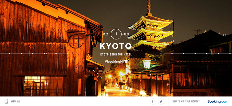
Booking.com
In the above example for Booking.com’s New Year’s Eve promotional event, clearly the most fascinating visual is the high-definition picture of the temple in Kyoto. You want your HD background to make an impression on the user without dominating the screen. In this example, the user can still easily see the text and title, smartly placed at the center over a vacant background section.
At the bottom of the page, notice how the navigation also stands out thanks to the white contrasted background.
In general, there are three main types of HD backgrounds: Still Images, Videos, and Animation.
Below, we’ll discuss the strengths and weaknesses for each, as well as advice for using them.
Still Images
As we mention in the free ebook Web Design Trends 2015-2016, full-screen, or hero, image backgrounds are another popular web trend today. These large-scale images take full advantage of HD’s visual power.

Macquarie-Park.com.au
HD image backgrounds allow designers to influence users with a better emphasis on texture, colors, and even the image’s content. This does wonders for that split-second, all-important first impression.

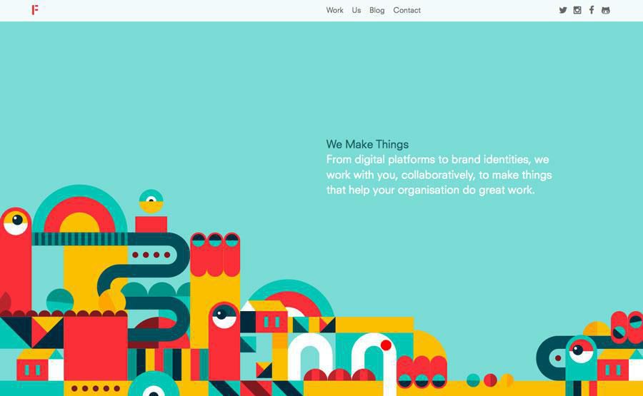
WeAreDandy.com
If you know just the image to best represent your brand as the first thing your user sees, here are 5 suggestions to implementing it:
- Don’t compete – The HD background will naturally attract a lot of attention, so other elements will only distract the user and complicate the visual hierarchy. Try pairing this background with a minimalist interface.
- Sliders or collages – Multiple images obviously give you more options in what you can show, so sliders or collages are acceptable strategies if you have more than one image.
- Image effects – Blurs, color overlays, integrating graphics and photography – some effects can achieve more goals than one image alone.
- Consider screen size differences – Elements align with the background image differently depending on device screen sizes, so keep all variations in mind. That’s why you must embrace responsive design.
- Cropping – Photo backgrounds rarely conform to the 1 to 1.5 aspect ratio of cameras, so crop your images to get the best possible result.
The HD image background will make a lasting first impression, so make sure you choose an image that you want your users to associate with your brand.
2. Videos
Despite the potentially heavy loading times, HD video backgrounds can take still images a step further with their ability to create emotional connections. Apply classic cinematic techniques to web design and move both the image and the user.

AirBnB.com
AirBnB uses video backgrounds to develop the context of their service. Showing “human” movements typical of traveling gets the user excited about booking an accommodation through the site.
Until the introduction of HTML5, most browsers and internet connections couldn’t handle video backgrounds, but now designers are able to mine HD video’s full potential.

BrindisaTapasKitchens.com
The benefits of HD video are the same as the benefits of film itself. If you’d like to explore a cinematic background, consider these 5 tips:
- Between 10-30 second loops – Aim for this range to keep loading times down and hold your users attention, all without sacrificing coherence.
- Sound off(!) – Automatic sound can be an annoyance, so set the default to off with the option to turn it on.
- Minimize loading – The biggest drawback of HD video is loading time, so minimize this as much as possible. Your video will be worthless if your users get bored and leave before it loads.
- Backup for devices that can’t render video – Set a backup for devices where your video can’t be rendered – Google Analytics will show you which devices your site is used on most.
- Quality – Don’t forget the advantage of HD is how good it looks, so select the best possible quality, whether filming it yourself or using stock.
Simply having a video clip in the background is not enough. Respect the medium and draw on decades of film theory to maximize the gains of HD video.
3. Animations
Somewhere between images and video are animations, sharing elements of both. While the principles of animation remain the same, what’s different is the quality introduced by HD.
mMdeByFieldWork.com
The biggest concern here is transitions, which should be as seamless and unnoticeable as possible. Whether your animations are looped or triggered by interaction, they should have an organic feel that doesn’t draw attention to itself. This is more important in HD, as flaws or loading stutters are harder to ignore.
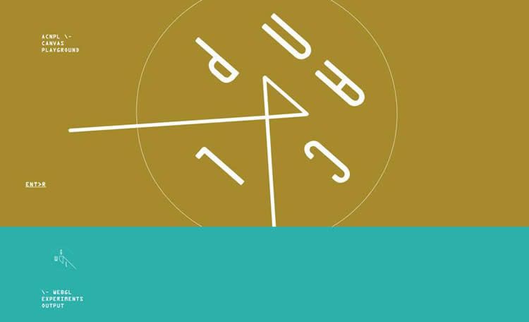
acnplwgl.com
For HD animation, remember these 5 best practices:
- Keep it simple – The limitless potential of animation makes it easy to go overboard. Don’t convolute your site with unnecessary complications.
- Connect animations to the interface – Using signifiers like key colors or suggestive cues, you can use animations to show functionality and add emphasis.
- Vectors – Use scalable image formats so you don’t have to worry about animations performing on different screens or resolutions.
- Use the rules of video – Think of animation as an extension of video, so the same rules apply.
- Design for target audience – Different animations styles suit different types of users, so use the one that hits your target audience.
Animation has a lot of practical benefits as well as visual. The addition of HD only enhances its value.
Related Topics
Top