As a rule, call-to-action buttons rarely undergo cardinal changes. The last big thing in this sphere was when we were widely introduced to ghost buttons. Although their hollow shape felt a bit inappropriate, everyone was obsessed with the idea. Ghost buttons took the web by storm without a doubt, but it was a long time ago.
Things haven’t changed in any radical sort of way. CTAs are still rectangle-shaped elements with a relatively big size in comparison with other tiny details. However, this doesn’t mean that they don’t keep pace with the latest fashions. And the bright coloring of call-to-action buttons is clear proof of that.
It’s a predictable continuation of the trend of vibrant color schemes that show up in web design these days. But with one exception: Buttons are where different experiments are being conducted. Starting with the disco neon blue of Pink Mobility and ending with the classic forest green of TecExpert, you can stumble upon various stylistic choices. What’s more, if you can´t decide what tone to use, you are always welcome to opt in favor of a gradient.
Let´s consider some fantastic examples from the real world.
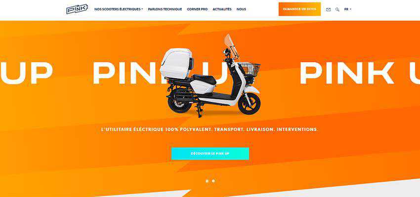
Pink Mobility
The first website to examine is Pink Mobility. We have already mentioned it, and there is a good reason for that. Not only does the team skillfully adopt the bright coloring for general purposes, making the overall design feel energetic and flamboyant, but they applied this trend to the tiniest details such as call-to-action buttons.
Several stylistic choices instantly draw an eye. The first one is, of course, neon blue. It is an eye-catcher, and it goes perfectly well with the bright orange set as a background for the slides. The second one is a gradient-styled button that echoes the primary coloring. It looks extremely appealing. The other ones are navy blue and white, which skillfully complete this entourage.
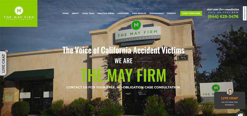
The May Firm
The team behind The May Firm has fixed on a bright green. It enhances various elements of the design, starting with the logotype and ending, as you may have already guessed, with the CTA. It is exactly what the doctor ordered for this serious-looking website. It makes the formal, businesslike atmosphere of the law firm friendlier and more inviting.
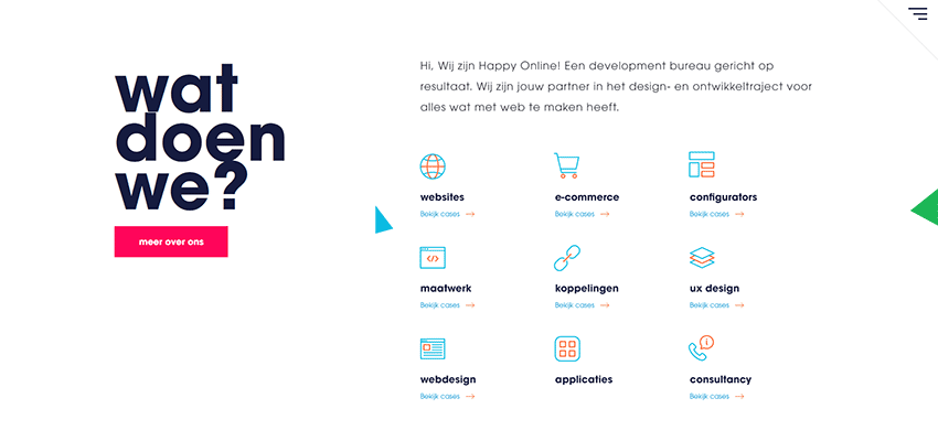
Happy Online
While some may consider pink and crimson girlish and even a bit mawkish, the designers behind Happy Online prove that theory wrong. Here, a beautiful ruby tone that is used for CTAs perfectly supports the straight-laced theme. Against the pure white background, it looks brilliant. You will also find some other tones such as green and blue that also perfectly blend in.
NSR
The team behind NSR pleases our eyes with a bright yellow that was not chosen accidentally. Note the beautiful dark blue image background in the hero section that shows a scene from outer space – it is our sky. Whereas the yellow CTA and icons in the top bar play the role of stars. It is a classic combination with charisma.

Ezra
The design of Ezra goes for the trendy red color that some may find a bit overwhelming, yet not in this case. Here you can feel the power hidden inside this tone. It adds seriousness to the project without much effort. It contributes not just to the clean white design but also perfectly supports the website’s idea. There are several things in the interface that draw the attention from the get-go and CTA is one of them.

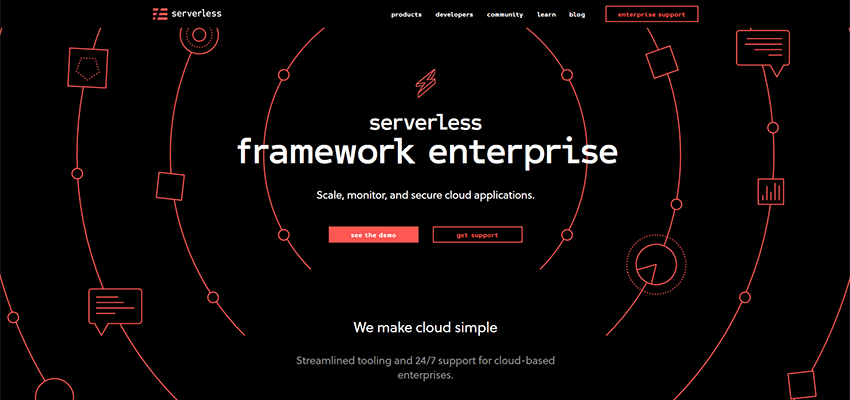
Serverless Framework
Serverless Framework surprises you with its gorgeous coloring. While we are all accustomed to seeing black and white together, there is undoubtedly something divine in this beautiful coral tone that has a quality of Pantone’s 2019 color of the year. The design is majestic.
Hachem
The call-to-action button of Hachem is the focal point without being overwhelming or extravagant. Its beautiful purple tone is so pleasing that you can´t take your eyes off of it. The dark background plays no subtle role here. It skillfully highlights the whole beauty of the coloring. Also, the warm gradient used for the headline strengthens the impact. Indeed, this team has an eye for detail.
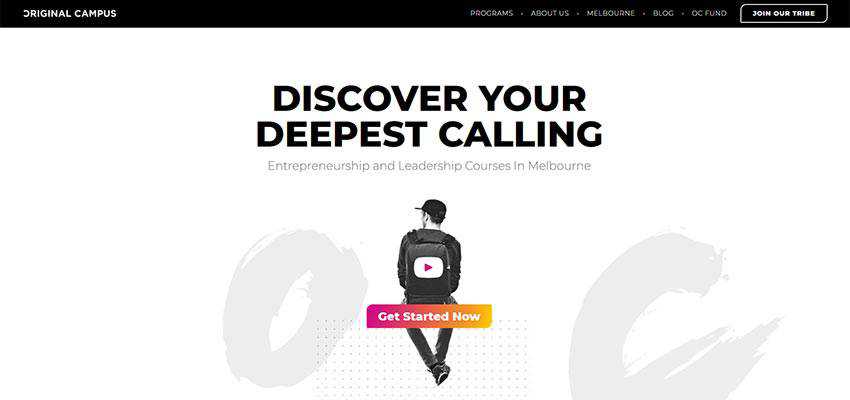
Original Campus
Speaking of gradients, Original Campus shows everyone that sometimes one color is not enough to produce a powerful impact. Their call-to-action button takes center stage on the hero area, thanks to the multicolored gradient. It does not look outdated or poorly-fashioned. Instead, it looks modern and zingy. It stands in contrast to a relatively neutral design, setting a natural focal point for readers.
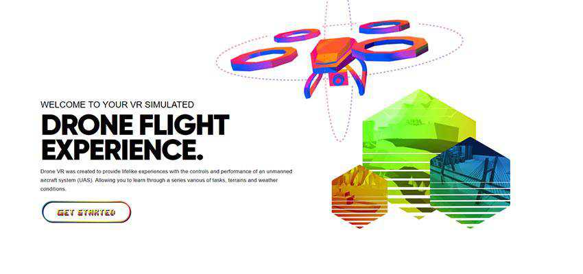
Drone VR
The team behind Drone VR has another interesting take on colorful buttons. They also went for a gradient. Yet this time, instead of using a solid shape, they added extravagance to the design by using the line style. The result is intriguing and a bit controversial. It certainly has the right to life, especially placed in such a vibrant entourage.
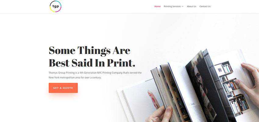
TGP
TGP maintains clean aesthetics and feels extremely businesslike, yet it does not look dull or trivial. Using tiger orange as a primary tone for the CTAs, the team managed to naturally draw attention towards the important things but also add some splashes of positive mood, making things visually appealing.
Sheerlink by RTX
Sheerlink by RTX is an example of a website that proves that bright buttons are a perfect choice for saturated designs. And it does not feel overdone at all. It fits here like a glove. As it turns out, the bright yellow CTA with sharp edges nicely interacts with the picturesque background. At the same time, it stays on the surface – grabbing a deserved dose of attention.

Enough Color to Brighten Your Day
Bright colors always have a bright personality. They are able to bring various emotions to the project, serving as a valid tool for enriching the overall aesthetics.
It naturally sets apart elements from the content flow and makes them valid players in the arena. And it is a nice finishing touch to the modern designs that have a particular inclination towards bold color schemes.