Content sliders are a great way to make a website more dynamic. They add flair, and if used correctly, could be the difference between a purchase and a back button. Normally, they would be built with jQuery or some other Javascript library. However, with the advent of CSS3, I will show you how to build one using only CSS.
The result won’t be the most semantic thing to ever be made, but it will be completely functional nonetheless.
Some simple HTML to start with
<div id="content-slider">
<div id="content">
<div id="content-inner-1">
<div id="content-inner-2">
<div id="content-inner-3">
<div id="content-inner-4">
<div id="content-inner-5">
<div id="content-inner-6">
<div id="content-inner">
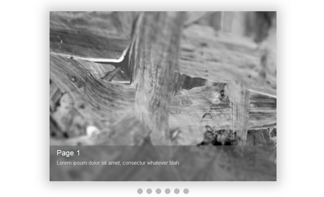
<div class="page" id="page1">
<div class="page-info" id="info1">
<h2>Page 1<h2>
<div class="page-text">Lorem ipsum dolor sit amet, consectur whatever blah.<div>
<div>
<div>
<div class="page" id="page2">
<div class="page-info" id="info2">
<h2>Page 2<h2>
<div class="page-text">Lorem ipsum dolor sit amet, consectur whatever blah.<div>
<div>
<div>
<div class="page" id="page3">
<div class="page-info" id="info3">
<h2>Page 3<h2>
<div class="page-text">Lorem ipsum dolor sit amet, consectur whatever blah.<div>
<div>
<div>
<div class="page" id="page4">
<div class="page-info" id="info4">
<h2>Page 4<h2>
<div class="page-text">Lorem ipsum dolor sit amet, consectur whatever blah.<div>
<div>
<div>
<div class="page" id="page5">
<div class="page-info" id="info5">
<h2>Page 5<h2>
<div class="page-text">Lorem ipsum dolor sit amet, consectur whatever blah.<div>
<div>
<div>
<div class="page" id="page6">
<div class="page-info" id="info6">
<h2>Page 6<h2>
<div class="page-text">Lorem ipsum dolor sit amet, consectur whatever blah.<div>
<div>
<div>
<div>
<div>
<div>
<div>
<div>
<div>
<div>
<div>
<ul id="nav">
<li class="button" id="button1"><a href="#content-inner-1"><a><li>
<li class="button" id="button2"><a href="#content-inner-2"><a><li>
<li class="button" id="button3"><a href="#content-inner-3"><a><li>
<li class="button" id="button4"><a href="#content-inner-4"><a><li>
<li class="button" id="button5"><a href="#content-inner-5"><a><li>
<li class="button" id="button6"><a href="#content-inner-6"><a><li>
<ul>
<div>Granted, that looks scary. Very scary. Remember, this isn’t going to be the most semantic thing on the planet. Now, let me explain.
We have a “content-slider” div, which holds all the content. We’ll just “margin: 0 auto” it and forget about it.
Then, we have two sections: the “content” div and the “nav” ul. The content div is what holds all our pages, and the “nav” ul is what allows us to access different pages.
Now, right inside the “content” div, you’ll notice 6 nested divs: “content-inner-1” through “content-inner-6“. These 6 divs will make all the magic work, and I will explain exactly how later on.
The Magical CSS
#content-slider {
font-family: arial;
width: 640px;
margin: 0 auto;
margin-top: 100px;
}

#content {
overflow: hidden;
width: 640px;
height: 480px;
-webkit-box-shadow: 0px 0px 50px 10px #c9c9c9;
-moz-box-shadow: 0px 0px 50px 10px #c9c9c9;
box-shadow: 0px 0px 50px 10px #c9c9c9;
}

#content-inner {
width:10000px;
height: 480px;
}

.page {
width: 640px;
height: 480px;
float: left;
}
As I said, all we did to the “content-slider” div was center it, and move it 100px from the top of the page.
The “content” div styling is very important. We set its “overflow” to “hidden” – This makes sure that the slides are invisible until they are selected.
Now, the “content-inner” div is what holds all of the pages. That’s the reason it has a width of 10,000px. Normally, javascript would give it the right width, but in this case, we aren’t using Javascript.
The pages have a width and a height, and they’re floated to the left to be side by side.
Now, we have some generic styling. We’ll style the “page-info“, and the “nav“.
.page-info {
height: 90px;
background-color: rgba(99, 99, 99, 0.6);
position: relative;
margin-top: 0px;
bottom: 103px;
color: #dedede;
padding-left: 20px;
padding-top: 10px;
}

.page-info h2 {
font-size: 21px;
margin-bottom: 10px;
margin-top: 0px;
color: #fafafa;
}

.page-text {
font-size: 15px;
}
As you can see, it’s just some simple styling that makes the page info semi-transparent and makes the text legible.
Next, we’ll add some nice CSS3 styling to the buttons.
.button {
float: left;
background: #bababa;
width: 16px;
height: 16px;
-webkit-border-radius: 8px;
-moz-border-radius: 8px;
border-radius: 8px;
margin-left: 5px;
margin-right: 5px;
}

.button:hover {
-webkit-box-shadow: inset 0px 0px 2px 2px #d4d4d4;
-moz-box-shadow: inset 0px 0px 2px 2px #d4d4d4;
box-shadow: inset 0px 0px 2px 2px #d4d4d4;
}

.button:active {
-webkit-box-shadow: inset 0px 0px 2px 2px #7a7a7a;
-moz-box-shadow: inset 0px 0px 2px 2px #7a7a7a;
box-shadow: inset 0px 0px 2px 2px #7a7a7a;
}

.button a {
display: block;
width: 16px;
height: 16px;
}
We made the buttons circles, and gave them inset drop shadows to add some eye candy.
Finally, we’ll add the magic ingredient to the mix. Before that, however, I’ll explain how this is all going to work.
Using the CSS3 :target pseudo-selector, we can style elements that are in the url. For example:
#example {
visibility: hidden;
}

#example:target {
visibility: visible;
}
Now, if we were at a url such as “http://www.example.com/index.html#example, the “:target” styles above would be applied. In this case, the “example” div would be visible.
Using this concept, we can mimic a javascript click function. If the user clicks on a link pointing to “http://www.example.com/index.html#example”, then the styles would be applied to “example”.
In this case, we’ll use “:target” to make our content slider work. When the user clicks on any of the six buttons in the nav, the “content-inner” will slide to the appropriate position, much like with a javascript version.
Here’s the code:
#content-inner-1:target #content-inner {
-webkit-transition: all 400ms ease;
-moz-transition: all 400ms ease;
-o-transition: all 400ms ease;
transition: all 400ms ease;
margin-left: 0px;
}

#content-inner-2:target #content-inner {
-webkit-transition: all 400ms ease;
-moz-transition: all 400ms ease;
-o-transition: all 400ms ease;
transition: all 400ms ease;
margin-left: -640px;
}

#content-inner-3:target #content-inner {
-webkit-transition: all 400ms ease;
-moz-transition: all 400ms ease;
-o-transition: all 400ms ease;
transition: all 400ms ease;
margin-left: -1280px;
}

#content-inner-4:target #content-inner {
-webkit-transition: all 400ms ease;
-moz-transition: all 400ms ease;
-o-transition: all 400ms ease;
transition: all 400ms ease;
margin-left: -1920px;
}

#content-inner-5:target #content-inner {
-webkit-transition: all 400ms ease;
-moz-transition: all 400ms ease;
-o-transition: all 400ms ease;
transition: all 400ms ease;
margin-left: -2560px;
}

#content-inner-6:target #content-inner {
-webkit-transition: all 400ms ease;
-moz-transition: all 400ms ease;
-o-transition: all 400ms ease;
transition: all 400ms ease;
margin-left: -3200px;
}
Conclusion
We have 6 “content-inner-[number]” divs, and each div corresponds to a page. 6 pages is 6 divs.
The “content-inner” div is a child of each “content-inner-[number]” div, so when any 6 of these “content-inner-[number]” divs are :targeted, we can style the “content-inner” div accordingly.
Since each page is 640px wide, we simply set the margin-left of the “content-inner” div to a multiple of 640.
To make these “:target” styles work, we have to have links pointing to them. Hence, the “nav” ul underneath the pages.
In order to actually animate the “content-inner“, we give it the usual CSS3 animation properties, with vendor prefixes, of course.
Well, there you have it: A fully functional, albeit non-semantic, content slider.
Related Topics
Top