Typography is one of those things that we can talk about forever. Just remember our outstanding articles where we discussed The Rise of the Hand-Written Typography Trend on the Web, 40 Examples of Clever Typography in Logo Design or even 70 Examples of Beautiful Typography in Print Ads.
In essence, it is just a set of rules for things like cap height, letter spacing, shapes of strokes and some other details. But the way it looks, behaves and interacts with other elements makes us stare. It is like the kid who always sits at the cool table and someday will become a prom queen. We are just destined to admire and copy her style.
And like any future queen of a ball, typography has lots of responsibilities and things to do. Today, typography is not just a trivial detail of a website that is used to display text and titles. It is a viable tool for giving the content a visual weight, finishing off the entourage and making an impression. We are no longer considering it only in the context of the readability. It is a valid player in the entertainment arena as well.
Typography has lots of dresses and shoes in a walk-in closet, starting with the classics and ending with the bizarre. Modern solutions allow us to use whatever fonts we want. The era of boring typefaces is over. It is time for experiments and bold decisions. You are welcome to use different letter forms and styles, even those that are unlikely to survive in web design. For example, line-style typography.
Let’s be honest. In an era where (almost) each and every website greets visitors with an action-packed hero area, such a tiny creature as line-style typography has little chance to survive. There is nothing wrong with it: It is just too fragile and delicate. Or is it just a victim of prejudice? As a matter of fact, in capable hands, this kind of typography not only can see through all the obstacles but also make its own statement. And we are going to show you 10 such examples as proof.
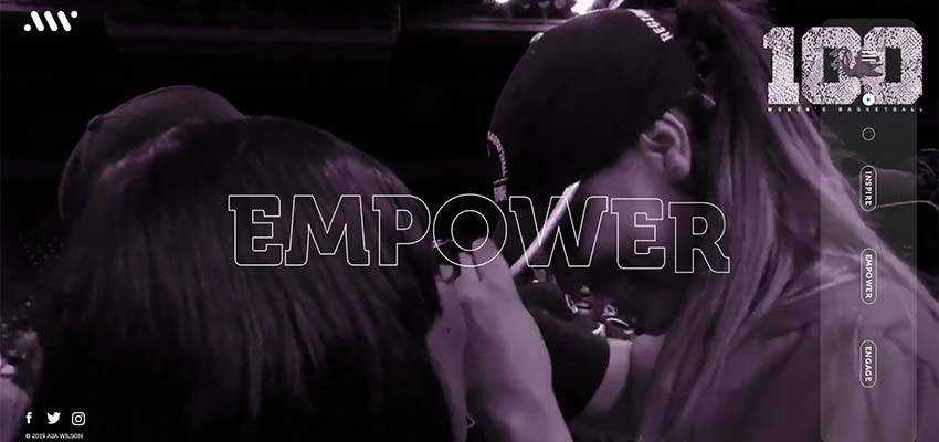
A’ja Wilson
Let’s begin with the official website of A’ja Wilson. Here the home screen features a traditional video background that draws the attention from the get-go. However, the size of the catchy phrases keeps the line-style typography from getting lost. The team managed to save the elegance of the thin forms, letting it contribute to the feminine aura of the project.
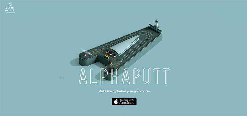
Alphaputt
Alphaputt’s hero area has another trendy solution: Animation. Nevertheless, the team has thought this through. Here the animation takes up only the small part of a screen, leaving everything else clean and static. This gives the outline typography a secure background.
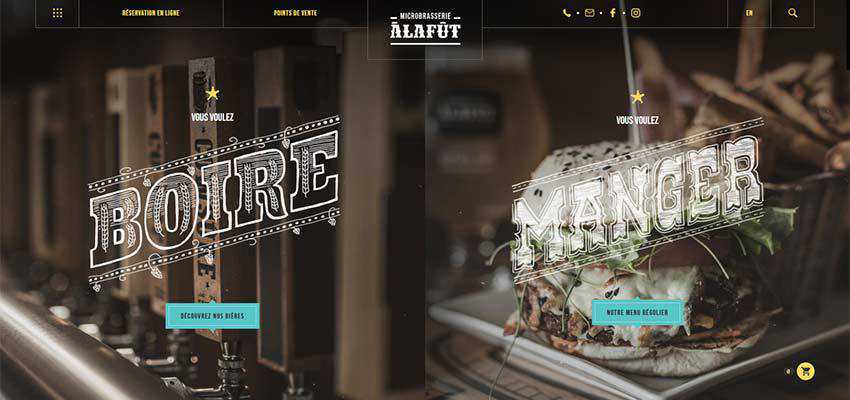
A la fut
The home screen of A la fut is marked by gorgeous retro typography. Fat forms and big sizes are exactly what is needed for words to stand out naturally. The chalk filling is not only a nice touch that enriches the aesthetics, but it also makes letters more solid.
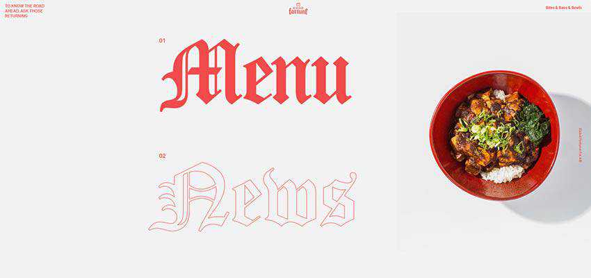
Yard Agency / Good Fortune
The teams behind Yard Agency and Good Fortune skillfully mix and match line and solid styles to unobtrusively set focal points.
Although Yard Agency has a pretty heavy and intensive video slider, to say nothing about the attention-grabbing transitions, the team still chose a fragile line-style typography. On one hand it makes the second word less important. On the other hand, it is used as decor for slides, skillfully tying everything together.

Good Fortune is another example in our collection where line-style meets retro-style – resulting in a beautiful union. Thanks to a monochrome canvas and a generous amount of whitespace, the graceful typeface easily draws attention towards the links to essential sections. And much like in the case of A la fut, it plays a decorative role – establishing a lovely atmosphere.
Toonami – Adult Swim / Dot to Dot
Toonami – Adult Swim and Dot to Dot are examples of websites where line-style typography is a predictable choice.
Toonami’s design has a marvelous cosmic vibe with lots of outlined circles, a grid and shallow boxes. The hollow shape of the letters feels refined and techy. They blend in perfectly.

Dot to Dot also exudes an image of techy elegance. Ghost buttons, solid and hollow circles and an ultra-narrow typeface for secondary content create an ideal foundation for the outlined typography.
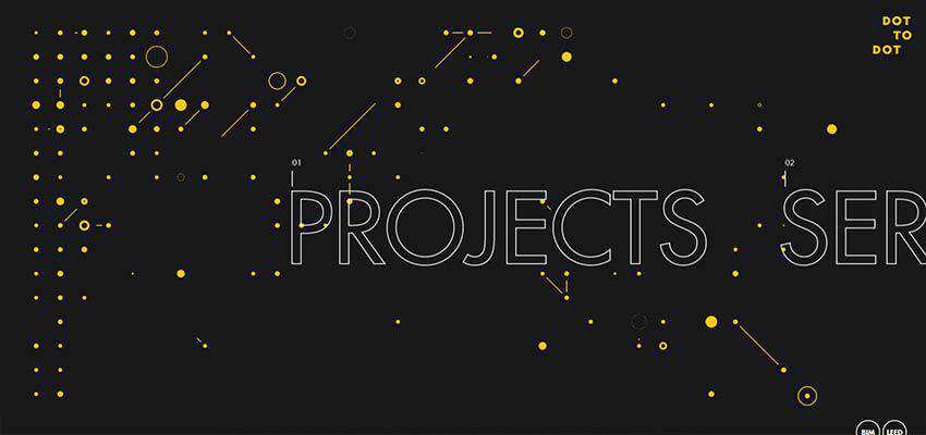
In both cases, you can’t imagine any other font. The choices are so well-thought-out.
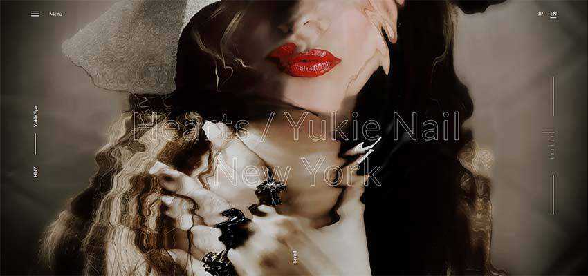
Yukie Nail New York
In the case of Yukie Nail New York, outlined typography is a questionable decision. The hero area is based on a canvas with a liquid behavior that is truly difficult to pass by. Every move of a mouse leaves a ripple that disturbs the entire surface. The hollow typeface merges with the background a little, but still feels at home as it perfectly fits the feminine atmosphere.
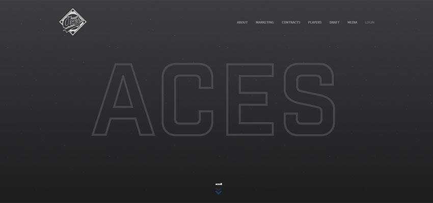
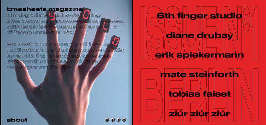
ACES Baseball / Timesheets Magazine
ACES Baseball and Timesheets Magazine prove that line typography can never be too large. You can even stretch words from top to bottom and it will still look elegant and sleek.
The homepage of ACES Baseball features nothing more than a single title that strikes an eye. Thanks to its large size, it takes up the most-viewed part of the screen and speaks louder than ever.
The team behind Timesheets Magazine uses hollow typography behind a scene. Here it serves both as decorative and an informative detail. Thanks to a delicate letter form, the text in the back does not compete with the text up front. But it still reads loud that this is the first issue. This is undoubtedly a subtle balance.
Rules for Success
Certain rules help line-style typography survive in the action-packed world of modern web design. First of all, bear in mind that size matters. Even though the fragile nature goes perfectly well with a tiny size, do not fall for that. It will undoubtedly get lost and stay overlooked. So, the bigger the better.
Secondly, outlines of letters should be almost tangible. They should not be overly fat, but should separate the text from everything else.
And finally, contrast is your loyal friend. As a rule, white lettering placed against a black canvas is an ideal option, but you are always welcome to experiment.