Color is one of the most powerful tools in website design, especially when it comes to manipulating reading flow. As a rule, the standard reading path starts from the top left corner, with the exception of some Asian and Arab cultures. People move their eyes from left to right and gradually go down. This principle works everywhere. However, it does not mean that you cannot make some exceptions.
For instance, you can set a tagline to a big font size, and it will instantly catch an eye. Another proven way to force people to change their normal behavior is to use color that stands in sharp contrast to other units of the design. One time-proven option to do the job, regardless of the environment and neighborhood, is neon color.
Neon colors always command attention. It is in their nature. What’s more, since this year saw numerous millennial-targeted website designs filled with gradients and juvenile details, it has become quite popular. It perfectly blends into the vibrant infantile realm – emerging into a tiny trend. Let us consider some representative examples.
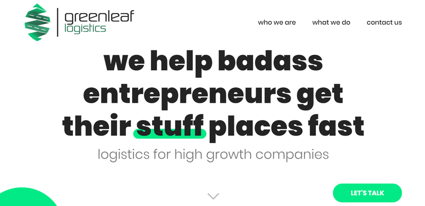
Greenleaf Logistics
The homepage of Greenleaf Logistics is spiced up with several modern solutions that instantly catch an eye. For example, all the images are presented as morphing blobs. In such a bizarre environment, the neon coloring nicely fits into the general aesthetic.
The logotype, call-to-action, and “go up” button are set in an almost screaming green. They are unobtrusive focal points that force readers to follow the path established by the team.
Flowhub
Much like the previous example, here neon effects are used on almost the same range of UI elements. Yet with some tiny differences.
For example, the team behind Greenleaf Logistics has highlighted only one word in the headline, whereas Flowhub has stressed out the entire tagline. They have used it like a shadow that changes its angle depending on the mouse position. In addition, neon green accentuates not only the words in the content, but also important details of the accompanying illustrations, images and icons.

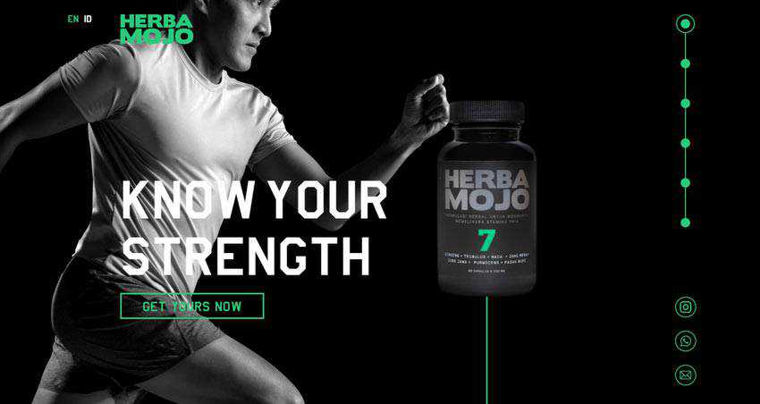
Herba Mojo
Neon green is quite a universal tone that plays nicely with both light and dark themes. Consider Herba Mojo for showing it in practice.
Here, the luminescent green is used for various details: logotype, language switches, slider controls, CTA, and even product imagery. However, it does not feel overpowering. The deal is that the dark environment saves the day by striking an excellent balance between these two.
Well, we have already mentioned that neon green fits like a glove in different types of environments. However, what about its optimal dosage?
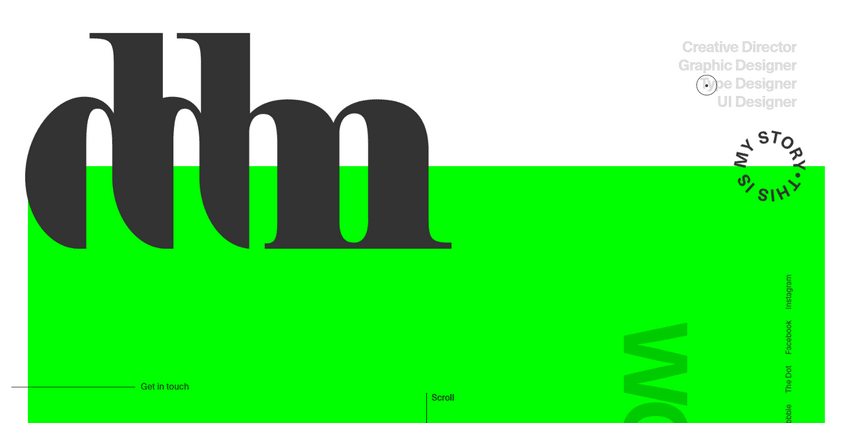
Danilo Demarco
All of the previously mentioned projects feature quite a limited amount of fluorescent color. It is mostly scattered throughout the entire page, looking like bright splashes. But what if you want to use it as a big, bold spot? No problem. Consider the personal portfolio of Danilo Demarco.
Here, kryptonite green occupies the lion’s share of the homepage. However, surprisingly, it does not overwhelm visitors nor scare them away. It just works. It can be seen in every corner of UI. It enriches big and small headlines, hover states, the mouse cursor, content sections, block reveal effects, etc. It rules the roost here, and no one will complain about that.
Neon green is not the only one that is used these days on the web. The neon color range has some outstanding choices. Let’s consider other fantastic options.
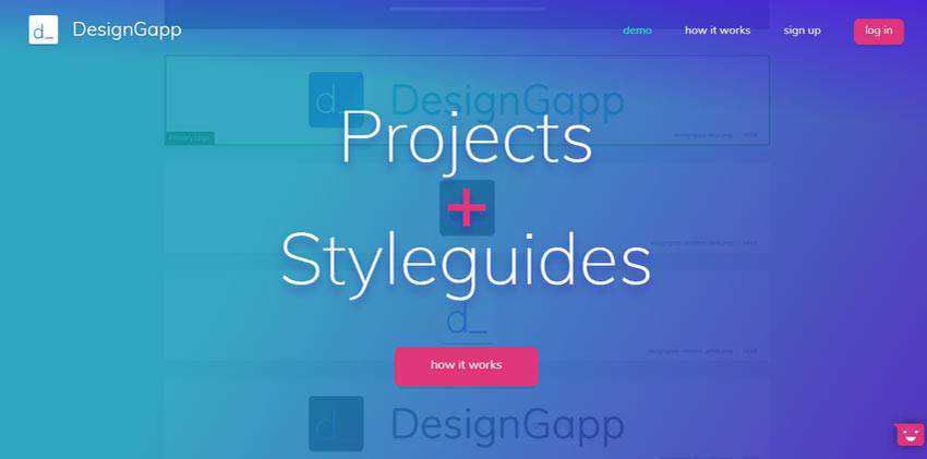
DesignGapp
DesignGapp goes for a gorgeous pink that instantly reveals its beauty, placed against the bluish gradient-style background. It skillfully highlights the CTAs, playing nicely with the vibrant theme that runs through the entire website.
Kostumn 1
Hot fuchsia and a fashion-related website are just destined to be together. It gives the design a sense of luxury and sophistication with ease. Even when used in tandem with a large font size, it does not ruin the overall harmony and looks pretty organic. It enriches titles in the slider and hover states of product names.

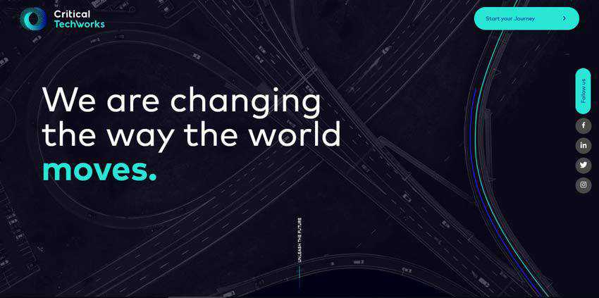
Critical Techworks
Critical Techworks employs one of the most iconic neon tones: rich turquoise. It looks outstanding inside a dark techno environment. All the details of the UI that are enriched with its charisma draw the attention from the outset.
CTAs, text, headlines, elements of images and parts of the vehicle benefit from it. What’s more, there is an additional dark blue fluorescent tone. It nicely accompanies the turquoise, giving an extra edge to design.
Active Theory
Active Theory adopts the same solution as the previous example. The website also has a powerful techno vibe that oozes sophistication. Here, neon blue collaborates with line-style typography. Together these two make a sweet couple.
That’s not all. There are some other fluorescent tones. They perfectly complete the theme, making the website feel one of a kind.
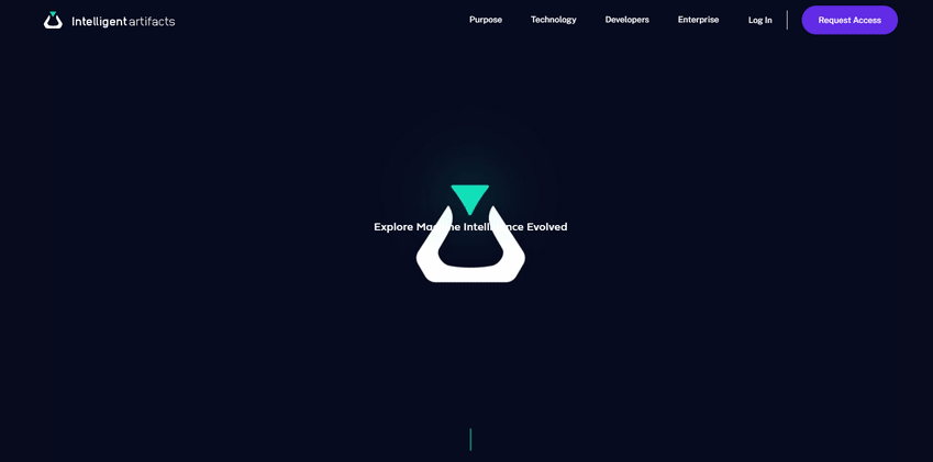
Intelligent Artifacts
The homepage of Intelligent Artifacts gets the most out of a pair of neon colors: turquoise and purple. Again, they are used against an almost black canvas that reveals their refined, dark nature.
They almost glow and shine, instantly striking an eye. As befits, they are used to bring extra attention to essential details of the website such as call-to-action buttons, logotype, navigation, and even images.
Whoamama Design
The team behind Whoamama Design has built their entire aesthetic around neon coloring. They are everywhere. The website feels electric, bizarre, and fancy. It is like a blast from the disco past.
Some may consider it too much, while others may find all those eccentricities quite amusing. All in all, this unique oddness and singularity make the UI stand out from the crowd and bring attention towards the content.
What else do you need in the harsh reality of fierce web competition? Sometimes you need to be a freak to get yourself heard.
A More Colorful Existence
One of the main advantages of neon colors is that they perfectly collaborate with both dark and light themes, bringing a dose of charisma. When used along with a white background and light environment, they feel playful and whimsical. When used with a black canvas and somber tones, they open their sophisticated and intricate nature.
They also perfectly fit different types of websites. Whether it is a serious company that develops products based on AI or a community platform that seeks like-minded users, the neon color will find its place under the sun and makes its contribution to the user experience.