Visual hierarchy is vital to good website design. It’s one of the key principles that will make your website effective in accomplishing your goals for it.
There’s a lot of theory behind visual hierarchy. It’s so important that a lot of study and effort has been put into understanding how and why it works. Understanding it can help you use it.
Design is a Form of Communication
At its core, design is a form of visual communication. It’s about communicating ideas to others through a visual medium. This is true of all forms of design. It is especially true of web design, the design school of the information industry.
Massive blocks of information do not communicate well because people are actually visual thinkers. We don’t simply process data. People do not simply see things. Rather, human beings organize what they see in terms of “visual relationships”.
The Rise of Visual Hierarchy
Why we see in terms of relationships has been a study unto itself. Anthropologists contend that it’s a remnant of hunter-gatherer history that helped our ancient ancestors survive.
A practical, less scholarly way of looking at it is that it’s just the way our brains understand information. We group similar elements together and organize them into meaningful patterns that we can use simply use.
Regardless of how you think the visual hierarchy used by the human brain came about, it is how we organize information and utilizing it is a very effective way of communicating a message.
The Tools of Visual Hierarchy
Now you understand the visual hierarchy is a useful tool for communicating information, how do you create it as a web designer?
The tools to pull it off are very simple and easy to learn. All you need to do is figure out how to use them.
Size
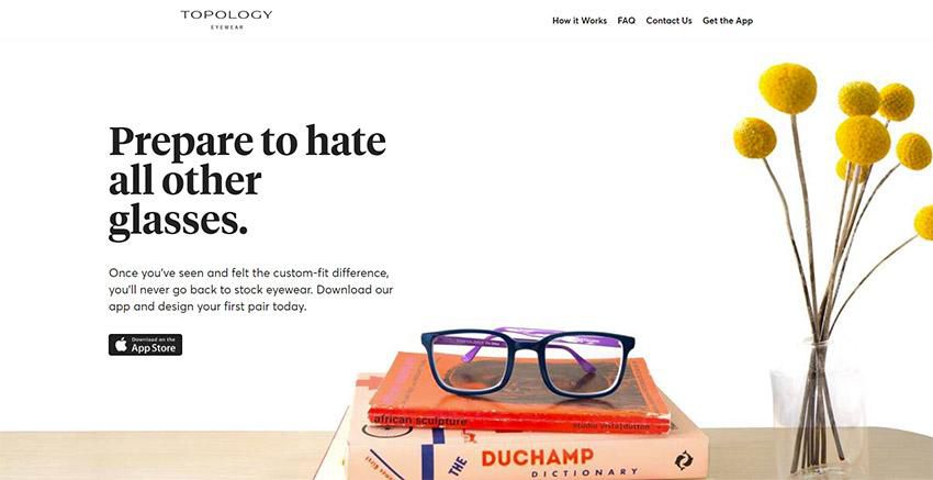
Bigger objects are essentially shouting. They demand people pay more attention to them. In terms of visual hierarchy, a viewer’s eye will naturally be drawn to a larger object.
This is one of the most powerful tools you can use for visual organization. Correlate size with importance. Your biggest elements should typically be your most important, while the smallest ones are normally the least important.
Color
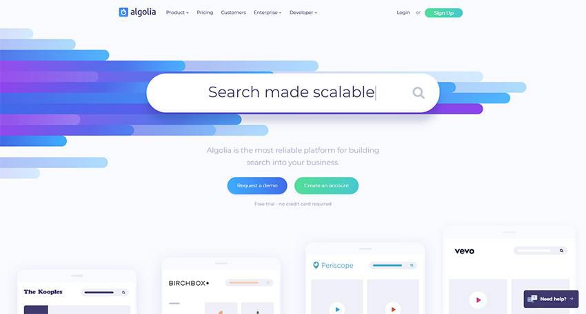
Color is both an organizational tool and a way of adding personality to your web design. Bold and contrasting colors demand a viewer’s attention and focus.
This is best used for buttons and hyperlinks. As a tool for adding personality, color can be used in more sophisticated ways.
Fun, bright colors can make a page exciting while claiming colors create a soothing feel. Color is very important. It can communicate a brand (i.e. Pepsi blue, McDonald’s yellow) or can be used as symbolism (i.e. passionate red). You can even apply colors as a way to classify info within the visual hierarchy.
Fonts
Selecting the proper fonts for your design is critical when wanting to create visual hierarchy. It’s not just the font itself important, but how you use it. The weight and style you use are as important as the area of the site you place them in.
To organize what’s important, try using a variety of type sizes and weights. Italics serve their purpose as well in certain situations.
You can create a typeface hierarchy on your site with text of various sizes, weights, and spacing. It doesn’t matter that you’re using a single font on your website.

By using a variation of it size and weight, you are not only drawing attention to the more important elements, but you are creating an overall composition that will be easy to read and understand for the visitor.
White Space
In the midst of all this careful use of visual hierarchy, make sure there is whitespace left. You need to give your content room to breathe.
Negative space is an important part of the visual design, defining it just as much as a positive use of space.
White space is often defined simply as being “the space between stuff on the page;” although, this extra space is not always white in color, which has led to more individuals instead referring to it as “negative space.”
White space essentially enables you to dictate which particular features of a website that you’re building should stand out over others. Thanks to the welcoming type of layout this creates, visitors will be more likely to remain on the website for longer amounts of time.
Whitespace offers a break for the eye and also highlights important elements. Too much crowding and clutter can drive viewers away because they can’t understand what is actually important.
The Human Eye and Scanning Patterns
The human eyes work in predictable ways. They are automatically drawn to certain points of interest. Some of this does depend on the individual person, but most people follow particular, predictable trends with how they view just about everything, including websites.
F-Pattern
This is the scanning pattern most people use for text-heavy websites like blogs or wikis.
The reader first scans a vertical line down the left side of the page, looking for keywords or other points of interest in the first few sentences of the paragraphs.
Once the reader finds something interesting, he or she starts reading the text normally in horizontal lines. The overall pattern resembles the letter F (or E).
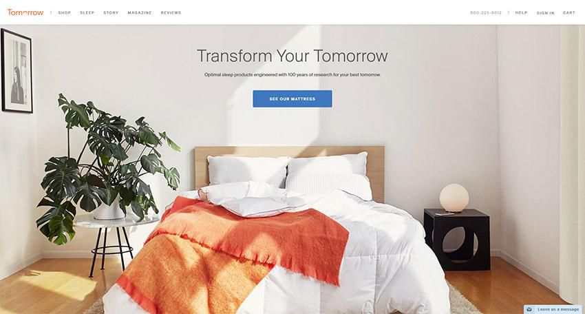
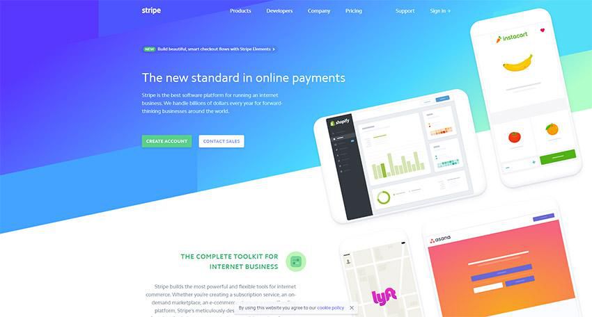
Z-Pattern
This scanning pattern is used on pages that are not centered on the text. Readers first scan a horizontal line across the top of a page. This of often because of the menu bar, but it is also a habit that comes from reading left to right.
Once the eye reaches the end of the horizontal line, it moves down and to the left, another left to right reading habit, and starts over again. The pattern resembles the letter Z.
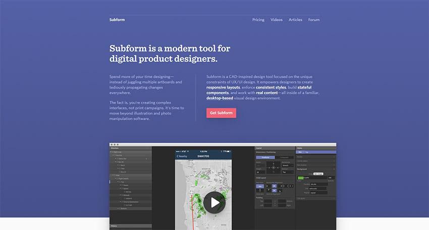
This is a useful pattern to take advantage of in your site’s visual hierarchy. It addresses many basic site design requirements: calls-to-action, visual hierarchy, and branding.
It’s really, really great for those times when simplicity is a major priority and the call-to-action is the primary purpose of the page. It brings a sense of order to simpler websites. However, complex content does not work terribly well with the Z-pattern and the F-pattern might be a better choice.
These are a few best practices:
- Separate your background so that the viewer’s sight is kept within the visual pattern framework.
- Logos look good in the upper left, right where they are immediately visible.
- A colorful secondary call to action within the Z-pattern can be a helpful guide for users.
- Featured image sliders in the center of the page help separate the top and bottom aspects of the Z-pattern visual path.
- Add icons to the left side of the page to guide people to the call-to-action.
- The visual pattern should end in your primary call-to-action.
Understanding visual patterns and the natural movement of the human eye can help you arrange your website design to your best advantage. When you know what people will be looking for, you can arrange information so it best catches their attention and guides them where you want them to go.
Conclusion
Visual hierarchy is an important part of web design. Understanding how it works will allow you to create as effective a site as possible.
It provides a guideline for organizing your content. Take a look at some good site designs you’ve seen and see how they’ve used it to effectively communicate their message.
Related Topics
Top