Lately I have found myself focusing more and more on an illustrative approach when I think about how to develop the true identity of a product.
I’ve found it a lot easier to build a unique, memorable style by introducing illustrations to the mix. Maybe it’s because it’s giving me another stick to beat the product with to sculpt its true brand identity.
Bring a Twist to Reality
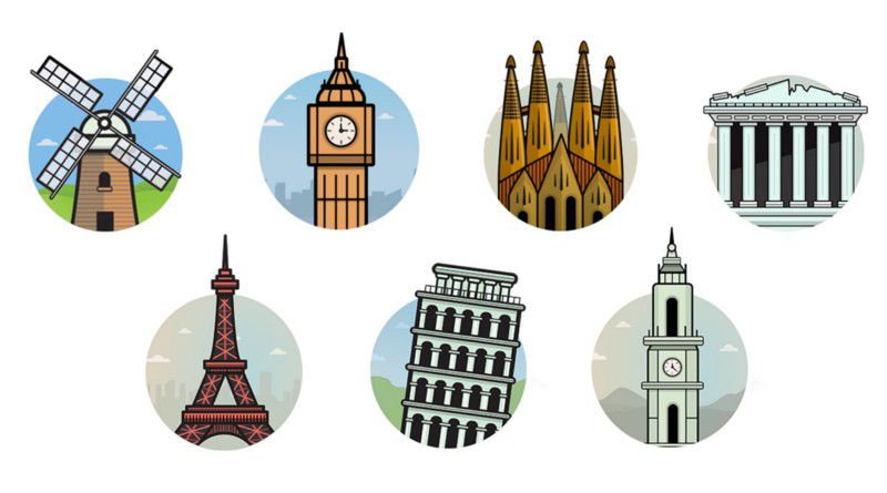
Photography is often dull, forgettable and bland. Finding the right image that you need to sell your cherished product, a product that you’ve slaved over, caressed, truly loved, can be virtually impossible. Nothing is good enough for your digital baby. Trawling through stock image galleries, looking at poorly paid models in ridiculous poses can be a difficult task, to say the least. Photography is limited. Unless you’re willing to get a photographer involved, you are pretty much stuck to whatever stock galleries have to offer.
This is where illustration comes into play. Illustrations have been around since the local cave man wanted to explain to his mates what he had for his dinner. When done right, an illustration can tell a thousand words with one simple swipe of a cave man’s stick.
You can go far beyond the limitations of photography. The rules can be easily bent. In fact, illustration is far more effective when we take a sidestep from reality and jump knee deep into something away from the norm. Illustration design gives us a chance to create a unique, memorable style that will live long in the memory of our users.
Enhance the Brand Identity
At times a brand can be rather stagnant. We use the likes of a content strategy to bring a dynamic approach to our brands. But visually, we’re often limited with regards to what we can do to enhance our brand identity from a product design level. We’re often cornered as to how we can express the true identity of a brand.
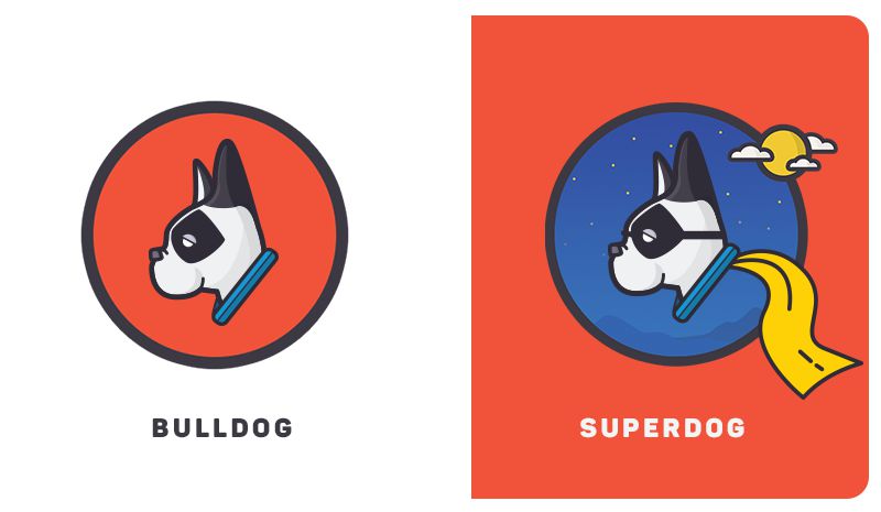
The use of illustrations across a platform can help drive brand character. For example, the use of strokes in an illustration can portray simpleness, the use of vibrant colours or rounded corners can push a fun and playfulness approach. It is important that the illustration style mirrors the brand values.
Help Guide the User’s Experience
Introducing illustrations across various areas of a design can help guide the user experience. It’s becoming more and more common for the likes of onboarding screens to be driven mainly by illustrations. What used to be a space for content strategists to flex their writing muscles to explain how a product should work has been captured by product owners drawing stick men explaining to illustrators how their product works.
“Never underestimate the simplicity of the general public”
Generally, I find, the user doesn’t read all that much when skimming through a flow. Designers often rely too heavily on the use of content to explain certain aspects of a flow and then when you test it, you are left pulling your hair out as the user looks everywhere, but at the line of text they should read that explains exactly what is needed. Less is more.
Introducing Illustrations to Europe’s Biggest Airlines
Recently, I was lucky enough to be heavily involved in the site redesign of one of Europe’s biggest airlines, Ryanair. With over 40 million visits monthly, it certainly was a daunting yet incredibly exciting project.
One of the arms of the project was to lead a team of designers in creating a new illustrative style for the Ryanair platform. As Head of UI at Ryanair, I was tasked with coming up with a redesign that was unique and memorable and I felt giving a fun, illustrative twist to the site would certainly differentiate ourselves from the competitors.
It was early on in the project when we decided that leaning heavily on illustrations would give us an edge, so we set about putting some ground rules in place as to how exactly we were going to approach the project.
- What is needed exactly?
Firstly we met with stakeholders to get buy-in as to exactly what way they felt we should tackle the style. We had already delved deep into this exploration earlier in the project when we were figuring out the broader UI styles, so it was easy enough to get an understanding as to exactly what we needed.

An early exploration into an illustrative approach
- How are we going to use them?
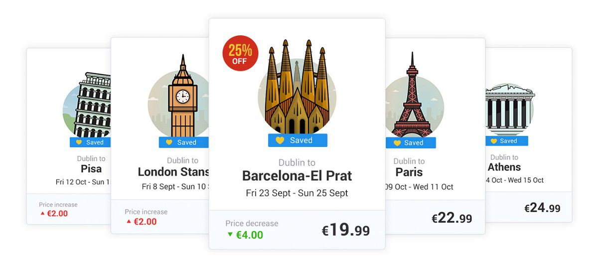
The next step was to figure out how and where we were going to use illustrations on the site. Everyone on the team agreed that we should try to incorporate illustrations into both our ancillary products as well as to the destinations that we flew to. So myself and another illustrator on the team, Chris O’Sullivan, took it upon ourselves to try flesh out a style that fitted our unique brand. Our main approach was to try to keep the illustrations as fun, colourful and as simple as possible, as we felt that that would line up nicely with what we were doing on the user interface side of things.
- How are we going to get them done?
We split the two illustration families up; Chris took the product illustrations while I tackled the destinations list. We were in the lucky position that the style was effectively up to us to create, control and push forward. The stakeholders on the project had totally bought into what we were trying to do so it gave us a lot of confidence to really push the illustrative style to work hand in hand with the overall interface.
- How can we develop the library?
As the project developed, we searched for areas where we could push the catalogue of assets even further. Introducing characters into the mix gave us a chance to reinforce the fun, playful approach but also gave us the opportunity to drop the character into various scenes enabling us to explain various complicated scenarios through illustration rather than wordy content. Basically, the more assets we had in our library, the more flexibility we had to expand on our illustrative approach across the platform.

- Now we have them, how do we use them?
Once we had settled on a general style; the next step was to carefully introduce the correct amount of illustrations across the platform. We didn’t want to totally overwhelm the site with illustrations, but equally, we wanted them to be ever present so that they would have an input into the overall experience of the site.
- What do we do going forward?
A key part of the project, as with product design projects in general, was enforcing consistency. A styleguide was created outlining constraints around colour palettes, stroke widths and the rules around the overall simplicity of the concepts. We felt it was vital to have this documentation going forward especially if a new illustrator was given the job to carry our project forward.
I’ve since left the team at Ryanair, but I’m confident that the legacy that we built will remain a key element of the brand identity of Europes biggest Airline for years to come.
You can see more of what we achieved over at a recent case study I created around the subject here
At the End of the Day
I believe it’s time to embrace illustration as another arm of your visual identity. Don’t get me wrong, it’s not for everyone. I just believe you’re pretty naive if you’re willing to overlook this extra string to your bow when trying to build a stronger identity. After all, a picture is worth a thousand words
Feel free to pick my brain (or whats left of it) over at:
// Twitter // Dribbble // Behance // Portfolio site //
Related Topics
Top