As CSS3 gathers momentum, more and more new techniques are being published every day. Each seems to explore exciting never seen before avenues, and ALL push the boundaries of CSS ever further. It really is an exciting time for web design.
The post should have been called “The Top 10 Kick-Ass Experimental CSS3 Techniques That Simply Blew My Mind Away!“, but instead we opted for the more conservative route. Having said that, that title describes this post perfectly and gives you a clearer idea of what you will find.
Here are our favorite CSS3 experimental techniques, And please, please do try this at home, we will look forward to seeing the results.
Our Solar System – An experiment with CSS3

This is a recreation of our solar system using the CSS3 features border-radius, transform and animation.
The orbits and planets have all been built using border-radius, while the animation have been done via –webkit animation properties and transform. The result is amazing!
Our Solar System →
Star Wars HTML and CSS: A NEW HOPE
A couple of years ago, would you have thought that the Star Wars Episode IV opening crawl could be built by using only CSS and HTML? I didn’t either.
Star Wars HTML and CSS: A NEW HOPE →
Pure CSS3 Animated AT-AT Walker from Star Wars
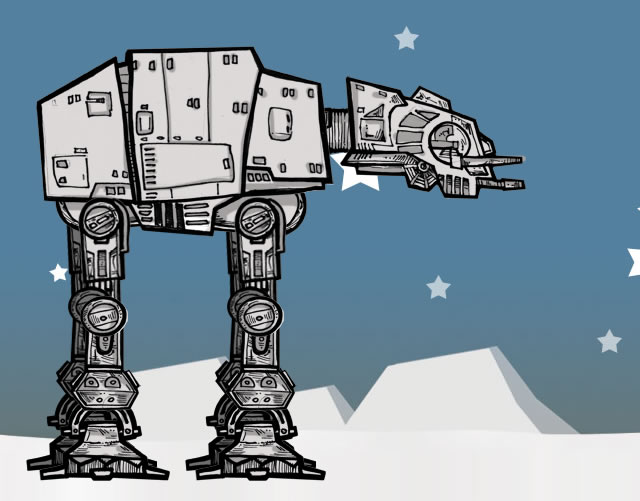
This article not only showcasese experimental CSS3, it actually shows you how to do it via a highly detailed and well written tutorial by Anthony Calzadilla. It walks you through the process of creating a CSS3 animation of an AT-AT Walker from The Empire Strikes Back.
Animated AT-AT Walker from Star Wars →
Pure CSS3 Spiderman Cartoon

This experiment is a recreation of the intro to the classic 1967 Spiderman cartoon using CSS3 for animation and a dash of HTML5 for audio.
Pure CSS3 Spiderman Cartoon →
CSS3 Clock
This experimental clock has been built by using CSS3s 3D transforms and transitions. JavaScript has only been used to set the time and turn the wheels, but the wheels themselves are built and animated using only CSS. There are two demos available, one with Javascript and one without.
Pure CSS3 Page Flip Effect
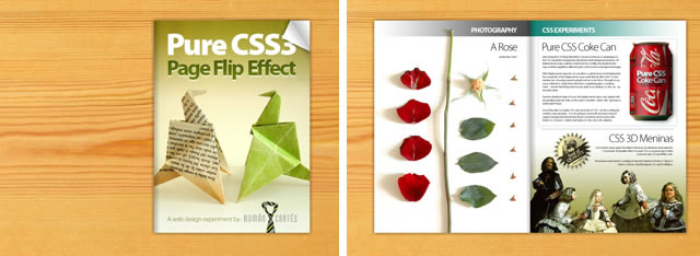
By using CSS3 gradients, transitions, 2d transforms and clipping, Román Cortés has built this pure CSS3 page flipping effect.
Pure CSS3 Page Flip Effect →
Pure CSS3 Cube

Create Social Media Icons in Pure CSS

These icons are an amazing and practical example of what can be achieved with CSS3. Built using the new CSS3 properties border-radius, text-shadow, box-shadow and gradients. They are an amazing achievement.
Curtis CSS Typeface by David DeSandro
img src=’https://speckyboy.com/wp-content/uploads/2010/05/css3_experimental_09.jpg’ alt=’Curtis CSS Typeface by David DeSandro’/>
Curtis is the name given to this font, that has been entirely built using CSS3. All shapes are rendered by the browser, using a combination of background-color, border-width, border-radius, and a heavily reliance on absolute/relative positioning.
Anigma – Online Gaming Using CSS3 Animations & Transitions
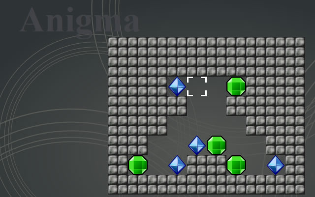
Benjamin Meyer has built the experimental Anigma, an online game designed to showcase some of CSS3s functionality, and in particular its transitions and animations.
CSS 3D Meninas
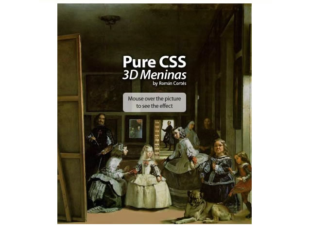
This is another experimental demo from Román Cortés, this time he has taken the classic painting 'The Maids of Honour (Las Meninas)' and given the painting a CSS pseudo-3D/parallax effect. It is pure CSS.
CSS 3D Meninas →
Top