Typography is the Jan Brady of graphic design – it doesn’t generate the rabid excitement of color nor cooing over flashy images. But typography can’t be ignored – in its basic form it’s what spells out a message, in its true and full form it can be used for optimum readability, impact, or even an artistic statement. Its this full form that elevates it to an art-form.
The design community has tons of typography tutorials to help you brush up on your skills, but there are other methods to help and inspire you to becoming a typography titan.
Mixing up Typefaces
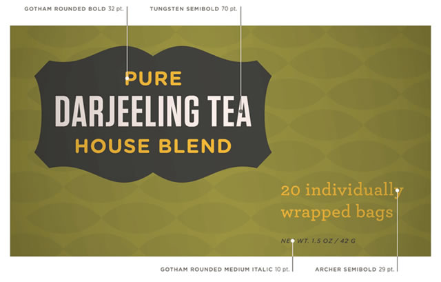
The ubiquitous Helvetica is everywhere, and while you wouldn’t say it’s overused, there’s something to be said for inviting other fonts to the party. That being said, you don’t want to have a nonsensical hodgepodge of fonts cluttering up the design work-space.
Further Resources:
- 7 Rules for Mixing Multiple Fonts in Good Web Design
- Mixing Fonts in a Logo
- What is the Best Way to Choose or Mix and Match Fonts?
- Mixing Typefaces Cheat Sheet PDF
Watch Type Related Movies
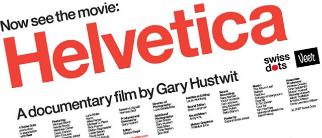
An entire documentary about fonts? Can you believe there’s more than one? Helvetica, released a few years ago, earned a lot of praise for its depiction of the history and influence of the 50-year-old font. The film also interviews the people who create typefaces.
Helevtica Movie Preview:
Helvetica is a film about typography, graphic design and visual culture. Looking at the proliferation of one typeface, it explores the way type affects our lives. Helvetica invites us to take a second look at the thousands of words we see every day.
Meanwhile, Typeface is a new movie that, according to its website, “focuses on a rural Midwestern museum and print shop where international artists meet retired craftsmen and together navigate the convergence of modern design and traditional technique“. Screenings are making their way across the country and even around the world as we speak.
Typeface Movie Preview:
In a time when people can carry computers in their pockets and watch TV while walking down the street, Typeface dares to explore the twilight of an analog craft that is freshly inspiring artists in a digital age.
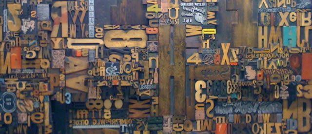
The Hamilton Wood Type Museum in Two Rivers, WI personifies cultural preservation, rural re-birth and the lineage of American graphic design. At Hamilton, international artisans meet retired craftsmen and together navigate the convergence of modern design and traditional technique.
But the Museum¹s days may be numbered. What is the responsibility of artists and historians to preserve a dying craft? How can rural towns survive in a shifting industrial marketplace where big-box retailers are king?
Design Your Own Font

Maybe you’re tired and bored of your font collection? You may have visions of a certain style of the letter “Y”? You could design your own fonts, but a warning: Font-editing programs can range from the cheap, to the expensive.
Still, there is something liberating and satisfying to be had from creating that perfect font that’s stuck in your mind.
Further Resources:
- How to Design A Font: Get Inspired!
- So, you want to create a font
- A review of Font Software for Creating Fonts
Get Inspired – Typography is Everywhere
You can find beautiful and inspirational typography where ever you look. Just look around and you will be inspired. Carry a digital camera or a notebook – paper or virtual – with you at all times to capture the inspiration when it hits you.
When an advertisement catches your eye, take note of if its type and form. It doesn’t have to be blatant to inspire.
Further Resources:
- Design Inspiration: Typography in Advertising
- Gorgeous Typography Examples in Advertising Design
- Creative use of typography in advertising
- 50 Inspirational ”Live” Typography Examples From New York
Think of the end result
A traditional rule of thumb is that serif fonts are for print and sans serif fonts look better on the web (have a look at this article:Serif Fonts Vs. Sans Serif Fonts: A Working Case Study).
A quick Internet search yields arguments for both, but when it comes down to it, just consider your individual project: Is your project big like a poster or small like a business card? Are you going for a minimalist website or a graphic-heavy one? Stand out among other designers by breaking some rules and experiment with what will ultimately look good for your project.
Related Topics
Top