Many web pages nowadays are using fluid layouts. While these are very useful, they do have some minuses. Imagine trying to read a fluid layout on your phone – it’s impossible.
The sidebar would be maybe 50px wide, and the main layout would be maybe 250px. Another problem is with really wide screens – the layout fills up almost the whole screen, which results in a horrible reading experience.
Today, I’ll show you how to take the best of two worlds: static layouts and fluid layouts. We’ll call this a rubber layout.
Let me explain how everything will work. There are going to be four stages for the layout.
- First, there’s going to be a container of 1000px wide.
- Second, using media queries, we’ll change the width of the container to 720px when the user’s browser is 999px wide.
- Thirdly, once the user’s browser is 719px wide, we’ll change the main container to have a width of 100%, so everything fits right in the browser.
- The fourth and final stage will make everything inside the container have an equal width. This change will happen at 479px.
Stage 1 – The HTML & CSS
The HTML
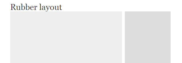
First off, we’ll have to code an extremely simple layout. There’s going to be a header, a main content div, and a sidebar.
<div id="container">

  <h1 id="header">Rubber</h1>

  <div id="main">

  </div>

  <div id="sidebar">

  </div>

</div>
That’s it for the HTML.
The CSS
Great, we’re at the fun part. We’ll start off by defining a default set of widths for everything.
#container {
width: 1000px;
margin: 0 auto;
background: #52a0ff;
}

#header {
font-size: 50px;
margin-top: 50px;
float: left;
width: 98%;
margin-left: 1%;
margin-right: 1%;
}

#main{
background: #eeeeee;
float: left;
width: 68%;
margin-left: 1%;
margin-right: 1%;
height: 1000px;
}

#sidebar{
background: #dddddd;
float: left;
width: 28%;
margin-left: 1%;
margin-right: 1%;
height: 1000px;
}
Notice the widths of the header, main, and sidebar elements. They are in percentages for a reason. More about this later.
Stage 2
In stage 2, the container will change to 720px wide.
@media screen and (max-width: 999px) {
#container {
width: 720px;
}
}
As you can see, we aren’t redefining the widths of the header, main, and sidebar elements, because they automatically scale to fit into their new size container. That’s part of the beauty of rubber layouts.
Stage 3
When the user’s browser is 719px wide, the layout changes, and the container becomes fluid.
@media screen and (max-width: 719px) {
#container {
width: 100%;
}
}
Now, when the user resizes their browser, the layout resizes with them as well. This is useful for tablets and small laptops.
Stage 4
When the user’s browser hits 479px, all of the elements will become the same size. This solves the problem with iPhones and Androids and such.
@media screen and (max-width: 479px) {
#header {
width: 98%;
}

#main {
width: 98%;
}

#sidebar {
width: 98%;
}
}
Finished!
That’s it! We’ve got a fully functional rubber layout, with four stages depending on browser sizes. Widescreen, small screens, smaller screens, and handheld devices.
Related Topics
Top