When it comes to advertising, what’s being said can be a bit less important than how it’s said. In no case is this truer than in the case of typography based advertisements, which are common in print advertising and gaining popularity even in television and other video mediums.
Typography can do everything from adding meaning to drawing attention, and using it right can mean the difference between mediocrity and stardom in the world of advertising. In this post, we take a look at some of the most striking examples of typography in print ads from around the world.
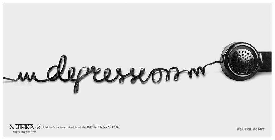
Aasra Suicide Prevention Helpline – Depression
You’ll notice the clever use of visual pun, this is an ideal way for a print ad to say everything in just one image.
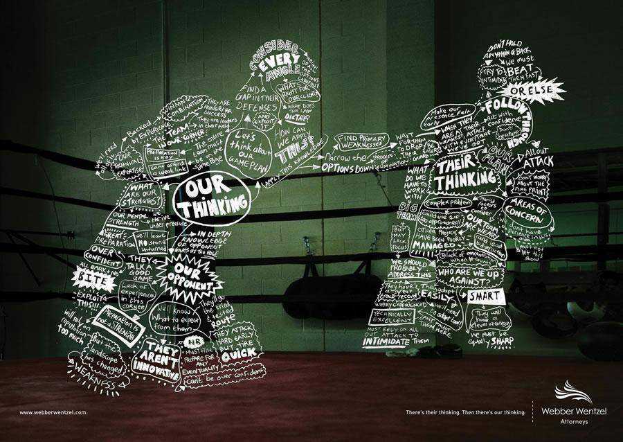
Webber Wentzel Attorneys – Boxer
From small text to large and bold text, you cab see with this ad how important typography can be.
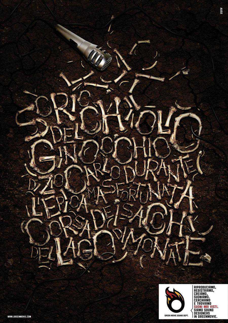
GreenMovie Sound Dept. – Watch the sound, 2
Here, you notice loads of typography used for emphasis. Demonstrating that no matter what type of print ad you need to create, you should consider typography an indispensable element of the ad rather than merely text.
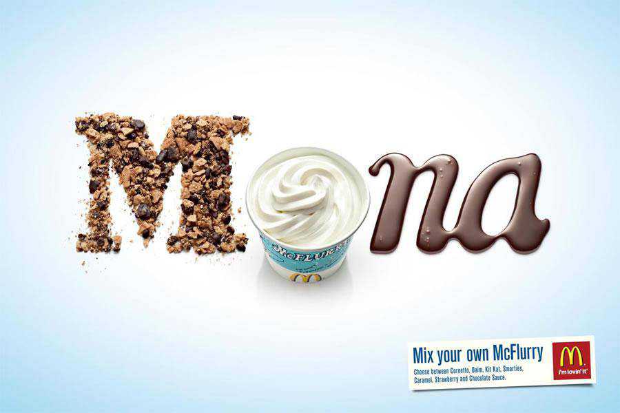
McDonald’s McFlurry – Mona
Mix your own McFlurry – Choose between Cornetto, Daim, Kit Kat, Smarties, Caramel, Strawberry and Chocolate Sauce. McDonald’s – I’m lovin’ it.
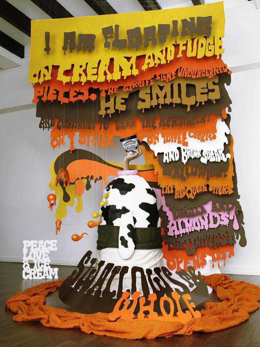
Ben & Jerry’s – Giraffe
Choosing a suitable typeface for a project is critical, as is considering the message you would like to communicate, the "consumer" we want to reach and the tone we want to impress.
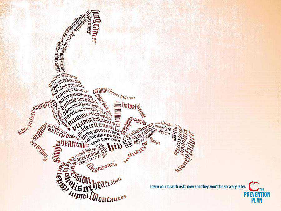
US Preventive Medicine / The Prevention Plan – Scorpion
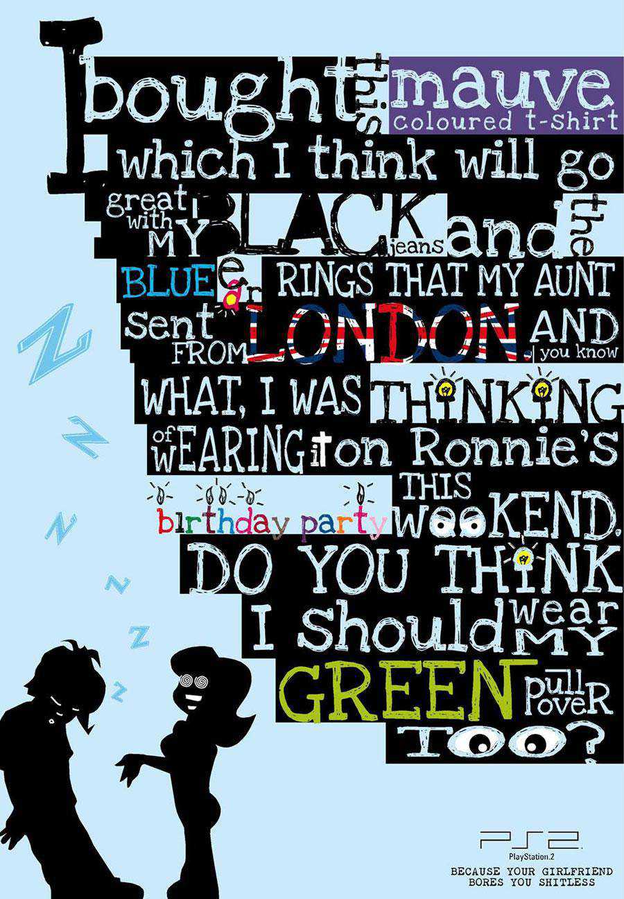
PS2:Girlfriend
We see perhaps an overuse of text in this ad. Different variation of size, style and of course color create distinction where the typography could have been a bit unexciting and monotonous.
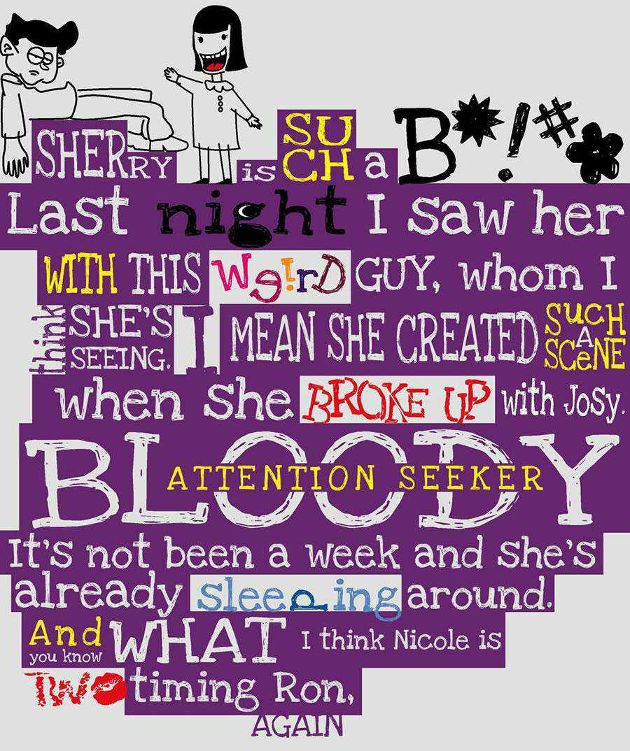
PS2 – Girlfriend, 2
Second version of PS2’s girlfriend ad, where we see again an overuse of text saved by variation in size, style and color to create the distinction.
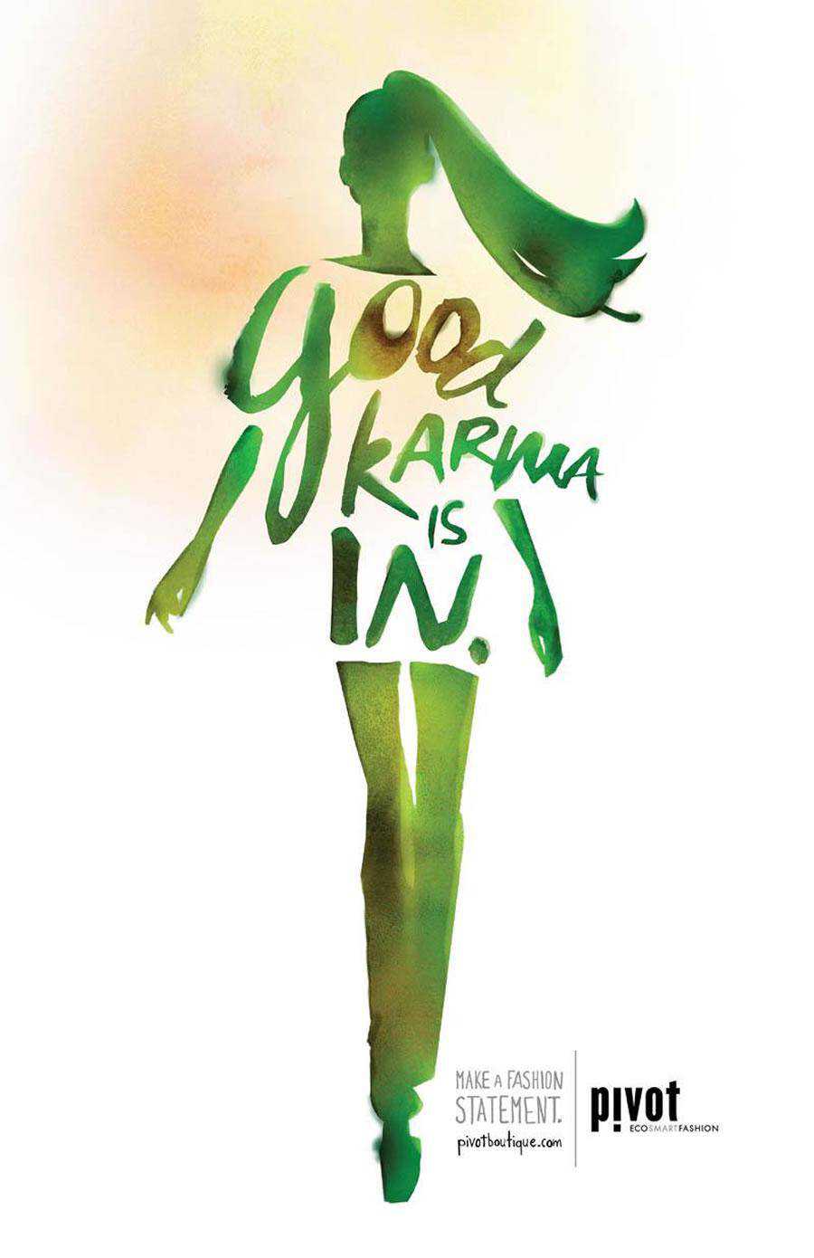
Pivot Boutique – Karma
The weirdness of this ad makes it memorable. After all, making a lasting impression is what every ad strives for.
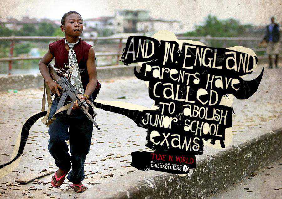
Coalition to Stop the Use of Child Soldiers – England
With the number of ads that have already been made, originality is hard to come by. This print ad successfully conveys its originality and novelty though.
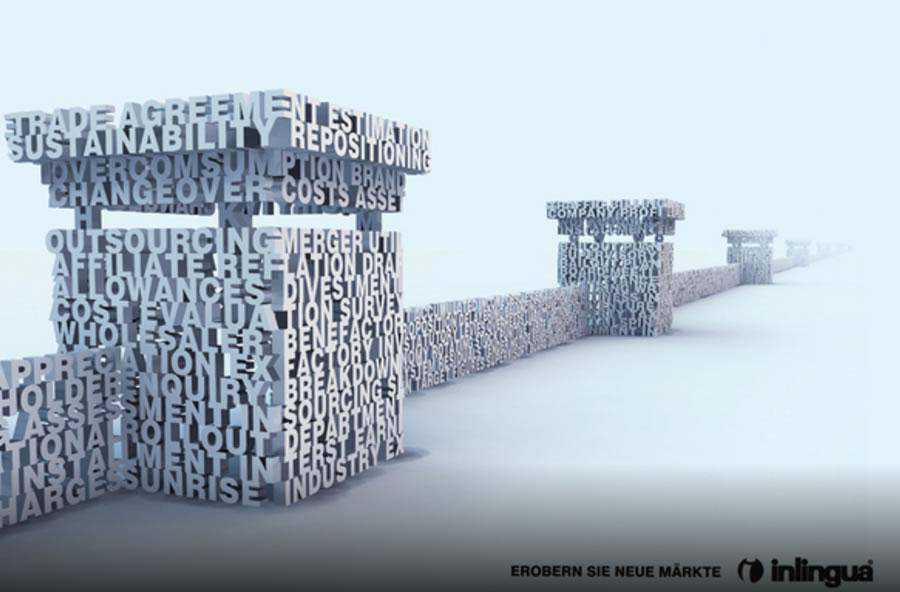
Inlingua – Business English
This is an original print campaign where you can see the designers use of balanced typography to create an illusion.
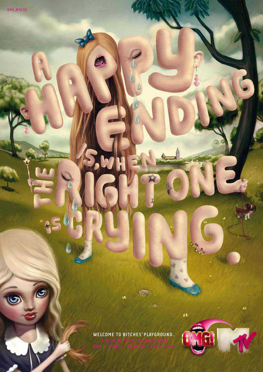
MTV – Happy End
In print ads, a striking image is great at catching viewers’ eyes. However, since it’s an ad it demands that all compulsory text be crammed into the composition, as well.
Amnesty International – Ted Bundy
Another innovative use of the typography based print ad that stands out mainly because of its extreme creativity.

Brighton Language School – Espanol
Different kinds of ads call for different amounts of text. It’s somewhat surprising to see how versatile minimal text patterns can be. It’s just the thing you need to get people’s attention right away.

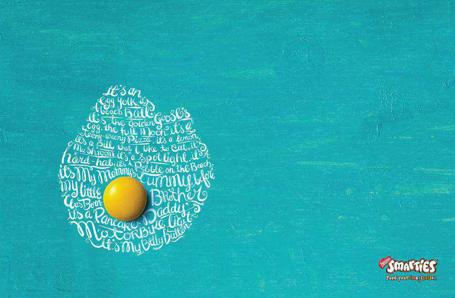
Smarties Campaign
Using the perfect typography in a web design or print ad may seem very easy to learn at a glance, but actually mastering it takes a lot of practice. It’s worth it though, because it can be the thing that really makes or breaks a design.
Orange – SMS
This creative print ad clearly states that text messaging while driving will prevent you see what you actually need to see. It’s dangerous, and this ad communicates that perfectly.

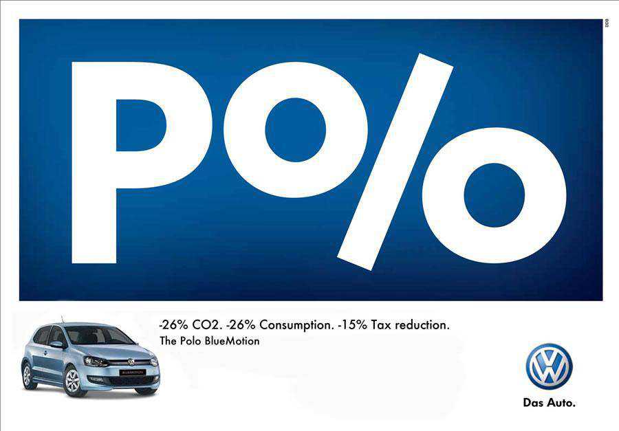
Volkswagen Polo – Percent
Here, we see how text elements can be creatively placed to convey a totally different message. Quite impressive and visually alluring.
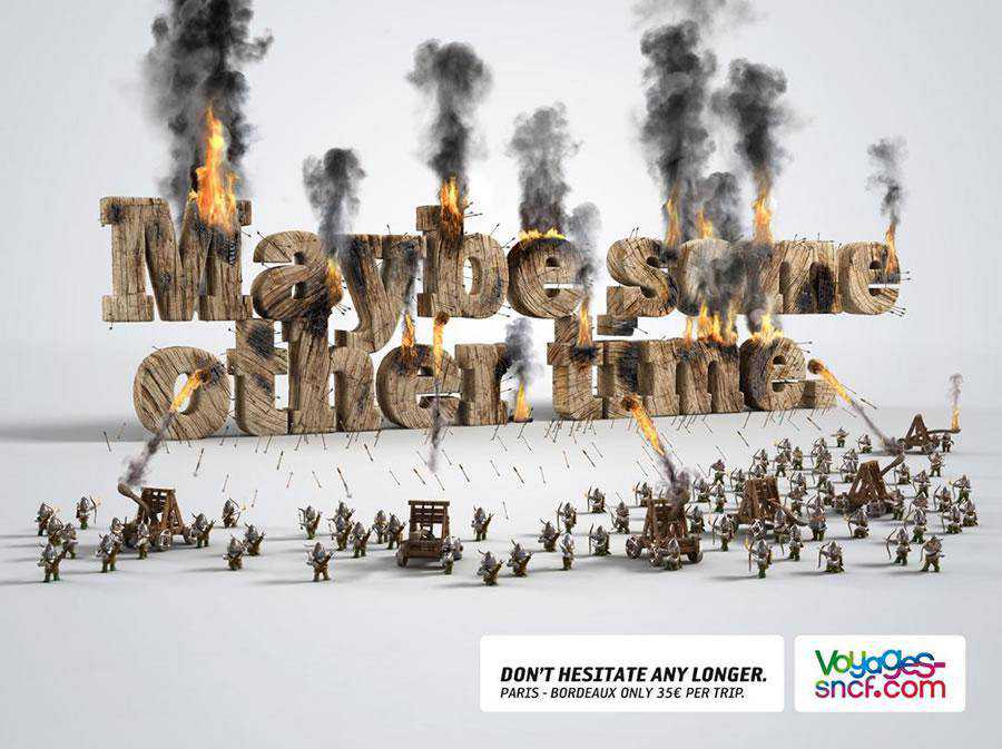
Voyages-Sncf.com – Other time
The Visual of this print ad is exceptionally good. However the subliminal message is most likely saying that this voyage is dreadfully risky and chances are that someone can understand it the other way around.
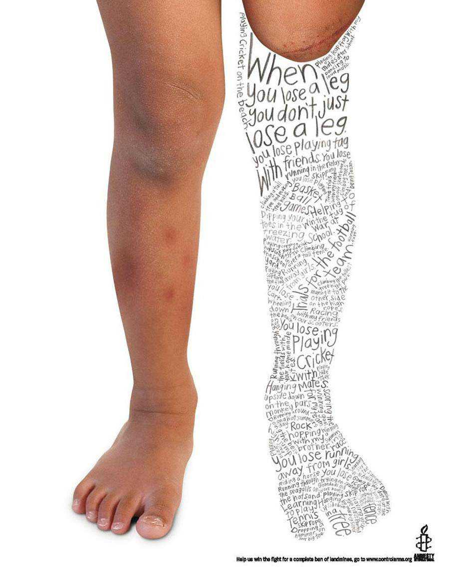
Amnesty International – Leg
This print advertisement with its brilliant use of typography clearly shows what happens when you lose something, and the things that you can no longer do are clear.
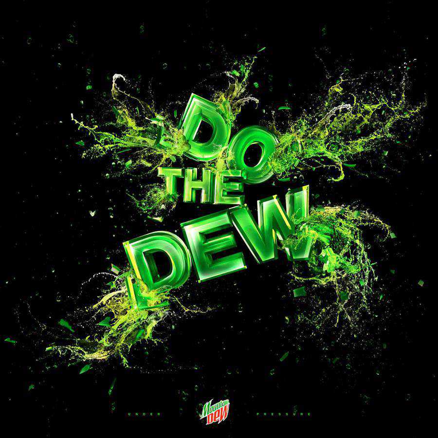
Mountain Dew
Typography plays a big role in this concept. It really grabs the attention and makes people want to read.
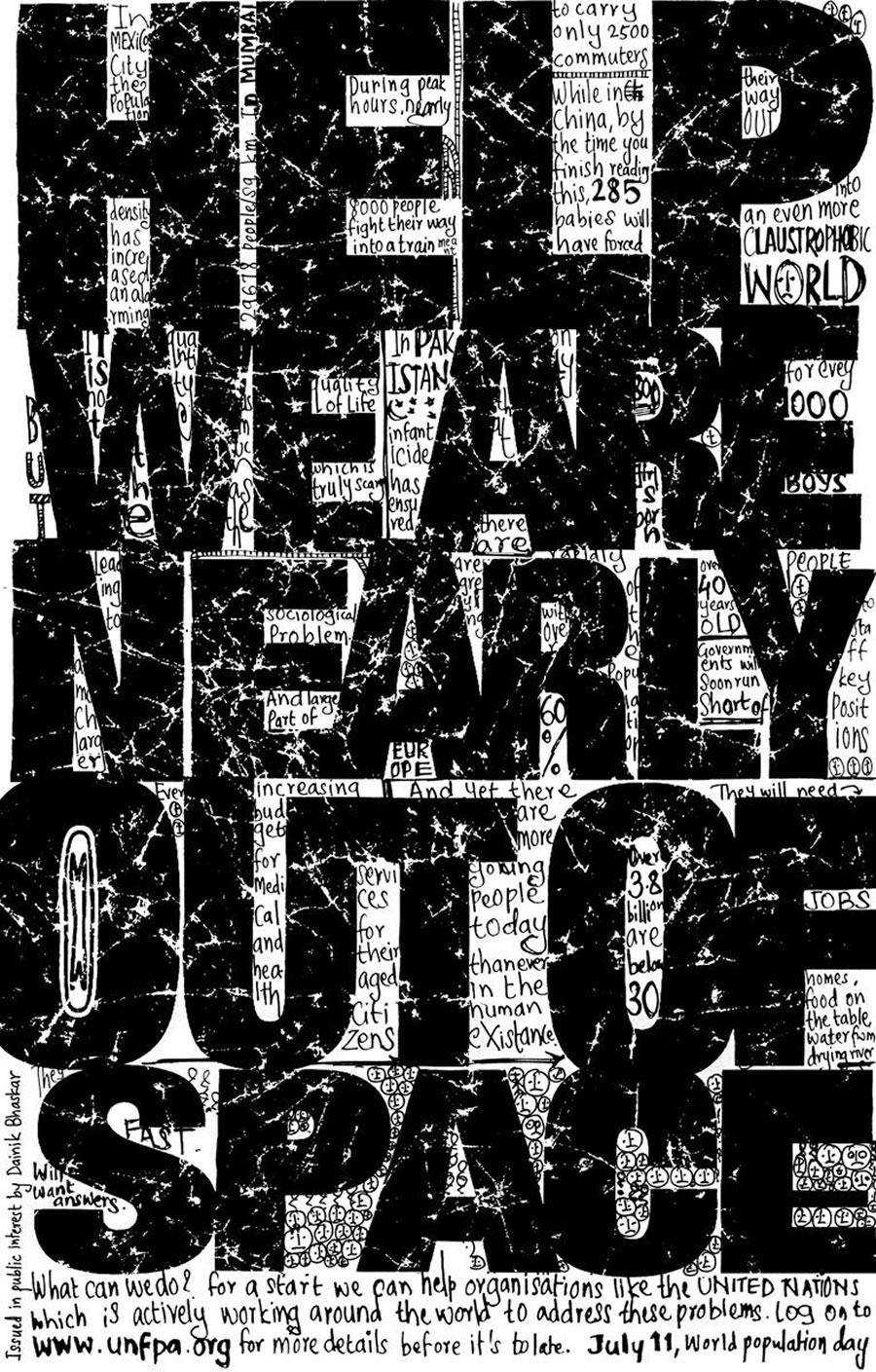
United Nations Population Fund – Population day
This brilliant concept has been designed for United Nations Population Fund to create awareness of the overly populated world.
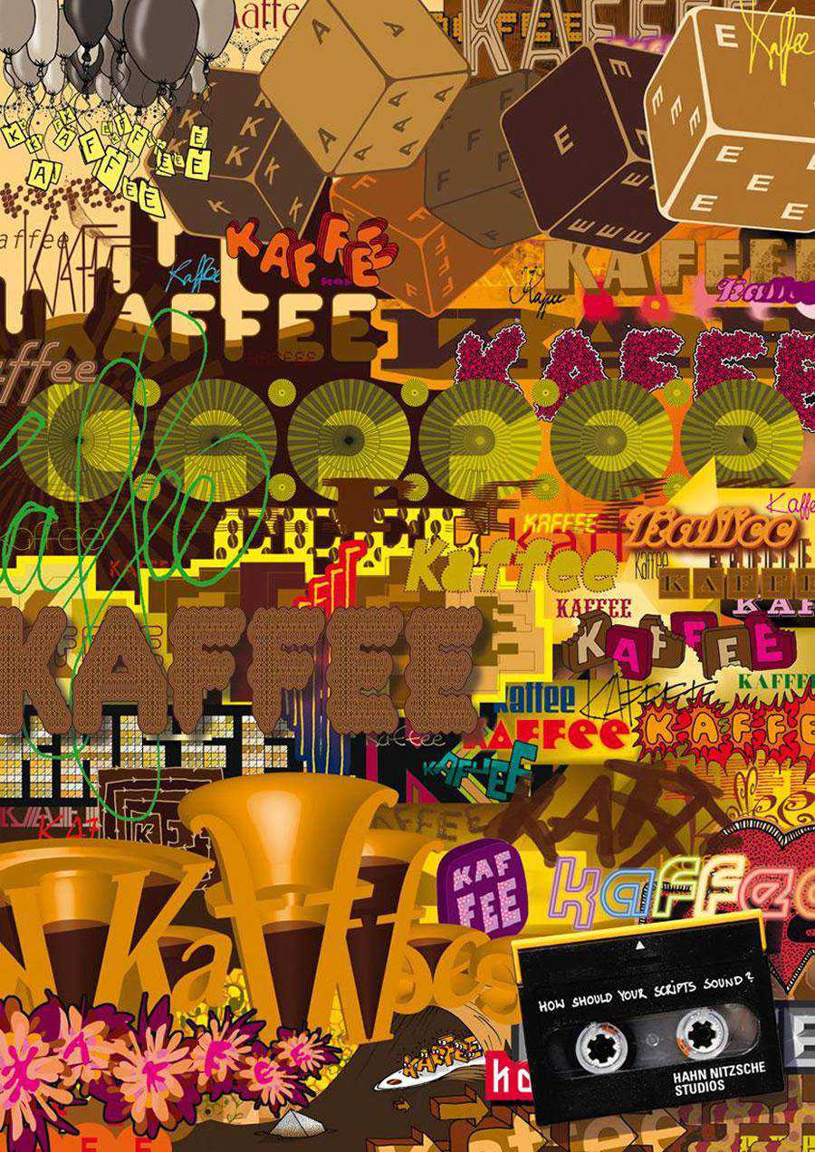
Hahn Nitzsche Recording Studios – Kaffee
This ad is a bit difficult to read and comprehend as it’s quite messy. It’s an outstanding design though that makes people want to work to read it.
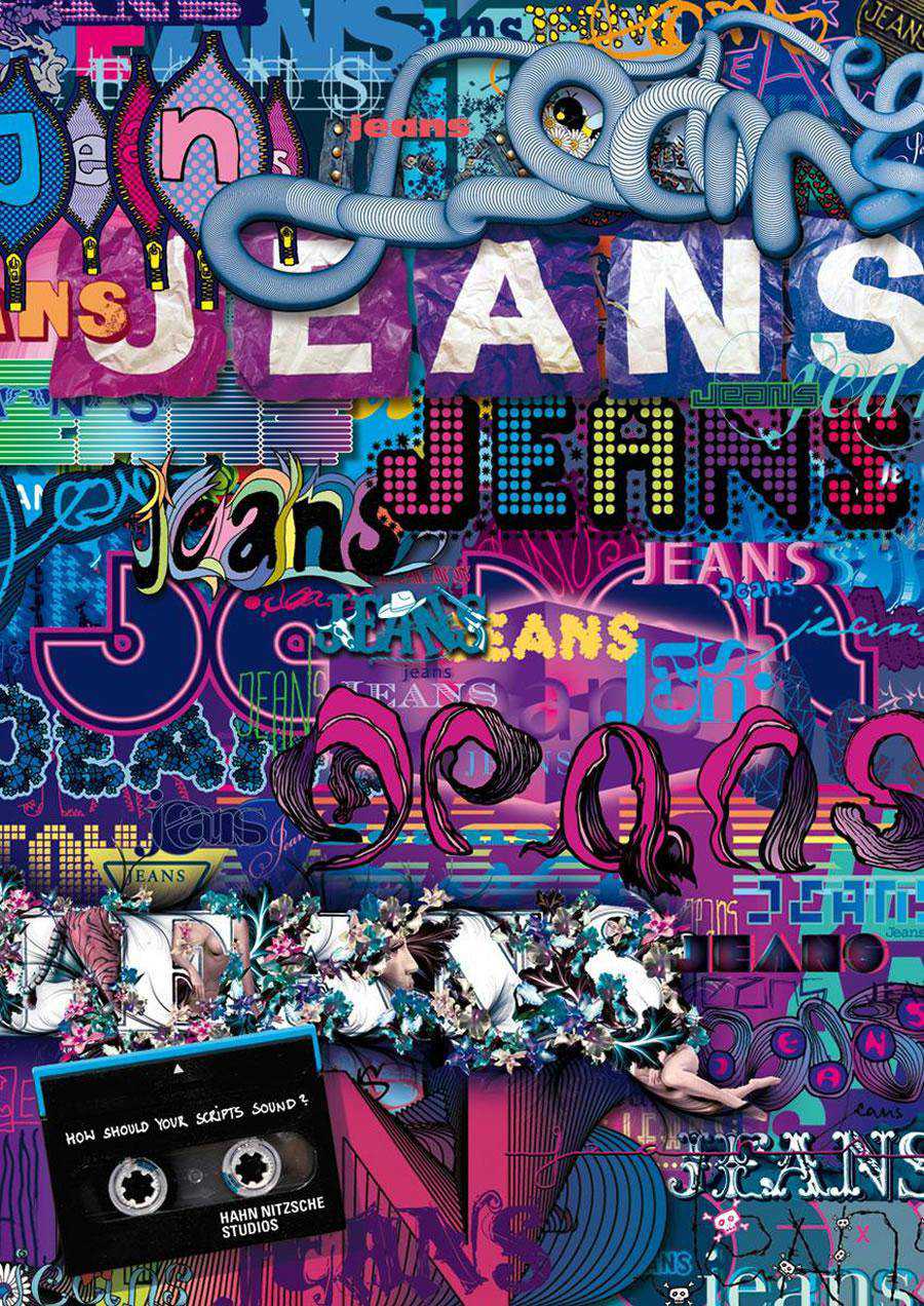
Hahn Nitzsche Recording Studios – Jeans
Same approach has been taken in this ad as that of the previous one. Messy but excellent design.
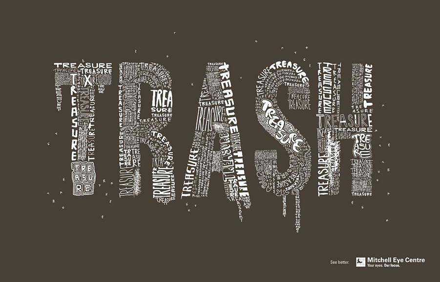
Mitchell Eye Centre – Trash
With such a creative use of typography, you can land within people’s interest and concentration.
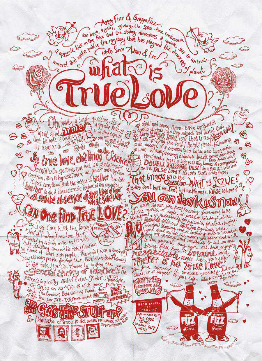
Appy Fizz, Grappo Fizz – True Love
So, would you also like to answer this question? For Appy Fizz lovers, their true love is Appy Fizz.
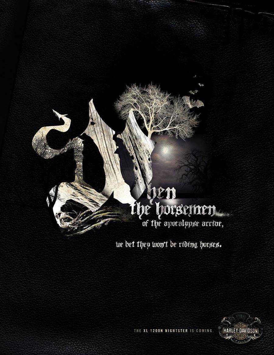
Harley Davidson Nightster – Horsemen
Innovative and unique typography can be viewed here. The whole impression has been created without any aid of the visual element.
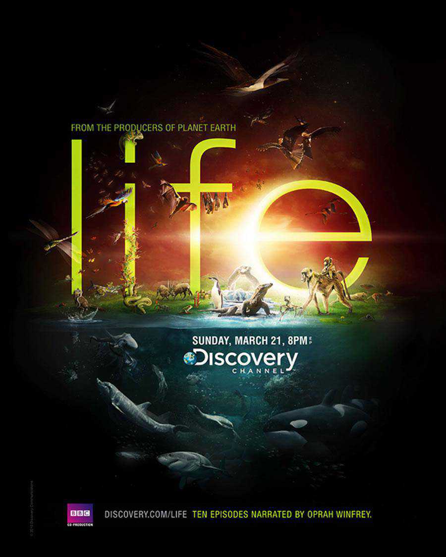
Discovery Channel – Life
Here the Discovery Channel has designed a print ad to portray what they broadcast. The word “Life” has been made prominent in the whole ad.
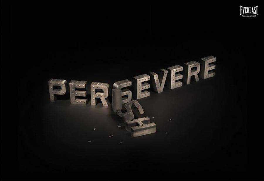
Everlast – Persevere
This is quite interesting and a visually alluring print ad that displays a bold use of typography. Overall, a very good design with an intelligent use of typography.
Related Topics
Top