Each time a discussion pops up about responsive design, the common terminology and concepts that get the maximum attention include grids and images, and obviously the settings like fluid or flexible. Typography, though essentially always deemed important, is rarely given the weight it deserves when it comes to responsive web design.
In this article, we will be discussing typography in responsive web design. Our focus will be on typography strictly in relation to responsive web design only.
Introduction
To be fair, responsive web design, by its very definition, already includes some level of responsive typography. Even though many people are unaware or simply overlook this fact, but responsive design comes loaded with macro typographic issues such as line height, column width, etc. Yet, all of this cannot naturally be called complete, and we need to do our own homework.

Now, when it comes to implementing typography in responsive design, the approach is simple, and two-fold: first, you need to take care of the type-face itself, that is, the type should resize on the basis of screen size, etc. Second, you also need to bear in mind the stuff related to optimized line lengths (because failing in this second point will mean killing any chances of legibility or readability that your design had).
1. The Responsive Type
Whenever you are doing something related to typography, it becomes obvious that it all begins with a font. Whether you are using a downloaded font, or crafting one yourself, or relying on web fonts, the importance of fonts in themselves can never be overlooked.
At the very basic level, the choice boils down to serif versus sans serif. Now, I will not debate for or against either, because I personally like them both. I also feel that serif serves the purpose of lending your type a more serious look, whereas sans serif gives you more liberties to play with. The debate of serif versus sans serif has been in existence for a long, long time now; books have been written on the subject, so taking sides here will not be the easiest (or even necessary) thing to do.
With that said, here is one word of practical advice: if you are having a text size which is less than 12, be careful with serif typefaces, because serif typefaces below the size of 12 do not render well.
Now, looking at fonts from the responsive design angle. If you take a font such as Seaweed Script for your headings, you will be fine on desktop computers, but on many mobile devices with much smaller screens, unless you make it awkwardly large, your viewers will have a hard time reading it.
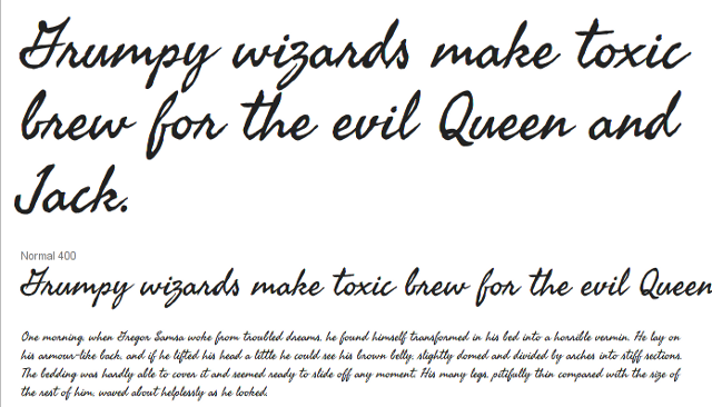
But what if you are really, really in love with Seaweed Script? How do we solve this?
The simplest approach is to retain Seaweed Script for headings on desktop devices, and switch to an alternate font (most likely a bigger size of your body font itself) for headings on mobile devices. This is how:
@media (min-width:960px) { h1 {font-family:"Seaweed Script", script;} }
@media (max-width:960px) { h1 {font-family:"Droid Sans", serif;} }
2. Font Size, Line Height/Length and Contrast
Now, on to our second point!
Size of text, to some extent, depends on the reading distance. Now, since computer screens are kept at a farther distance from eyes as compared to books or printed magazines, the text too has to be bigger than printed material. This is because even though the text on screen will have a bigger size, the perceived size will be smaller, since it will be kept farther away from eyes as opposed to printed text.
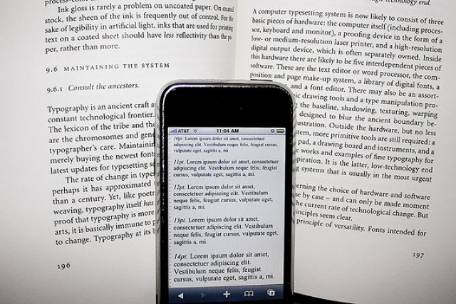
Again, when talking about line height too, we can compare it with printed text. Since printed books and magazines are held closer to the eyes as compared to a computer screen, the line height can be lesser than that of on-screen text. Also, you must bear in mind that line height benchmarks, though suggested by a zillion of websites all over the internet in absolute terms, are a product of the type-face that you have selected.
What about line length? Baymard Institute suggests that the ideal number of words in one line for easier readability can be between 50 and 75 characters. Now, I would not recommend following this rule blindly, because responsive design means that we have to bear in mind the different device sizes too. On extra small screens, getting even 50 characters on one line may be detrimental to readability. The proper way to do it will be to keep 50-75 as a starting yardstick, and then, keeping in mind the different screen sizes that your target audience is likely to use as well as the fonts that you are planning to employ, arrive at the ideal line length.
Special Note: Tablets and Smartphones
Before we sum it all up, let us take a moment to consider the issue of multiple screen sizes that users employ. For the sake of simplicity, let us take two representative items: tablets and smartphones.
Now, while both are portable devices, people often tend to hold the tablet at a farther distance from eyes as compared to the phone (try noticing it next time you hold your tablet and then the phone). This is why tablets can be a challenge when laying down responsive typography rules: you use your tablet by keeping it almost at your knee when in the train, or at chest-level when standing in a bus, probably right in front of your face when lying down in bed, and so on. The distance with desktops does not vary so much. And phones? Again, if sitting in a train, the phone will likely be held at your chest-length, not at the knee-length. (Exceptions apart, obviously).
So, what should be done? Two things:
- Begin with a smaller line height, because the screen itself is smaller.
- Next, you can also delicately adjust the character spacing — do not be too extravagant with it, though.
The above two tricks help tone down the difference in the perceived size of text as viewed over smartphones and tablets. Since the tablet (the bigger screen as opposed to phones) is kept at a greater distance from eyes, the adjustment in character spacing and line height ensures that perceived size difference is normalized.
Conclusion
Typography is an important aspect of responsive web design. Even though it may look confusing at first, optimizing it is not very difficult.
What do you think of these observations about typography with respect to responsive web design? Share your thoughts with us in the comments!
Related Topics
Top