Design and photography are somewhat interrelated disciplines, each drawing principles from the other, but they are distinct fields and should be treated as such.
Still, there’s a certain ambiguity to the idea of “design,” necessitating further specification with adjectives to distinguish between things like “graphic design” or “interior design.” But because photography is a way of seeing and capturing the real world to maximize a visual aesthetic value, its principles can be applied to almost any area of design.
These are the general principles of photography that can apply to almost any design-related endeavor.
Framing Helps You Stage a Scene
How you frame a scene can help you draw a user’s eyes to the most relevant areas of that scene. In photography, the rule of thirds is the best way to do this.
The theory behind this is simple; imagine your photo is split into a 3×3 grid, with imaginary lines splitting the photo into 9 different equal compartments. A viewer’s eyes will naturally be drawn along these imaginary lines, so the most powerful way to present your target subject is along one of these lines, or at the intersection of two of them.

An image cropped with and without the rule of thirds applied.
If you’re designing in some kind of two-dimensional space, you can use this principle directly, establishing your own frame using imaginary lines. But even if you’re using three-dimensional space, you can still use the power of framing and perspective to draw a user’s focus to the most important elements of your work.
Lighting Affects Mood
There aren’t many elements that can affect the mood and emotion of a visual piece as much as lighting, and it’s not just about brightness. The brightness of your lighting, its coloration, and the angles of your lighting can all make a drastic impact on the final emotional resonance of your piece.
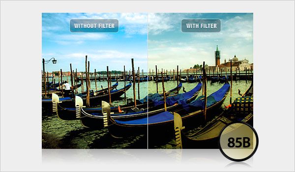
Effects can change the tone and mood of your photographs.
For example, imagine a subject – we’ll say a table and chairs – outside on a sunny day, around noon, versus that same subject inside, with one bright fluorescent light hitting it from an obscure angle and casting a large shadow across the floor.
In physical applications like interior design, your lighting can make or break how your arrangements are perceived. And even in graphic design and digital elements, you can use lighting to distinguish your coloration and add complex layers of mood to your creations.
Angles Can Make a Huge Difference
This is a simpler principle, but it’s one worth noting. When you watch a photographer work, you’ll often see them squatting, reaching, and circling their subjects. Why? Because the angle at which a photo is taken can make or break how it is perceived.
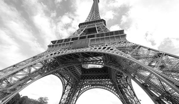
An angle from below can make a subject seem huge, or powerful, or intimidating, while an angle from above can make that same subject seem smaller, cuter, or more distant. A slight turn of the face is sometimes all that’s necessary to completely change how people interpret a design element – so use this information wisely.
Making the Ordinary Extraordinary
At the end of the day, the photographer’s greatest and most important power is making the ordinary seem extraordinary. It’s about finding the beauty and emotion in human subjects or capturing the one moment in a day when something interesting happens.
Photography and design are both about cutting out the fluff and showing people the concentrated essence of something, giving them a glimpse of something powerful they might not otherwise have considered. This is hard to pull off, even with creative experience, but it can’t be neglected.
If you’re interested in becoming a better designer, you may consider taking up photography. You’ll literally be looking at the world through a new lens, but more importantly, you’ll learn to develop a keener sense of visual perspective in your surroundings.
If you allow these principles to carry over into your regular design work, you’ll be able to produce creative pieces that accomplish your objectives, facilitate higher emotional resonance, and make a bigger impact on your target audience.
Related Topics
Top