Much like the shopping cart and checkout processes for e-commerce, the room reservation process is a critical part of any hotel’s online presence. Due to the key role it plays, the reservations process has the power to influence the overall impression that guests form about a hotel brand and the type of experience that they can expect from the brand (both online and offline).
Unfortunately, the reservations process has historically been – and for many hotels, still is – the part of the website that often suffers the most from poor design and user experience. And in many cases the contrast between this part and the rest of the website can be quite stark, resulting in a sort of Jekyll and Hyde user experience.
In this article I’ll look at how hotel reservations has traditionally been implemented, and then I’ll present the three main components of a reservations process, along with essential items to keep in mind during design and implementation so as to provide guests with a positive experience.
The Legacy of Hotel Reservations Systems
Several months ago, as my team and I researched digital design trends in the travel industry, we observed that while some hotel brands are setting designs trends of their own, many others are still playing catchup. Very basic and dated reservations designs are still very commonplace.
To put things in context, here’s an example of what I consider basic and dated:

Henry Jones Art Hotel
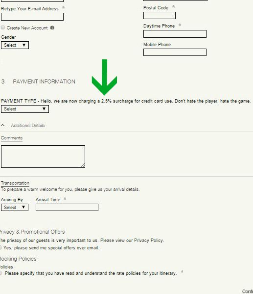
The above screen displays after the users has submitted a reservation request for a specific set of dates. Most of the key information that the user needs is there. All the necessary call-to-actions are present. But overall, there is a certain amount of visual weight and general drawbacks, such as:
- One has to invest time into dissecting the various part of the interface: the breadcrumb at the top, the search fields directly below, the room and price listings (along with the two types of categories contained within that section), and so on.
- The buttons, fonts and colors are quite prominent and loud which adds more visual weight to the interface.
- Less pertinent information – such as the 4 rooms that are not available for the selected dates – are presented in the same style as the available rooms. By presenting less relevant information in the same style as the relevant information, the user’s attention is distracted by content that is ultimately, not helpful.
- Long descriptions of the hotel are presented here and this seems odd. While there is certainly the business need to engage the user and upsell, the reservations interface is primarily a “workspace” for guests, and has a very specific function. So any extensive storytelling that relates to the hotel’s history, ambiance, and the like is best left to more suitable pages of the website.
When other industries seem to be breaking new ground every day in the domains of design an user experience, why is it that the hotel industry is still delivering such sub-optimal experiences? Well, it’s not that the hotel industry is hiring bad designers. It’s in part due to the industry’s general slowness to evolve and adapt (as pointed out by this hotel group CEO). And it’s also due to another major catch, specifically in the hotel reservations world: 3rd party reservations system.
Historically, these backend reservation systems were conceived as administrative tools that allow hoteliers to manage room availabilities and rates, blackout dates, etc. Look and feel was never a major priority. According to Jean-Yves Simon, CPO at Fastbooking, “Generally booking engine vendors do provide a certain level of personalization and customization, but it’s limited to colors and text for the “out of the box” or SaaS version”.
However, as digital identity, design and user experience are becoming more of a priority for the hotel industry, vendors are making it easier for designers to unleash their creativity. “More and more vendors, particularly those targeting hotel chains, provide fully customizable versions of their tools”, Mr. Simon says. “At Fastbooking, for example, we have development partnerships and APIs and in-house development services that allow customers to address their need for full customization”.
These sort of evolutions are a great step forward that allows designers and product managers to focus on creating digital experiences that really represent the hotel brand and the needs of their guests, rather than just working around the limitations of the reservation system.
With this background in mind, let’s move forward by examining the three components of a hotel reservation process and the checklist of items you should always keep in mind when designing this process.
The Three Components of Hotel Reservations
When designing a hotel reservation process, it is helpful to break it up into 3 basic components:
- Search.
- Results.
- Booking Validation.
The idea of these 3 components is to approach things from guest’s point of view, which in story form can be formulated as such:
“I need a room (Search), that is [of a certain size, costs a certain amount, comes with free breakfast, etc.] (Results) which I can book for my next trip (Confirmation)”
By breaking up the process into 3 components you can then evaluate what is needed for each and subsequently, decide how they whole things fits together into a seamless process.
Let’s take a look at each component and some general pointers to keep in mind as you work on design and implementation of a reservations process.
1. Search
The first step in the reservations process is all about collecting basic information from the guest so that you can propose room options that they will explore and evaluate (in components 2 and 3) of the process. This initial Search phase needs to be quick and easy, ideally requiring little investment of time and effort on the guest’s part.
Things to keep in mind:
- Display search fields on homepage: While it is traditional to have a Reservations button that leads to a dedicated page, consider having the search fields immediately available on the homepage. This small change can be a time-saver for busy travelers who are evaluating their options. Of course, by placing the search fields on the homepage, you want to make sure that they work with the overall design and don’t come across as an element that is being forced on to the user for the sake of conversion.
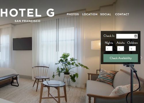
Hotel G: Do display search fields directly on the homepage.
A nice alternative to displaying the search fields on the homepage is to have them permanently displayed in a sidebar or top header. The benefit here is that you give users the flexibility of searching for rooms from any page of the website. They don’t have to go back to the homepage when they get the urge to make a reservation.
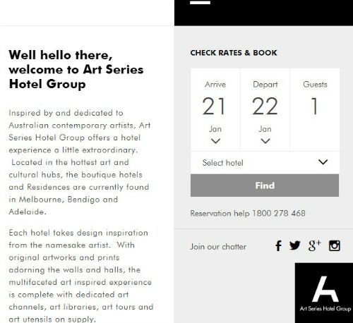
Art Series Hotel: Do consider using a fixed sidebar to give access to the search fields.

Vault Karakoy – House Hotel: Do place search options in a fixed top bar if it works with the layout.
- Limit the number of search fields: Save guests some time by limiting the number of fields they have to fill. The point is to get them on to the Results phase where they can explore the various rooms available. The absolute minimum information one really needs in order to search for rooms is: check-in and check-out dates; number of guests.

Lobagola: Date and guest information is sufficient to kick off a Search.
If you’re designing for a hotel with multiple geographical locations, then this is also a good time to collect the destination information.
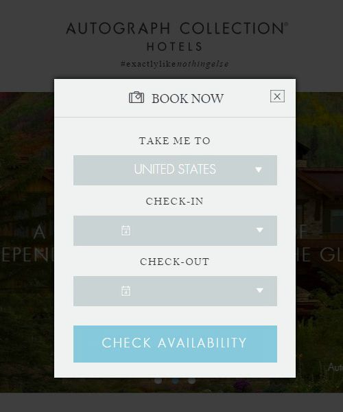
Autograph Collection Hotels: Do ask for the minimum information such as dates and destination.
- Auto update check-out date: This one is a pet peeve we can all relate to…once the guest has selected their check-in date make sure that the check-out date field updates accordingly. So if I am on your site in April and I select a June check-in date, don’t insist on still displaying April in the check-out date field.
- Discount code fields should be optional: If the hotel you are designing for offers promotional or discount codes, make sure that these fields don’t feature very prominently amongst the search fields. They should be optional, usable via the selection of a checkbox that activates them or by making them expandable/collapsible.

Ace Hotel: Do “hide” optional promotional code fields.
- Only ask for information that is used in search algorithm: This is another pet peeve that many can surely relate to…be absolutely certain that every piece of information you collect from users will be used to filter the search results. That means if you ask users to submit the number of children they will be traveling with, then that information should be used in the search algorithm. Otherwise, the search and the subsequent results become irrelevant for the user (more on this in the section about the 2nd component, Results).
2. Results
You’ve collected information from the guest about their travel dates and it’s time to show them what you got. Entice them to move forward with finalizing their reservation.
Things to keep in mind:
- Make sure results match search criteria: As I mentioned in the last point from the previous section, make sure that the results list is relevant in relation to the search criteria submitted by the user. In the example below the search criteria was 1 room for 2 adults and 2 children. Of the 7 rooms listed in the results:
- 2 were for a maximum of 2 adults.
- 1 was for a maximum of 2 adults and 1 child.
.
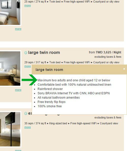
Amba Hotels: Don’t display irrelevant results; this can lead to wrong bookings and guest frustration.
That’s 3 out of 7 items items in the results list that definitely do not suit the search criteria. If a guest doesn’t pay close attention to this and assumes the search algorithm took all their criteria into account, they run the risk of booking the wrong room and having lots of frustrations upon arriving at their hotel.
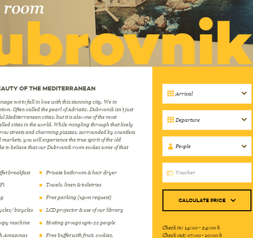
- Use big pictures and highlight key information: Make it easy for guests to take that final purchase decision (and maybe even splurge on a room that they wouldn’t normally consider). This means all items that influence purchase decision (total cost, room size, amenities, items included in cost vs. extra cost items) should stand out in the design.
This also means using big, good quality images to entice the guest. This is particularly important in the case where the guest hasn’t visited the Rooms section of your site before submitting the reservation request. The Results interface is the first time they will be encountering what you have to offer, so use good images to help make the sell.
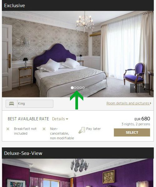
Hotel Negresco: Do include a slideshow of room pictures and highlight important information.
Art Series Hotel: Do make results visual and easy to read.
- Keep room descriptions very brief: Avoid the urge to include very lengthy room descriptions in the Results. Include just a few bullet points or better yet, make the information hidden, available via a “learn more” button or a mouse over action. This will go a long way towards reducing the visual weight of the results interface.
- Show original search criteria: Always make sure to clearly redisplay the search criteria the guest submitted and make it easy for them launch a new search without having to go back to a specific starting page.
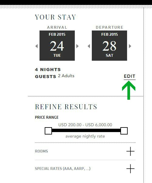
Thompson: Do recap the search criteria and make it easy to launch a new search.
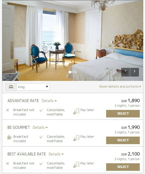
- Be upfront about price breakdown: It is always a good idea to give guests the price breakdown information, so that they are aware of any possible rate variances during the course of their stay. Hiding may lead to a raised eyebrow or two, creating some doubt or mistrust in the guest’s mind. Make the display of the information optional to save screen space.
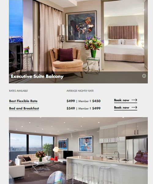
- Use icons and grids to facilitate rate comparison: And while you are displaying the various rates for a particular room, make it easy for guests to compare and evaluate them. As the example below shows, a smart design using columns and rows gives guests a quick way of understanding what they are getting with each rate.
Hotel Negresco: Do make it easy to compare payment rules and items included in rate.
- Be upfront about cancellation and payments policies: Depending on your design you can either display the information permanently in the default view or make it an optional item that can be viewed on mouse over or by expanding an item.
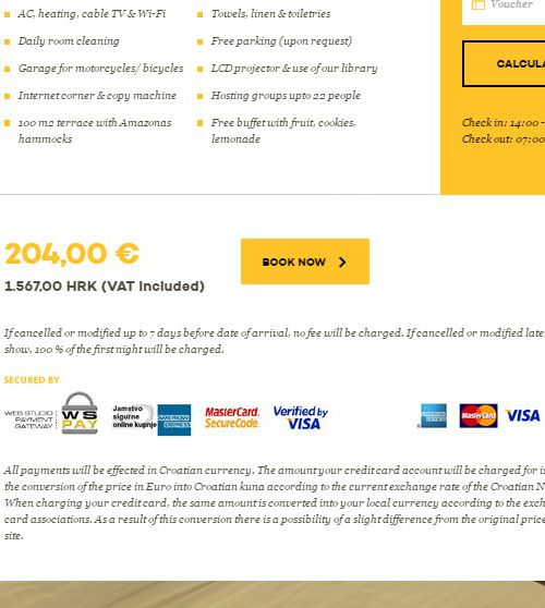
Lobagola: Do give users access to payment and cancellation policies to avoid misunderstandings.
3. Booking
So you’ve collected information from the guest, you’ve given them relevant and enticing room options and they’ve decided to reserve one of the rooms. Now it’s time to secure their booking and convert them into a new (or returning) guest.
Things to keep in mind:
- Reassure the guest: Since this part of the process requires guests to give away personal information such as address and banking details, it’s a good idea to provide a recap of the reservation cost, dates, number of guests, room selected, etc. Yes, that information was already presented in the previous step but a final recap gives the guest one last chance to double check that everything is in order before making a financial commitment.
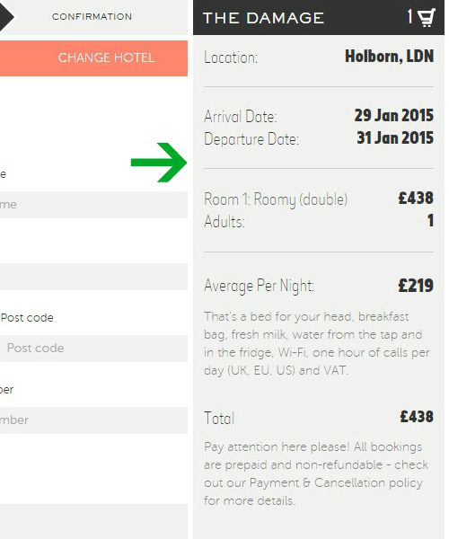
The Hoxton: Do summarize the reservation details, highlighting key dates and costs.
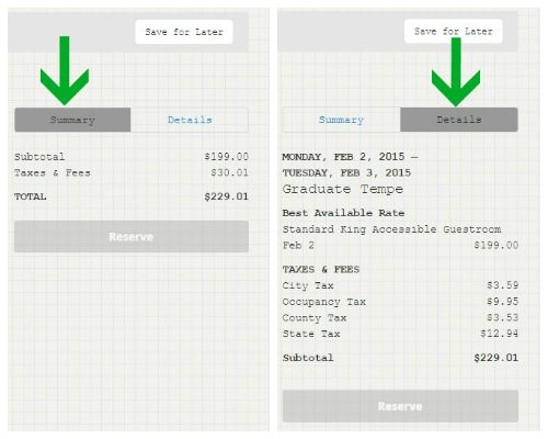
Graduate Hotels: Do provide the flexibility of seeing reservation summary and details.
- Spell out all booking terms and conditions: Make sure to point out all payment conditions (e.g. deposit required, full payment required, special fees), terms & conditions (particularly in the case of non-refundable rates), and just like in the Results component, include a reminder for the cancellation and/or reservations policy.
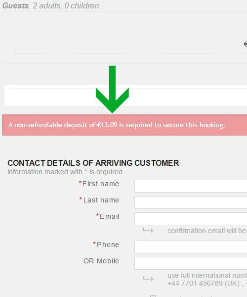
Dean Hotel Dublin: Do highlight deposit fees and surcharges.
Hotel Hotel: Do indicate fees associated with specific payment methods.
- Confirm, confirm, confirm: After the guest has submitted their personal and payment details, always provide a confirmation message indicating that the reservation has been secured. Once again, quickly recap the details of the reservation and make sure to send a final email and/or text message to the guest.
Conclusion
While the three components listed in this article will apply to any reservations process, the details of what goes into each component will vary from one brand to another. As with any design project, a clear understanding of the brand’s positioning, value proposition, objectives, target audience, and other key defining elements will allow you to determine what should ultimately be included in your design.
Regardless of the brand, however, you always want to prioritize flexibility and convenience for guests. This means, for example, that guests can access the search from any page. This also means that guests who are viewing the dedicated page for a given room can reserve that room directly without having to go through the main booking process.
Lobagola: Do include direct reservation from room description pages.
While I’m on the topic of convenience and flexibility, let’s not forget the biggie: making sure that the website is responsive. Studies show that 94% of leisure travelers (and 97% of business travelers) have at least one mobile device on them. Reservations made via mobile devices are accounting for more than 20% of hotel bookings, and compared to reservations made via desktops, are growing exponentially.
Apps such as Hotel Tonight are catering to the needs of on-the-go, mobile-only travelers while also redefining the hotel market with unique features and memorable mobile design. So the hotel website is no longer something that is done just for the sake of checking off an item on one’s to-do list for brand marketing. It’s existence is necessary for the connected world in which traveler’s live and operate.
As I mentioned earlier the reservations interface is a “workspace” of sorts for guests. This means that even if your user research shows that the hotel’s target audience is technologically sophisticated, you want to avoid having lots of bells and whistles in this particular part of the website.
Brands like Rooms Hotel and Pendry Hotels, for example, target modern and tech savvy audience, and their websites are fun, full-on experiences that reflect this.
Such experiential and exploratory designs are excellent for many parts of the site, and while some of these elements can be incorporated into the reservations, it’s important to strike the right balance.
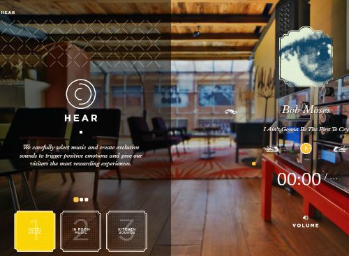
Rooms Hotel Tbilisi: Slideshows, music, mouseover effects and other interactive elements are best kept for pages such as the homepage.
Resources
As with all projects, the best source of inspiration is the target user. Many factors impact the decision-making process of travelers: budget, life stage, previous travel experiences, and more. The more clarity you have regarding the travelers, the better your chances of putting together a reservations process that is aligned with their needs.
For insights and analyses into societal trends that are shaping the hotel (and the wider travel) industry as well as an understanding of positioning and design trends in the industry, this report put together my team and I, digs into everything from UI patterns, to color choices, and online communication style of various brands.
In addition, look to hospitality and travel-specific resources such as Hotel Chatter, Skift, and Tnooz to get an understanding of how the hospitality and travel business is being shaped.
Related Topics
Top