In one form or the other, data visualization seems to come up quite often in the work life of a designer or a front-end developer. Be it an analytics dashboard or an internal report, if you have never created a chart before, there is a very good chance that you might need do so in future.
So, I decided to write this tutorial to show you how to create awesome, interactive charts.
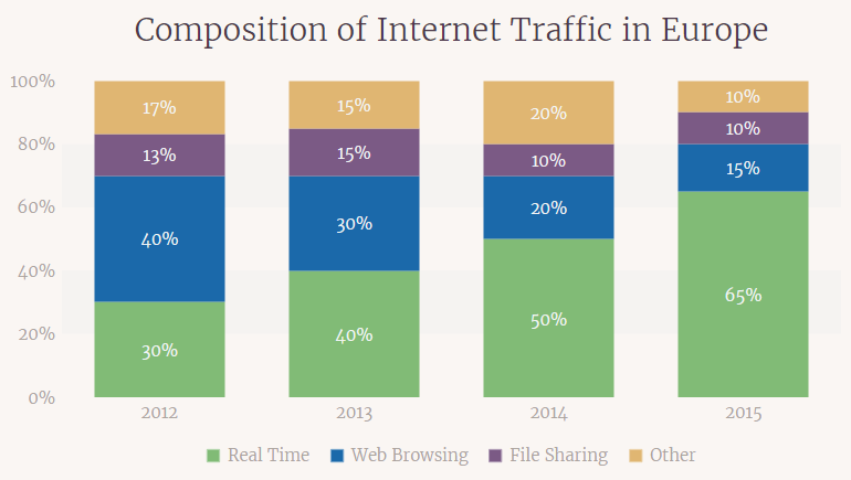
This is what we will be making in this tutorial:
It is a 2D stacked column chart built using FusionCharts’ JavaScript chart library. Stacked charts are used whenever the data sets to be displayed have to be broken down into their constituents. I have taken this just as an example, and the process that I will describe in next section can be used to plot any chart.
Now, let’s get to the tutorial!
Note: Please grab the trial version of FusionCharts’ library from their download page if you want to follow along.
Creating a JavaScript Chart in Four Steps
Different people have different ways of creating a chart, but it is always good to have a process in place. I have my own four step process which I have been using for years now, and it goes like this:
Step 1: Structuring Data
Before we start the process of visualization, we need to gather the data we want to plot and decide on the type of chart we want to use. Once you have done those, it is time to structure the data according to the library you want to use. For our case, that means we need to understand how FusionCharts accepts data.
FusionCharts accepts both JSON and XML, but we are going to use JSON in our example as it has slowly become the standard format for data exchange on the web. We need to form an array of objects containing label and value. Here’s an example of that:
[{
  "label": "Basketball",
  "value": "22000"
}, {
  "label": "Cricket",
  "value": "12000"
}...]
The above data format is good enough for basic charts like bar, column, or pie, but we are not plotting a basic chart today and we need to do something extra. Since every chart type has a slightly different purpose than others, it is often difficult to remember the exact data format required for that chart.
But this is an easy problem to solve: just head over to the chart attributes page or the examples gallery page and type the name of the chart you want to plot. You will get a live sample with full source code. That’s it.
You can just copy it from there and adjust it according to the number of data points you have. You can see the data format for a 2D stacked column chart on this page.
We have used four objects inside dataset array – one for each series. And there is a category array, under categories, which contains the definition for each data-plot (year). It’s difficult to comprehend like this, so just head over to the live source code on CodePen and please take 2 mins to digest this step.
Step 2: Getting Dependencies
This is a standard step for any web app you make. You need to include all the dependencies of the project using HTML <script> tags. Our chart depends on just two JavaScript files from FusionCharts and here’s how we include them:
That’s all the dependencies we need for creating our chart. You can add more things like font files to add a custom font to your chart, but that’s not required all the time. I’ll discuss more about this under ‘Customizing the Design’ section below.
Step 3: Declaring a Chart Container
On our HTML page, we need to create a container inside of which our chart will need to go.
I personally recommend an HTML <div> for this. Here’s how we define that:
Beautiful stacked chart will load here!
Notice that I have given above the <div> the id “stacked-chart”. I’ll use this in the next step for locating the container.
Step 4: Creating FusionCharts Instance & Rendering the Chart
In this last step we have to createan instance of the chart with type as stackedcolumn2d and define width, height, dataFormat and dataSource. This is the JavaScript code for doing it (explanation after code snippet):
FusionCharts.ready(function() {
  var stackedChart = new FusionCharts({
    type: 'stackedcolumn2d',
    renderAt: 'stacked-chart',
    width: '100%',
    height: '450',
    dataFormat: 'json',
    dataSource: {

      "chart": {
        "caption": "Composition of JavaScript Traffic in Europe",
        "captionFontSize": "28",
        // more chart cosmetics
      },

      "categories": [{
        "category": [{
          "label": "2012"
          // more labels for data plot
        },..]
      }],

      "dataset": [{
        "seriesname": "Real Time",
        "data": [{
          "value": "30"
        }...
        // more data
      }]
    }
  });
  stackedChart.render();
});
I explained categories and dataset array in step-1. And here’s explanation for the other things happening in the above code:
- We created a chart instance through FusionCharts’ constructor in the
stackedChartvariable. Every chart on your page will have a separate variable. This initialization code is wrapped insideFusionCharts.readymethod to prevent it from being called before the core library loads. - Next we set chart
typeasstackedcolumn2dchart. Each chart has its own unique name (or alias). Our chart has a width of 100% (will occupy full container width) and a fixed height of 450px. - As I mentioned above, we are using the JSON data format. So we need to specify that using the
dataFormatparameter. - The data for the chart and its cosmetics for inside
dataSource. - And finally, we call the render method to load the chart in the
stacked-chartdiv.
If you followed everything I described above, then you should have a working chart with you by now.
Customizing the Design
You will notice some attributes/parameters in my code that I didn’t describe above and they might sound odd at first look. What are these and what do they do? These are called chart attributes. And they help you customize even the minutest detail of your chart. It’s not possible to describe everything as there are hundreds of different attributes, but I have covered a few key ones below:
bgColorandcanvasBgColortogether allow you to control your chart’s background color. Any hex color code is acceptable as input to these attributes.paletteColorsdefine the series of colors that will be used on each individual column. the highest composition will take first color, second highest will take the second color in the list and so on.legendPaddinglets you control the space between the chart canvas and the legend.baseFontdefines the font-family of the chart. You can any use font you like. I have used ‘Merriweather’ from Google Fonts. Include the font file for the font you want to include in the<head>section, and set the font name as value tobaseFont.
I have just scratched the surface of the customization that can be done. To learn more, I suggest you visit the chart attributes page for 2D stacked column chart. If you are making any other chart, just type its name and you will see all the attributes that can be used in that chart.
What Next?
Now that you have coded your first JavaScript chart, where do you go from here? To help you answer that I have listed some resources below:
- In a world filled with frameworks and libraries, not many people are using vanilla JavaScript. So to help you out, there is a collection of wrappers and plugins for popular technologies. I am going to cover the jQuery charts plugin in detail in my next post.
- Once you start using a library, you are bound to face problems. And not all solutions can be found on Stack Overflow. So the official documentation will become your friend.
- Need some inspiration? Visit the chart fiddles gallery to find live samples of all the chart types. You can even fork one and go from there instead of starting from scratch every time.
If you have any questions about the tutorial or anything else related to JavaScript charts, feel free to post a comment below. I’ll try my best to help :)
Related Topics
Top