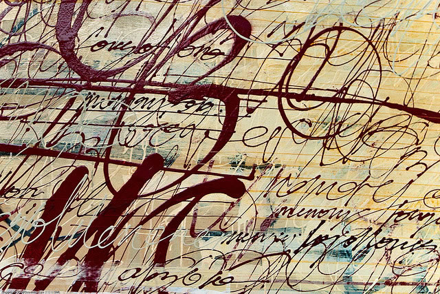
Evoking emotion in your viewers can be hard, but typography gives you the advantage of words. Unlike plain old drawings, you can use words or sentences to give the viewer more than just a feeling. You can make statements that explain or hint at something, leaving the viewer thinking.
Here are some trends and examples that you should keep in mind when you want to make evocative typography.
Setting the Mood With Type
Typography can be very powerful. Using certain fonts can inspire images or feelings. For example, using the type Manhattan evokes a classic 1920s feeling. Typography is very important for graphic designers going into advertising and marketing because they have to make advertisements that encourage the viewer to do something.
It’s not as easy as it sounds. You have to know what you are trying to portray. If you aren’t sure when you’re picking colors, fonts, and shapes, then your viewer won’t be either. Have a clear idea of what mood you want before you start.
Typography Trends
In recent years, the use of dramatic typography in advertisements has grown. Pictures draw in the viewer’s eyes more than type. Typography has gotten flashier because it has to compete with other media advertising.
The average viewer is bombarded with bright colors, flashy effects, and anything else that might grab his attention. Keeping someone’s attention with typography requires some really good skills and flashier typography.
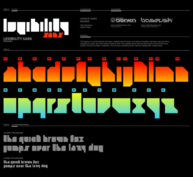
Top 10 Trendy Typography Fonts
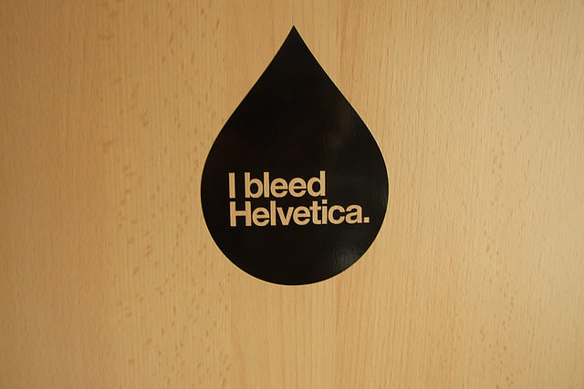
New fonts are made yearly, and more than 50,000 separate fonts are floating around. Not all of them are worth using, but certain fonts have become trendy and popular. Most of these fonts are new, but classics such as Helvetica are still the top choice.
Each font has a sort of personality to it. By combining the fonts with other design aspects, the possibilities are infinite. Here are some of the fonts seen in the top 10 most popular font lists:
- Helvetica
- Frutiger
- Myriad Pro
- Avenir Std
- Trajan
- Optima Std
- Futura
- Bickham Scritp Std
- Universe
- Eurotile
Colored Typography
Color is very powerful when combined with typography. Certain colors evoke certain emotions. How you use the color is just as important as the color itself. Warm colors can bring feelings of comfort and passion, whereas cool colors can cause a calm or sad feeling.
- Red is angry or passionate.
- Pink is playful or flirty.
- Blue is peaceful or sad.
- Yellow is cheerful or comforting.
- Orange is exciting and energetic.
- White is empty or open.
Once you have the basics down, you can get to work. Try working on your typography art when you are feeling the emotion you are trying to convey or listening to music that fits your theme – whatever you do, you want to add a feeling to your work that will move your viewers to tears or smiles.
Even if you just page through a symbolism book and find something that tells the message you want to tell, it will give you something to work with. From there, use your creativity to evoke emotion.
Related Topics
Top