Convincing people to visit your website might be tough, but the real challenge is convincing them to convert once they get there.
If your content marketing efforts, social media, and paid advertising are all the bait designed to lure potential leads, then your landing page is how you reel in those all-important profits. The trouble is, most brands have no idea how to create an effective landing page.
There are countless elements that a top-notch landing page needs. While there isn’t a one-size-fits-all guide to captivating your customers and earning that all-important sale, there are some best-practices you can follow to make your landing pages more effective.
By the time you’ve finished reading this article, you’ll know exactly what it takes to transform just another webpage into a conversion machine.
First Things First, What is a Landing Page?
Before we jump into an explanation of what makes the best landing page, the first thing you need to know is that your landing page is not necessarily your home page.
A landing page is where your visitors “land” when they click on a call-to-action or link that connects them to your company. It’s where they’re expected to hand over their contact information or perform an important action like getting in touch. For a page to be a landing page it must:
- Collect information or prospects
- Convert leads into potential buyers
- Demonstrate brand value
Now that we’ve got that out of the way, let’s look at the essential elements of your landing page.
1. An Eye-Catching Headline
The average attention span isn’t great. When someone arrives on your landing page, you only have a few seconds to convince them that’s where they want to be, before they click the back button. A headline is where your conversion journey begins, grabbing your client’s attention and letting them know that you’ve got something special to offer. A headline should be:
- Unique and interesting: Thinking about the breaking news headlines on newspapers, they’re designed to make you look.
- Informative: A headline that’s too witty or clever might go over your customer’s head and leave them wondering what it is you do.
- Short and sweet: You can explain your product or service later, keep your headline short, direct and snappy.
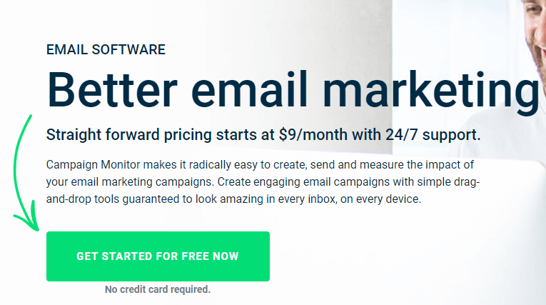
Campaign Monitor’s landing page tells you what you need to know instantly with the headline “Better Email Marketing.” The header is short, informative, and packed full of value.
2. A Descriptive Subheading and Explanation
Now that you’ve caught your lead’s attention with an exciting heading, it’s time to explain how you’re going to give them the value they crave. Your headline should allude to your services, but your subheading and explanation goes a step further by laying your USP out there in black and white. Your subheading and explanation should be:
- Direct and Concise: While your sub header can be longer than your header, and your explanation can be longer still, you still need to get to the point as quickly as possible.
- Benefit-driven: Don’t just tell your customers what you can do, let them know what you can do specifically for them.
- Consider alternative content: If you’re concerned you can’t get your explanation across in a couple of lines, try including a video too. Companies that use videos on landing pages can increase their conversions by 86%!
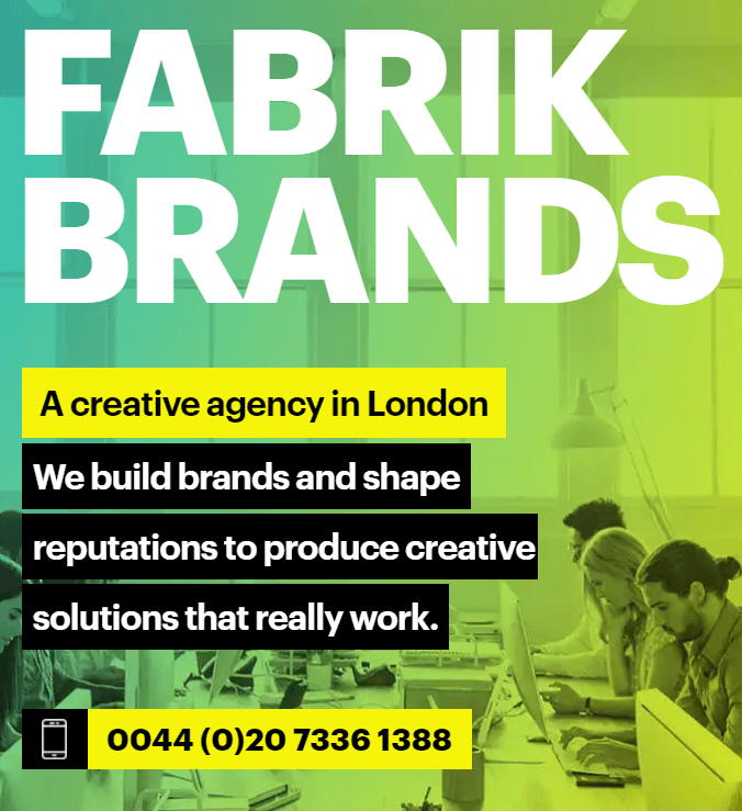
The “Fabrik Brands” page below highlights what the company is, what it does, and how it values the customer. It’s quick, to the point, and completely customer focused.
3. A Form to Capture Those Leads
While some landing pages include a link to a contact page, or an “act now” button, some of the best landing page examples out there get straight to the point by allowing you to enter your details as soon as you see what they have to offer. The key to a great form is making sure that it’s long enough to collect the right information, but short enough that it doesn’t scare your customers away. When designing your form, remember:
- Keep it short: Forms with between 3 and 5 fields can have a 20% conversion rate, compared to only 15% for those with 6+ fields.
- Avoid personal questions: People don’t like to reveal too much information about themselves straight away. For instance, conversion rates are higher on pages that don’t ask for a customer’s age.
- Make it easy to use: Ensure that your customers can access your landing form on a desktop, tablet, or mobile with easy-to-click menus.
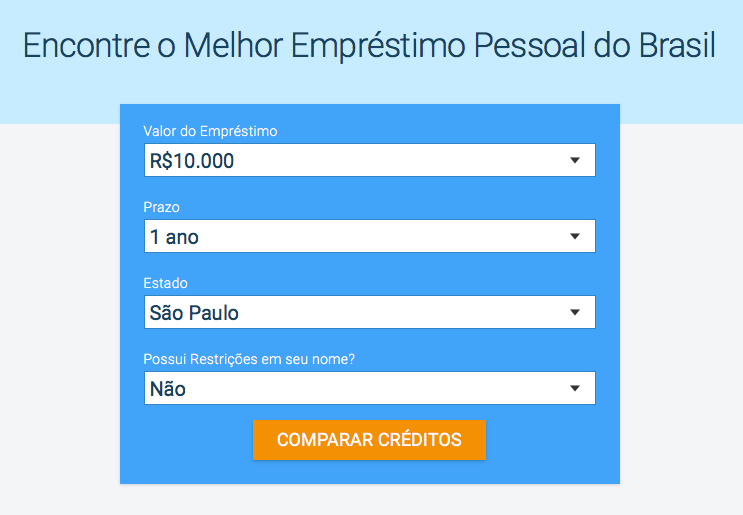
The Emprestimo Pessoal landing page is quick, clear and to the point. There are only four fields for leads to deal with, and the form itself is front and center in the page, making it easier to access and use.
4. Value Propositions or Benefits
Sometimes, you’ll be able to cover your unique values and benefits within the “explanation” section of the landing page. However, with more complex products or services, you might need a few paragraphs or bullet points that help you to go into more detail on what you have to offer. Remember, the most high-converting landing pages always answer the question “What’s in it for me?” This is your best chance to really sell yourself, so:
- Use different media to get your point across: Rather than just listing the benefits you have to offer, try using videos, images, and graphs to really engage your audience.
- Focus each benefit on the user: Instead of just talking about your company and telling your leads how amazing it is, let them know with statistics and figures, what they can get from you. For instance, instead of saying “We have a 98% success rate,” say, “You can enjoy a 98% success rate.”
- Keep scrolling to a minimum: Having a lot of value to offer is a great thing but remember that your client doesn’t want to scroll for days to get to a CTA or form.
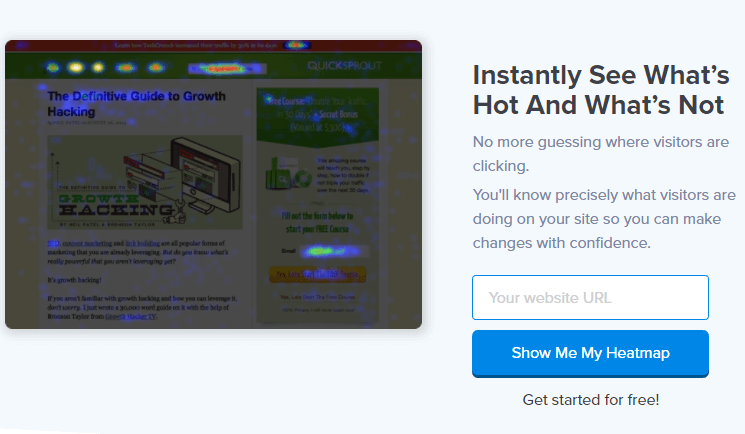
The Crazy Egg landing page demonstrates three distinct user benefits with images, explanations, and an immediate call to action beside each feature. This is a great way to make sure you don’t lose a lead’s attention.
5. A Powerful Call to Action
Finally, the last thing you need is a chance to tell your customers what to do. If you want them to call you, include your number next to bold, attractive font that says, “Call Now.” If you want your customers to hand over their email address, give them a form field and follow up with a button that says, “Start Today.” A few rules of thumb to follow include:
- Use contrasting colors to make your CTA really stand out: This button or text should draw the eye of your customer more than anything else on the page.
- Make sure the copy is compelling: Keep it value-oriented and don’t use the word “Submit.” Customers don’t like to feel as though they’re handing over control.
- Use a button: Today’s customers have been trained to expect a button on their landing pages. It’s simple, easy to use, and it works on mobile devices too.
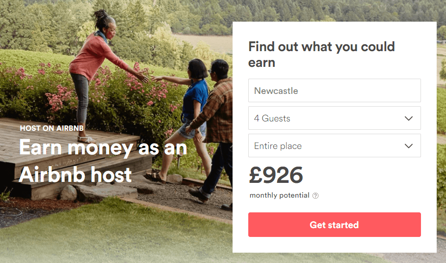
The CTA on the Airbnb landing page is friendly, user-oriented, and designed to stand out on the page in a bold, but not aggressive color.
Create Your Own High-Converting Landing Pages
Designing the perfect landing page doesn’t have to be a nightmare, but it does take some time, attention, and research. Follow the tips above and remember to frequently test your pages to find out which elements are more likely to convert.
The more you learn about your customers and how they respond to different form fields, CTA copy, and even color options, the more effective your landing page will become.
Related Topics
Top