We come across information dashboards everyday in various applications we use. Have you seen a dashboard that looked plain ugly? Have you come across one that didn’t inform you, the viewer, but confused you about what it’s trying to say? Or have you seen one that you were drawn to because of how visually appealing, and how informative it is? At those times, you’ve probably thought about what makes a dashboard effective or ineffective.
In this post, we discuss some of the key ideas that data visualization experts have shared about dashboards, in the hope that it’ll help you spot a good dashboard from a bad one. And if you build dashboards, the guidelines here will help you communicate more powerfully using dashboards.
Stephen Few’s Definition of a Dashboard
Let’s begin by defining what a dashboard is. Stephen Few, the leading expert on information dashboards, defines a dashboard as follows:
“A dashboard is a visual display of the most important information needed to achieve one or more objectives; consolidated and arranged on a single screen so the information can be monitored at a glance.” – Stephen Few, Information Dashboard Design: The Effective Visual Communication of Data.
Now, that’s a mouthful. Let’s distil it to the most important words:
- Visual display – This doesn’t mean that all dashboards need to have charts. A dashboard can be as effective with just text information in the form of KPIs. However, all dashboards are viewed by people, and a good understanding of human visual perception is important when building dashboards.
- Most important information – Dashboards that track mundane, useless information are doomed even before anyone views them. All dashboards plot information that the viewer cares about.
- Objectives – Every dashboard has an objective. Whether it’s to inform a viewer, or to get them to take an action, or to initiate an automated action in another application, there is an objective.
- Single screen – This is debatable in today’s mobile-first world, where the screen sizes vary from small smartphones, to large wall-mounted displays. Still, the idea of presenting information in a concise manner holds true.
- At a glance – A dashboard shouldn’t make the viewer jump through hoops to understand what it has to say. It needs to present information plainly, and invite the viewer to explore further if they like.
Here’s a dashboard created by Stephen Few, which stands as a great example of what an effective dashboard looks like:
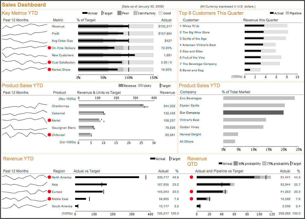
Image source: PerceptualEdge.com.
Now, let’s get down to the process of building an effective dashboard. Let’s begin by discussing what are the three types of dashboards.
Dashboards for Different Audiences
One way to classify dashboards is by the audience it’s meant for. Accordingly, dashboards can be classified into three types:
- Executive Dashboards – Also called ‘Strategic Dashboards’, These dashboards are viewed by the senior management in an organization. Their objective is to inform executives of how a company is tracking against its strategic goals. They answer the question ‘How are we doing as an organization?’ It’s common for these dashboards to have the most important KPI metrics alongside a few charts with historic data to give context to the KPIs. Based on what the KPI numbers are, executives may
want to drill down to gather more details about the situation. Because of the hierarchy of data, it’s important for these dashboards to follow Ben Shneiderman’s Infomation-Seeking Mantra – “Overview first, zoom and filter, then details-on-demand.” - Analytical Dashboards – Analytical dashboards are used by Business Analysts who focus on gaining insight from data. The analyst looks at historical data to spot trends, and reasons for fluctuations in performance. They also look to predict future performance based on a variety of internal and external factors. The analyst viewing these dashboards asks the question ‘How can we meet and exceed organizational goals?’ Analysts using these dashboards are armed with specialized training, and accordingly, analytical dashboards should contain advanced interactive features that enable the analysts to get more value out of the data. It follows that these dashboards aren’t used by all employees.
- Operational Dashboards – These dashboards are used by line-of-business managers, and the workforce on the frontline. It helps employees of a particular department be aware of goals for the team and for the company at large. It answers the question ‘Are we tracking our department goals for today?’ Operational dashboards contain only a subset of a company’s data that is relevant to the job at hand. Because of how highly focussed these dashboards are, they often contain low latency and even real-time data. Because of their importance to complete day-to-day tasks, operational dashboards should have the ability to drill down to the most minute level of detail.
Dashboards for Different Departments
Since a dashboard should contain the ‘most important information’ it’s important to define what the most important information is, for a particular department. Here are some metrics that are important to specific departments:
- Manufacturing – Units manufactured, units by product type, cost per unit, projected orders, plant waste.
- Sales – Leads, deals won, deals lost, average deal value, average deal time, sales by person, sales by region, sales by product.
- Marketing – Awareness, visits, downloads, leads, cost per lead, customer acquisition costs, bounce rate.
- Support – Total tickets, open tickets, average turn around time (TAT) , customer satisfaction (C-SAT), tickets resolved within SLA, tickets closed per person, % of issues resolved in first response.
- HR – Attrition rate, interview closure rate, average time to hire, open positions by department, payroll breakdown.
These metrics serve as a guideline of what could be most important to each department. However, before building any dashboard, it’s necessary to take the time time to understand what matters to the viewer of your dashboard.
Now that we know what a dashboard is, the types of dashboards, and what metrics they contain, let’s look at one of the most important design principles that can make or break a dashboard.
Data-Ink Ratio
There are many principles to follow when creating dashboards, but if there’s one that stands out among the rest, it’s the principle of data-ink ratio
Data-Ink ratio is a concept introduced by Edward Tufte, one of the earliest experts in the field of data visualization. In his 1983 book, The Visual Display of Quantitative Information, he says “A large share of ink on a graphic should present data-information, the ink changing as the data change. Data-ink is the non-erasable core of a graphic, the non-redundant ink arranged in response to variation in the numbers represented.”
Below is an example of the same data represented with two charts – one with low data-ink ratio, and the other with a high ratio. You’ll notice that the one with a high data-ink ratio is a lot more appealing, and communicates the story behind the data more clearly.
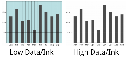
Image source: JesseFagan.com
With dashboards, just as with websites, less is more.
Armed with this insight, you’re now ready to go out and build effective dashboards that solve problems, rather than confuse viewers.
Do you build information dashboards frequently? Which of these ideas will have the biggest impact on your dashboards?
Related Topics
Top