Great tools make a huge difference in how quickly you can complete a task. I’d like to share a few tools and essential design resources I use when designing web applications to help me work faster and more efficiently. This isn’t a massive list of every design resource I could find on the web. Instead, I included just the ones that I and a few of my friends use to create great designs.
Patterns & Textures

When it comes to patterns and textures, there are two sites that have all my needs covered. Subtle Patterns is my favorite, but I’ve also picked up a lot of great resources from Tileables. When using their resources remember that you can modify them in Photoshop to create a look that better matches your design. Besides, who wants to use the defaults?

Icons
I have three go-to sources for icons: The Noun Project, Glyphish, and Fugue. Each fills a slightly different need in my design portfolio.
The Noun Project
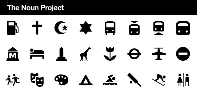
Often it can be hard to decide what visual metaphor best represents a word. This could be for logos, icons, or just the overall style for your design. So I like to plug a few words into The Noun Project to see the metaphors they used. Sometimes one of their icons fits perfectly.

Glyphish
Glyphish is an icon set originally created for tab bars in iOS applications, but I love using them all throughout my designs. The simple style works well on solid colors, doesn’t draw too much attention, and can easily be styled with a highlight (for the selected navigation item). The free set includes 200 great icons, but for $25 you can get the Pro set (which I use) that includes 400 icons at multiple sizes.

Fugue
Fugue is a massive set of small, 16 pixel square, color icons. These days I prefer to use flat, monochromatic icons, but when a project calls for small icons with detail, Fugue is my set of choice.

Inspiration
There are tons of sites available for finding inspiration, but only two that I keep coming back to: Dribbble and PatternTap.
PatternTap
When designing web applications, I often want to know how other applications tackled a really specific problems. Rather than looking for a specific style, I want to see how they solved the user-experience problems. This is where PatternTap really shines. Want to see popovers in use throughout designs? There is a tag for that.

Dribbble
Dribbble is where I turn when I want style inspiration. The screenshots are too small and focused to get an idea for the user experience, but the designers produce some great stylistic work. I’ve followed my favorite designers, so there is always something good in my feed.

Design Elements
Premium Pixels
For little design elements, Premium Pixels is the best place to go. These are small PSDs that are always wonderfully polished. I’ve used their browser chrome, maps, and several more. It is well worth your time to browse the site.
![]()
The Bricks
The Bricks is a massive template of design elements that look really nice. While I don’t use them myself, several friends do and they absolutely love it! It’s a paid set, but looks to be well worth the money.

Mockups
InVision
I sketch all my mockups on paper first, then design in Photoshop. When sharing with a team I like to use InVision to turn my flat design images into a interactive web application. You can define clickable areas and share with the rest of the team for feedback. Comment threads can be started on any design element, so it keeps any discussions focused and in context. You can use it for one project for free; multiple projects start at $15 a month.

Responsive Sketchsheets
Zurb’s Responsive Sketchsheets are great for designing how your application will look at different device sizes. Print them out for free and start sketching!

Mockingbird
If you like to use software to create your mockups, then you should check out Mockingbird. One friend just loves using them. Mockingbird is browser based, so your mockups are available anywhere and easy to share. They also have a “one project free” plan. Paid plans start at $9 a month.

Code
Bootstrap
The fastest way to have clean buttons, forms, and menus in your web application is to use Bootstrap. Created by two former Twitter designers, Bootstrap is an HTML and CSS library for quickly styling your application. Even if you don’t use the entire thing, some of their JavaScript code for popovers and modals are really helpful.

{wrap} bootstrap
The only downside to Bootstrap is that if everyone uses it, all the sites will start to look the same. So you need to customize Bootstrap to get the most value out of it. {wrap} bootstrap sells themes for Bootstrap so you can get a more unique style, while still using all of Bootstrap’s great features. The themes are around $20 each.

LESS & SASS
I’m sure I’m not the first person to tell you this, but LESS and SASS are amazing. For those who don’t know, LESS and SASS are CSS preprocessors that add a bunch of extra features. If you’ve ever wished you could seamlessly reuse bits of code or define variables in your CSS, then you want to check out these preprocessors. If you are trying to decide which one to use, check out Chris Coyier’s article on the subject.

jQuery Joyride
When a user first signs up for your application, you should give them a brief introduction to the interface. Instead of a series of screenshots or a wizard process, you want to point out features directly in the interface. The jQuery Joyride plugin from Zurb makes this really easy.

Start Using Them
That concludes the list of my favorites. Go download the free ones and definitely consider any of the paid options as well. The resources listed above are key to my workflow and to the design process for many other designers as well.
Related Topics
Top