Flat design is nothing but simplicity put into practice. The fact that simple shapes such as rectangles and circles are being preferred over gradients and drop shadows shows that the tide is in favor of simplicity. A case in point is the new design of the Windows Phone and the Windows 8 OS Metro UI — probably not the best example, but it surely was the first noticeable implementation of flat design in practice.
However, flat design, as such, is not a design movement or entity in itself. In fact, any design purist will tell you: there is no such thing as “flat design”. It is simply minimal design, with a flat look and feel.
Thus, if minimalism were a philosophy, “flat” will probably refer to the aesthetics and not the design as such. Furthermore, flat design is not a new innovation: everything you write on paper has always been flat, after all!
This new concept that we commonly call “flat design” is more of a notion related to appearance within the larger design movement of minimalism. Yet, for the sake of simplicity, we shall stick with the more popular term, flat design, all throughout this article.
![]()
Merits of “Flat” in Web Design
There are many advantages of flat design. In fact, flat design is in itself not just a trend, nor a mere extension of minimalism, but a step forward in the evolution of web design.
Owing to its simplicity, flat design elements are easy to scale, resize and identify as well as consume lesser bandwidth. Flat design is slim and low on cholesterol, and can easily be made responsive. By doing away with decorative extravagant design elements, flat design frees up precious screen space for content that actually matters. Since there is no unnecessary styling, it is easy to focus on the key areas of the page or user interface.
So, what does flat design really have to offer?
The Importance of Simplicity
Flat design discards intricate design concepts, and prefers to employ simpler shapes that are easy to identify. This has an overt advantage of its own: considering the fact that mobile web browsing is dominating the picture nowadays, simpler geometric shapes tend to be easier to identify and also maximize the usage of pixels on the limited and relatively smaller mobile screen. As such, such design elements load much faster too.
Simplicity, coupled with minimalism, also greatly enhances the readability aspect, both on the mobile and the desktop screens. This is precisely why even social media websites such as Facebook and Google+ are moving towards flat web design — the usage of flat design against a minimal layout ensures both readability and clarity.

Since flat design lacks intricate elements and depth, the images, icons and other design-related elements tend to appear visually simple. For example, icons that are formed using basic geometric shapes such as circles, triangles and rectangles become easily identifiable for the user.
No More Skeuomorphism!
Flat design primarily stresses on simple 2D representation. This is in stark contrast to the erstwhile usage of skeuomorphism in web design, which chose to represent images in the form of a real-world object, and employed shadows, textures and bevels to imitate the contours of the real world.
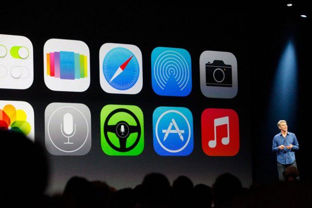
Let us, for instance, take the case of the iOS. The newer version of iOS seems to have favored flat design. Thus, it has done away with the skeuomorphism that was used in the earlier iOS versions. As a result, 2D icons have replaced the 3D images that were used in previous iOS versions. Gradients, textures, strokes, bevels and embosses — all gone!

Yes, that is right! Leather borders? Nope. 3D buttons? Not needed. Background textures? Eliminated!
Typography and Colors
The typographic changes are simple: shorter messages, crisp and clear font texts, and no more elaborate calligraphic alphabets.
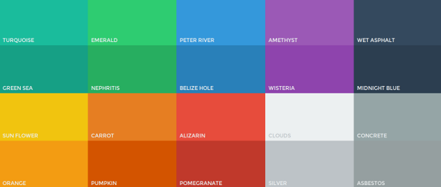
For the sake of aesthetics, flat design uses candy colors (mostly a bit desaturated). However, bright shades and neon colors, of course, are not in vogue — unless you just want to watch the world burn!

Since gradients are out, candy colors can provide an additional advantage: it is really easy to complement and contrast them with other colors. A good resource to help you get started with colors in flat design is Flat UI Colors.
Minimalism, Where Less is More
Flat web design relies heavily on the concept of minimalism. Geometric shapes will lose their value if your page is cluttered. Thus, white space is extremely important, and it serves as a form of breathing space for your viewers’ eyes. Unrequired elements and extravagant design has no room here — remember, best design is actually no design at all.
Flat design, due to its simplicity, is gaining momentum. If you are thinking of a new design layout, you should surely not overlook flat design.
What are your thoughts regarding “flat” in web design? Share them with us in the comments below!
Related Topics
Top