Infographics have been a part of human communications since the invention of the first “writing” utensils. Cave paintings, rock carvings, and sculptures have been found to integrate both images and written symbols (a type of pre-writing).
These artistic efforts were created some 32,000 years ago; they illustrate stories, record history, religious ideas, and much more. Even among prehistoric people, infographics were an ideal method to communicate an infinite types of information.
In modern terms, infographics are the visualizations or charts that are used to present a large amount of material to readers. This type of design is utilized to communicate information that would be impossible or too time-consuming to be explained solely by text or series of illustrations.
At the most pedestrian level, pie charts, maps, traffic signs, and bar graphs are types of infographics. Instruction manuals and children’s books often use infographics to explain processes that require step-by-step explanations. More intricate designs are often found in scientific and mathematical communities to display research and data.
Infographics continue to teach, inform, and entertain modern readers. Although we have somewhat evolved past the charcoal stick, the basic components of infography remain the same. Most infographics now utilize vector art. Many designers and studios will specialize in inforgraphy almost to the exclusion of other types of design.
Below is a showcase of some brilliant infographics found around the net. These were collected based on the design’s originality, sense of humor, clever design, usefulness, or awesome sense of ridiculousness.
You might also like these inspiring Video Infographics.
Infographics have been a part of human communications since the invention of the first “writing” utensils. Cave paintings, rock carvings, and sculptures have been found to integrate both images and written symbols (a type of pre-writing).
These artistic efforts were created some 32,000 years ago; they illustrate stories, record history, religious ideas, and much more. Even among prehistoric people, infographics were an ideal method to communicate an infinite types of information.
In modern terms, infographics are the visualizations or charts that are used to present a large amount of material to readers. This type of design is utilized to communicate information that would be impossible or too time-consuming to be explained solely by text or series of illustrations.
At the most pedestrian level, pie charts, maps, traffic signs, and bar graphs are types of infographics. Instruction manuals and children’s books often use infographics to explain processes that require step-by-step explanations. More intricate designs are often found in scientific and mathematical communities to display research and data.
Infographics continue to teach, inform, and entertain modern readers. Although we have somewhat evolved past the charcoal stick, the basic components of infography remain the same. Most infographics now utilize vector art. Many designers and studios will specialize in inforgraphy almost to the exclusion of other types of design.
Below is a showcase of some brilliant infographics found around the net. These were collected based on the design’s originality, sense of humor, clever design, usefulness, or awesome sense of ridiculousness.
America Hungry, Need Data
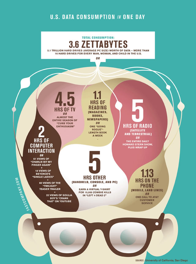
The contrasting colors used in this infographic are appealing, recalling a somewhat vintage look. The overtly geeky character appears to have consumed 3.6 zettabytes himself, judging by his eyeballs and size of his brain. Informative, humorous, and memorable.
Prism Social Media 2010

This design breaks down virtual social communities into the top websites used for each form of communication (e.g. pictures, blog platforms, and so forth). The somewhat mediocre choice in design is blown away by the vastness of the information presented. Note: if you have never heard of some of these sites, it’s okay. The infographic is the “German edition.”
2012: The End Of The World?

This poster-like infographic illustrates the debate between the doubters and ardent believers of the 2012 end of the world. The neutral colors of this design emphasis the tongue-in-cheek new-like presentation of this debate.
Colours in Culture
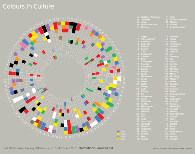
This design is visually striking and attractive; however, as a teaching tool, this infographic is not the easiest to understand (what’s up with “repels evil” anyways? How come I never knew that?)
All You Need To Know About Web Designers

This simple bar graph is taken up to the next level with humorous icons. Apparently the icon representing gender is also the summary of designers’ maturity level.
The Darwinian Evolution of Photoshop
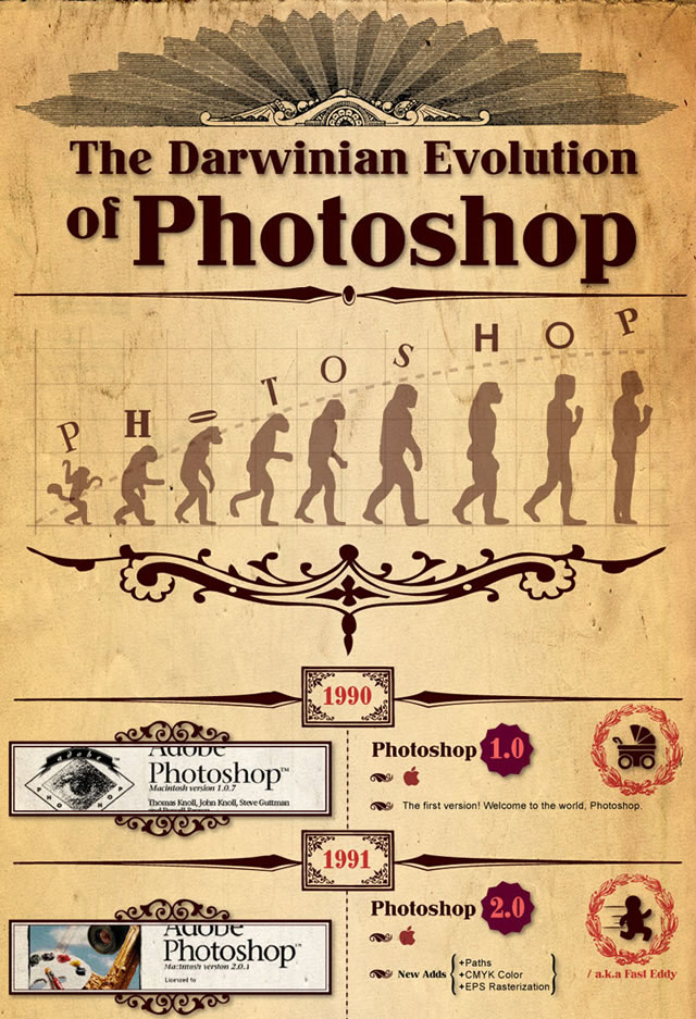
Timelines are another basic type of infographic. The concept of time and history can be somewhat abstract. The illustrative component helps people visual a linear progression of time (that is, if you believe in linear time…).
A Periodic Table of Visualization Methods

Overview of breakdowns in visual methods of communication. In periodic table format. Complete with mouse-over examples. Enough said.
Facebook Privacy: A Bewildering Tangle of Options

Facebook Privacy options as of May 2010. My favorite is the graph of illustrating the number of words in Facebook’s Privacy Statement (5,830 words) vs. US Constitution (4,543 words).
The Rock ‘N’ Roll Metro Map
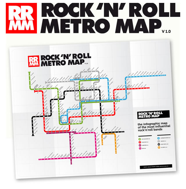
A “map” of sorts that strives to illustrate the many musical influences of rock ‘n’ roll bands. Clever presentation as a subway map look-alike.
The Trilogy Meter

A diagram of personal assessment of major trilogy movies in bar graph format. Simple and functional
Collection of Social Media Infographics
In my Dreams

An interesting representation on observing and documenting dream theory. The minimal use of illustration and emphasis on “white space” keep this design clear, modern, and sleekica-hungry-need-data”>
The contrasting colors used in this infographic are appealing, recalling a somewhat vintage look. The overtly geeky character appears to have consumed 3.6 zettabytes himself, judging by his eyeballs and size of his brain. Informative, humorous, and memorable.
Prism Social Media 2010
This design breaks down virtual social communities into the top websites used for each form of communication (e.g. pictures, blog platforms, and so forth). The somewhat mediocre choice in design is blown away by the vastness of the information presented. Note: if you have never heard of some of these sites, it’s okay. The infographic is the “German edition.”
2012: The End Of The World?
This poster-like infographic illustrates the debate between the doubters and ardent believers of the 2012 end of the world. The neutral colors of this design emphasis the tongue-in-cheek new-like presentation of this debate.
Colours in Culture
This design is visually striking and attractive; however, as a teaching tool, this infographic is not the easiest to understand (what’s up with “repels evil” anyways? How come I never knew that?)
All You Need To Know About Web Designers
This simple bar graph is taken up to the next level with humorous icons. Apparently the icon representing gender is also the summary of designers’ maturity level.
The Darwinian Evolution of Photoshop
Timelines are another basic type of infographic. The concept of time and history can be somewhat abstract. The illustrative component helps people visual a linear progression of time (that is, if you believe in linear time…).
A Periodic Table of Visualization Methods
Overview of breakdowns in visual methods of communication. In periodic table format. Complete with mouse-over examples. Enough said.
Facebook Privacy: A Bewildering Tangle of Options
Facebook Privacy options as of May 2010. My favorite is the graph of illustrating the number of words in Facebook’s Privacy Statement (5,830 words) vs. US Constitution (4,543 words).
The Rock ‘N’ Roll Metro Map
A “map” of sorts that strives to illustrate the many musical influences of rock ‘n’ roll bands. Clever presentation as a subway map look-alike.
The Trilogy Meter
A diagram of personal assessment of major trilogy movies in bar graph format. Simple and functional
In My Dreams
An interesting representation on observing and documenting dream theory. The minimal use of illustration and emphasis on “white space” keep this design clear, modern, and sleek
Related Topics
Top