Musical theater is a pretty old art form. As time has moved on, so has the graphic design of their posters. For some musicals, the changes are highly dramatic (no pun intended), others are so rooted in history that designers will not allow themselves to stray too far from the original design.
In this post, I shall describe the differences and similarities between three classic posters from three popular musicals. These musicals and their posters have been chosen as they highlight the differences and similarities between each. I will also rate each poster amongst their own group using the scale best, average and worst. I’m sure that there are a lot of badly designed posters out there, but I am only focused on the three that I have found to look, at the very least, semi-professional.
Let’s start off with one of the most well-known musicals, Les Miserables.
Les Miserables
|
Worst
|
Average
|
Latest and the Best
|
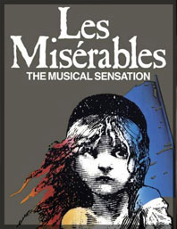
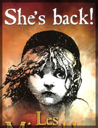
The first two posters, the first being the original London cast poster and the other an updated recent version. As you can tell, they are very similar with the main difference of one having slightly different backgrounds from the others. The main reason why I highlighted the original.
Why I believe the central theme of the poster has not changed is that Les Miserables is very well known. The little girl is the poster child of the musical. You can even say she has become the logo. With the combination of the Caslon Antique font (which is used in all “classically” set musicals), these posters are quintessentially Les Miserables.
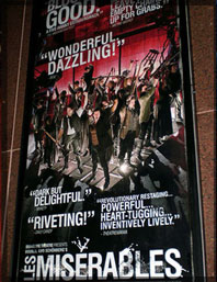
This doesn’t mean that designers don’t try and break the rules. Signature Theater’s production (Poster 3) is heavily photographic, its primarily a cast shot on a stage. This still represents that it is a very big musical, just as the other two posters do. The graphic statement of the poster child is equaled by the high angle shot of the whole cast looking imposing, getting ready for a revolution. The shadows make this poster particularly imposing.
We shall move onto Sondheim’s classic, Into the Woods. These posters are all different, nothing is really similar between them, other than the name of the musical and some recurring elements.
Into the Woods
|
Oldest and the worst
|
Old and the best
|
Newest and the most average
|
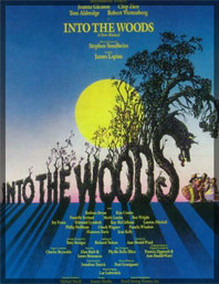
The first poster is from the 1987 original broadway cast production. As it was a new musical, they didn’t show a lot of foreshadowing to not give the story away. Complex typographical elements, which overshadow the little characters provide the visual impact to create interest for the audience.
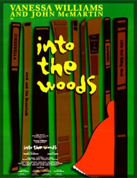
The next poster is for the 2002 broadway revival production, 15 years later. The musical has by now become more popular and thus has become more of a classic, rather than a fledgling musical. As its popularity has increased, you can start putting more elements from the musical into the poster. The biggest difference is the book theming and little red riding hood appearing. As it’s common knowledge to a theater goer that Into the Woods is about a mash-up of fairy-tales, designers can use this knowledge to enhance their designs.
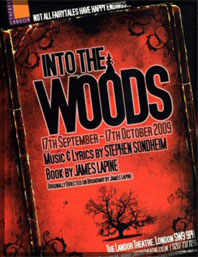
The last poster is the 2009 London cast, a much more recent and much more modern design. Typeset on an angle to create interest, very, very simple typography and the book motif appearing from the 2002 Broadway cast poster. The oldness of the book still evokes old fairy-tales, which is then enhanced by the tagline “not all fairy tails have happy endings.” It’s a good concept but relies too heavily on the text to make the design work.
West Side story is my next musical. Now we are getting to the real classics.
West Side Story
|
Oldest and the most average
|
Old and the best
|
Newest and the worst
|
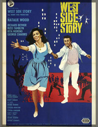
We’ll start of with the 1961 film version of the musical. Using a simple primary color scheme, and using a 50s illustrative style. The colors are what makes this poster visually interesting, the main figured are “whited out”/desaturated to provide the contrast. As a musical set in the 1950’s America, I think that the designer hit the mark (even though it was only a decade apart).
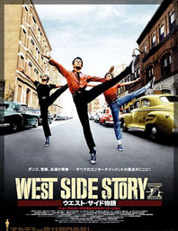
The second poster is for the 2002 digitally remastered version of the movie, which was released in Japan. Rather than promoting the musical, it’s more promoting the higher quality of play back. It provides a lot of impact though, and would easily be able to promote a stage musical with some little tweaks.
It is another strong photographical poster, only thing that irks me is that there is a spot near the middle of the poster which is totally white burned out, but that would just be the image that was used in the film version.
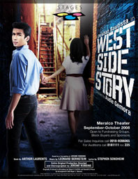
The last poster in this series is the 2008 Stages production. Simple concept, with some shoddy designing and photographer lacking a little foresight. The lead male is the one that is being accentuated in this poster, as it looks as though the poster is also calling for people to audition for the show. The photograph depicts Maria leading Tony through the back streets of New York (as that is where the musical is set).
What takes away from the design is the light coming in from the left of the lead character, most likely to get his full face into shot. However, the light wasn’t directed just at the face, and ended up catching on the clothing. The typography is heading towards illegible, as the designer tried to make the text on the wall follow the rules of perspective. You can only just read the “directed by” text, but it’s pretty hard.
Conclusion
Theater productions come from the same libretto and score, but the graphic design has changed over time. Changes in the brief can occur depending on the age of the musical or what you are trying to advertise. Sometimes the brief doesn’t change at all, especially for the extremely well known musicals (Phantom of the opera and Wicked are known examples.)
As theater stays almost set in time, the design world shifts and changes all the time. So, with theater design, you have to come up with something inventive and different enough to create interest in musicals that have stayed the same, some over decades.
Related Topics
Top
