The color blue can make you feel calm while a vibrant shade of red can make you feel hungry or threatened. We all perceive the world through our own individual filters, but there are some general rules for what draws our eyes to something.
So what makes one design more appealing than another? How can we tap into a visitor’s brain and make them feel a certain way just by affecting what they see? We will take a look at some common psychology tricks used in web design, as well as how you can use them to your advantage.
Using the Brain as a Roadmap
To fully understand the effect web design can have on the brain, it is essential to have a basic understanding of how the brain works. It does not take a brain surgeon to create a winning web page, but a working knowledge of how the brain perceives experiences is useful. If this sounds like a bizarre mixture of philosophy and psychology, then you are right on target: neurodesign, coined in 2012, allows us to determine what makes a customer experience good or bad based on aesthetic.
Image Source: Interni Magazine
One of the most basic concepts of the human brain we can apply to web design is that it craves order. Our brains form what are called “schemata” to organize information into our worldview. We use what are known as “heuristics,” or rules of thumb, to solve problems in everyday life.
A good example of this is pattern recognition. When confronted with a stimulus, like a garbled line of text, we can generally fill in the blanks and figure out what the text is supposed to say, since our brains are trained to recognize patterns and adapt them to what we already know. So how can we use these basic building blocks in web design? Here are a couple of examples:
- Users feel more comfortable when browsing sites that feature hierarchy. For example, if you are an online retailer, you may show categories like this: Home>Holidays>Christmas>Trees and Décor
- People are also at home assigning people to categories. Sites that offer real-time chatting designate users as available, idle, invisible, or offline.
Offering comfortable patterns is not the only way you can apply the brain’s organizational skills to web design. The Nielson Norman Group developed a list of 10 heuristics to use in web design. One of the most important of these is the idea of using recognition instead of recall.
For example, have you ever been in a position where you meet someone at a social gathering, and you recognize their face but do not remember their name? You have just experienced what psychologists call “retrieval cue failure.” This can be frustrating, and it is an experience you want to avoid on your website at all costs.
Using recognition on your website makes for a more enjoyable experience for the consumer because your interface is essentially doing more of the work for them. Here is how some popular websites use recognition in their interface:
- Google helps guide searches by using an auto-fill function based on past searches and browsing history.
- E-Commerce websites (like Amazon, Target, and Walmart) show shoppers what they have recently browsed, and even make recommendations based on previous views.
Tapping into the brain’s basic organizational skills can make for a friendlier user experience. There are other ways, however, that we can make consumers more amenable to using websites.
Building a Web Design Aesthetic
The proper use of aesthetics has been debated since the time of Plato, who wrote his own tome on the subject. He also understood its power
Image Source: Wikipedia
Thanks to strides in modern psychology, there is no longer a need to contemplate what passes as beauty outside of a philosophy classroom, as research tells us there are certain things the human brain finds pleasing. Let us take a look at how certain web design elements tap into emotions and contribute to a positive user experience.
Color
Color is one of the most important elements you can use to evoke a certain emotion from a user. This notion is nothing new; the ancient Greeks believed that humor influenced the body and personality.
People whose dominant color was red (for blood) were said to be energetic and courageous, which is where we get the term “sanguine.” By contrast, those whose color essence was dominantly black (for bile) were said to be despondent, which is where the term “melancholy” is derived. While we may have graduated from humor and leeches, psychology still does prove an association between colors and emotions.
Here are the more common colors and how major website developers use them to their advantage:
- Red is indicative of energy, vibrancy, and youth. CNN uses a bold red interface to make their users alert and ready to read the news.
- Pink makes you feel a sense of femininity and softness, which lingerie giant Victoria’s Secret uses to great effect.
- Green gives viewers an air of optimism. Since it also shares a hue with plants, it is often a go-to color for websites with an environmental lean, like green living website Treehugger.
- Blue recalls a sense of trustworthiness and openness, so it is no surprise that it is the color choice of social media giant Facebook.
We’ve previously publlished an article about the psychology of color in web design, and here is an infographic from Kissmetrics that summarizes color psychology nicely:
Typeface
Even something as simple as the font you use can affect the user experience on your website. Serif fonts for example (the ones with feet on them, like Times New Roman), are indicative of tradition and professionalism. Newspaper outlets like the Detroit Free Press and the New York Times use serif fonts to convey importance. Sans serif fonts, by contrast, are used to give you a sense of modernity. Silicon Valley giants like Google and Apple use sans serif fonts to appear on the cutting edge.
Image Source: SquidSpot
Spacing is also a concern in web design; if your letters have too little space between them, it conveys a sense of density and weight. On the opposite end of the spectrum, words with too much space between them give off an air of flightiness. It is important to strike a balance between good spacing and font size to give off the persona you are trying to achieve.
Imagery
Most clichés are simply true statements that have become overused sayings, and “a picture is worth a thousand words” is no exception. Think of a time you were overcome with emotion when viewing a photo: V-J Day in Times Square is a classic example:
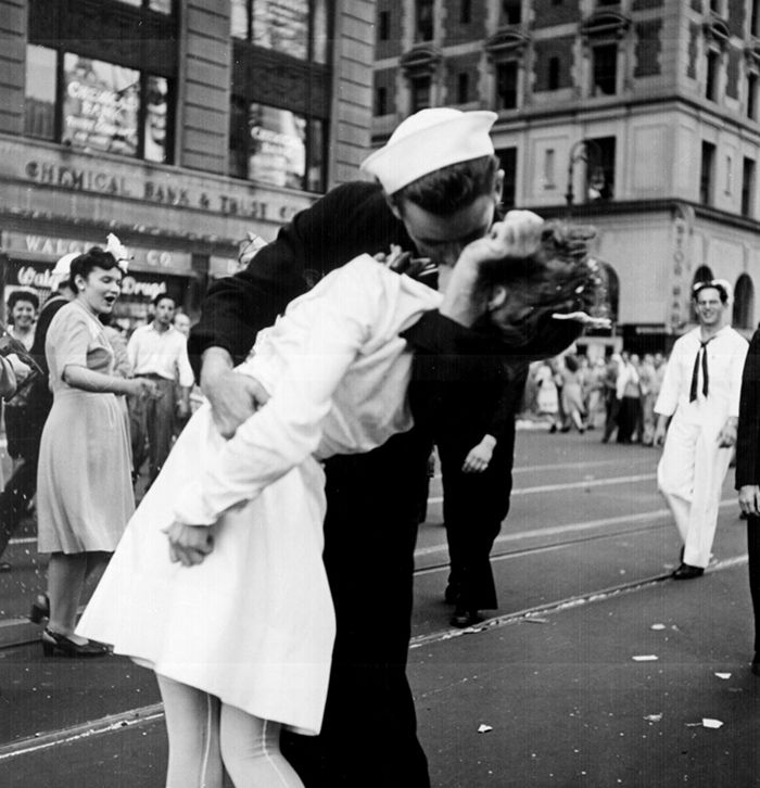
Image Source: Wikipedia
Photographer Ming Thein breaks down the relationship between images and emotion pretty well, so it is important to keep in mind your end goals when selecting your website imagery. A group of professionals shaking hands over clipboards, for example, may evoke professionalism and competence while cartoon images may convey youth and humor.
Applying These Principles to Your Site
So now you know about the basics of web design psychology. How do you incorporate these design strategies into your website? Here are a few ideas:
- Know your priority population. Who makes up the bulk of your visitors? Is it young millennials? Or well-off baby boomers?
- Create a survey to help identify customer needs and wants. With the information you receive, you can apply design principles.
Using psychology to drive your website design is one of the easiest ways you can increase traffic on your site and boost sales. If you follow these basic principles, you may be pleasantly surprised at the results.
Related Topics
Top