Beyond any question, responsive web design (RWD) has become the standard for anybody who wants to make a strong presence on the internet. With the passage of time, rules, best practices, layout standards and guidelines have been commonly created, implemented and accepted by most web designers and developers.
However, let us not forget that even though RWD is widely used, it is still a youngling and in spite of its awesomeness, it still has to improve in many aspects, such as taking into account that newer devices are being introduced with each passing day.
One of those scenarios where RWD critically fails is the correct handling of information in favor of responsiveness. For example: sometimes, after applying any of those widely accepted standards of RWD, we may have a desktop design displaying three or more columns, but the design for smaller resolutions downplays a lot of this information by piling it up so that it is not visible at first sight, or in some cases, it will completely disappear from the layout.
Of course, this inaccurate handling of information is not going to be a problem for all sites, but the truth is that each site layout and responsive scheme should be designed on the basis of the content and the desired impact on the visitors.

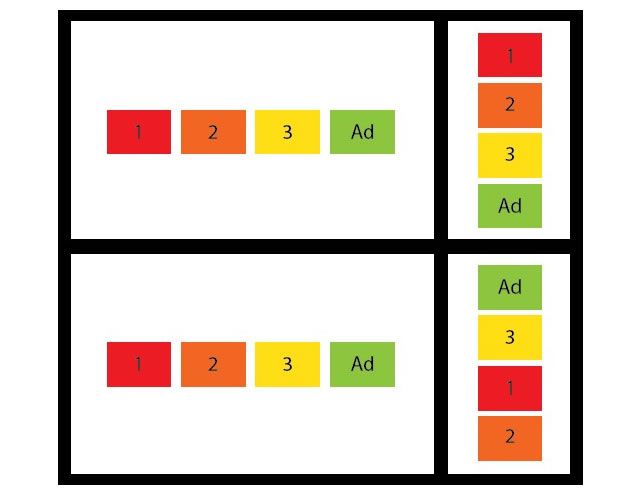
The foreground ad from the desktop version of the Boston Globe homepage disappears when viewed on a mobile.
A new position: Responsive design analyst
Every project is different from all others, and in most cases the main characteristics are unique. Thus, the design and architecture should be unique too. This is the main reason why standard rules of responsive design do not work for everybody, and a deep analysis of every project is needed in order to take full and proper advantage of responsive web design. At this point, a new position may play a key role: every project needs a person who can analyze the content and structure and help in finding an equilibrium between the handling of important info and responsiveness. The importance of this task has started to emerge; for example, we found this interesting quote while surfing on Linkedin:
“Although there are hundreds or probably even thousands of examples of websites based on responsive web design there is only a limited number of big companies that have adopted it and usually more as an experience or only partially (…) I believe that the reason is actually that although it is possible to do, it actually complicates the layout of pages and information architecture a lot. You have to plan for most common denominator between different devices which will usually lead to a compromise.” Magnus Jern, CEO Golden Gekko
An interesting challenge: a closer step to accurate user experience
One of the key challenges for any responsive design analyst is the creation of accurate structures to avoid the downplay of information that could actually make the difference. Owing to the desire to keep your latest post on top, there is a tendency to remove the other containers from the first row of the desktop layout when shrinking to fit the smaller screens. Generally, such ‘other containers’ include information of your main advertisers: no foreground sponsor would like to see their ad going out from the very first shot of the site — that isn’t what they are paying for, is it? Thus, strategic content placement is key in this responsive design process.
It should not be forgotten that responsive design has been evolving due to the continuous development of devices with access to the web and the need to display the accurate layout of the site on those different devices. Without losing that sight, it’s time to start giving more importance to content placement and its impact on viewers, and as quoted above, this work cannot really be done by a single designer/developer — it demands a specific person or team, indeed, set to analyze and consider a large amount of variables summarized in target, type of content as well as structure and relevance of the information to display.
Furthermore, such teams or individuals should be able to create an accurate set of structures for every resolution and have clear and powerful communication skills to express their ideas and structures to the development and design teams. This will help in providing the project with an responsive aesthetic design and a powerful adaptive content placing.
Content choreography: a first glance to responsivity analysis
An interesting approach that helps in providing more and more importance to content when designing responsive layouts, introduced by Trent Walton in the middle of 2011, is called Content Choreography.
One of the first steps of this concept is to establish content priorities, and once that is done, content may start dancing over the layout. You can take a look to this simple approach which exemplifies accurately how structure and hierarchy is broken and content is rearranged on the basis of priority.
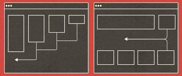
Content Choreography, an interesting approach for giving more importance to content.
Using this method, content placed horizontally should not have to place itself in the same order when transposed. Instead, such content would follow a set of preset rules to place according to the importance of every box of content.
One of the main issues that responsive layouts have is the predictable behavior of boxes when resizing to mobile resolutions (the situation we described above about the wrong placement of advertisements), Content choreography might be a good solution to face this problem. In the image below we can see two stages: the one on top shows the typical horizontal box arrangement transposed to a vertical pile keeping the same order and thus, the foreground ad loses its privileged place and may be hidden on small mobile screens.
The one on bottom shows an implementation that could be the result of applying content choreography: the typical horizontal arrangement is piled up according to its relevance, and then, the advertisement will stay at the top of the V-arrangement, keeping a foreground position irrespective of the resolution of the device which displays the website.
Comparison between regular a responsive implementation and a choreographic responsive implementation.
An advanced implementation of content choreography for advertising was featured by Responsive Ads, and it’s named Stretch. It’s not just changing positions depending on relevance, but also changing ads appearance to display much better in smaller resolutions and keep them displayed in main impression, so that any foreground sponsor’s investment is going to be worth every penny (as the content will keep showing up and the ad will not be lost by a bad implementation of responsive design).
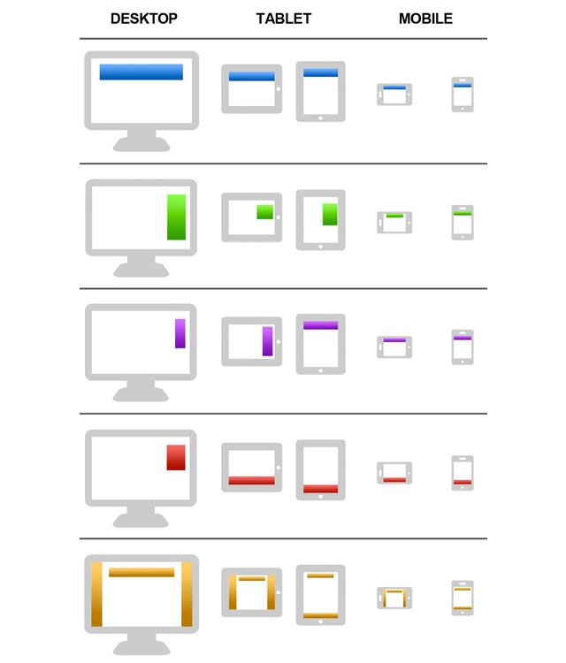
>Different approaches about how ads are smartly positioned on and adapted to screen depending on resolution. [Image Source].
There’s still a long of way to go, and that is why this specialized position should be implemented in the process of web design because when it comes to content, there can be no specific predefined template – each category of content is different and thus it needs different ways to be shown to the audience.
Related Topics
Top