Like an enigma wrapped in a mystery, effective traffic funnel User Experience (UX) design – that actually converts – is the most crucial and yet least understood aspect of web design, and with good reason:
- A pretty-looking web site with an undesirable and/or unclear call to action equates to crappy conversions (and ultimately, disgruntled clients).
- Conversely, minimalistic sites with a clear call to action that speaks directly to the ‘lizard brain’ of the visitor have proven to convert quite nicely.
Hence a high-conversion traffic funnel superbly blends the very best elements of compelling copywriting, minimalistic design, direct-response UX/usability, and neuromarketing into a savory end-user experience.
With this in mind, we’ll be exploring simple, time-proven evergreen methods and strategies that are easy to integrate, yet can produce amazing results (often, very rapidly).
These tips and techniques work equally well with lead-capture pages (aka “squeeze pages”), up-sell sales funnels, down-sell sales funnels, straight-sale funnels (i.e., no up-sells/down-sells), and even really creative “funky hybrid” funnels.
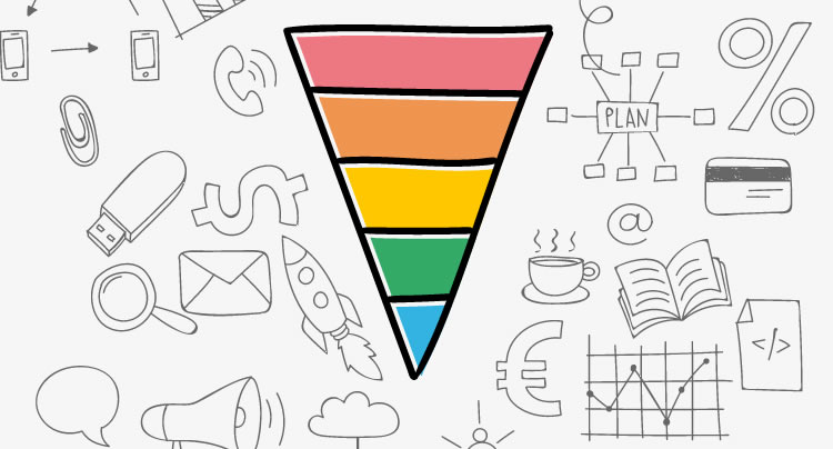
What Exactly Does a Traffic Funnel Consist of?
Although certain multi-stage traffic funnels can be quite sophisticated, at the most basic level it is comprised of three elements:
- A landing page,
- A unified, singular, distraction-free call to action,
- And a well-crafted blend of ‘emotional triggers‘ that compel the visitor to take immediate action (typically either Subscribe or Buy Now) – without coming across as hypish or solicitous.
Essentially, a high-conversion traffic funnel is a delicate balance between ditching the hype, yet retaining all of the excitement of your service or product. While at the same time, empowering your visitors to actually envision the desirable experience you’re offering them at the lizard-brain level.
Hence one of the keys to successful Traffic Funnel design is seeing the beginning from the end (from the visitor’s point of view).
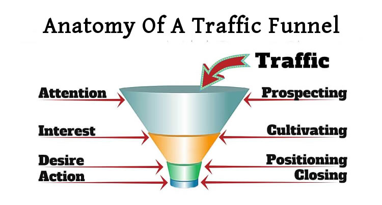
Image via Zolemia.com
Core Traffic Funnel Considerations
Understandably, most highly talented web designers have no real grasp of creating a traffic funnel that converts well. Instead, they create a ‘Mulligan’s Stew’ of sorts by slapping together a bunch of elements that they hope will impress their client (aka “Spray and Pray” method).
For example, many talented Web Designers are still under the illusion that the be-all-things-to-everyone approach is the way to go.
Simply not so.
Given the exact same offer, a minimalistic distraction-free singular call to action landing page will always out-pull a “nice-looking” (yet noisy and confusing) landing page 100% of the time without fail.
So the goal is to create a landing page which:
- Is neither over-hyped nor reads like an obituary,
- Has zero noise and confusion whatsoever.
Always remember – anything that detracts/distracts from your call to action is merely visitor repellent; hence it’s wise to get rid of any hype, noise, and confusion. Which brings us to…
The Four Crucial Questions Landing Pages Must Answer
In no particular order of importance, here’s a brief overview of each:
Question 1: What are you trying to sell me?
Whether a product or service-based offer (or even a lead-generating freebie offer), your concise value statement (aka “value proposition”) is what initially entices your prospect into becoming a subscriber, customer or client.
Think of your value statement like the teaser on the back of a book or a movie trailer. Its sole purpose is to gently lure the prospect in, wanting to discover more about your offer.
As such, your Value Statement needs to address the following in literally just a few short sentences:
- 1 or 2 main results/benefits your buyer, client, or subscriber can expect to achieve.
- What those results will do for the buyer (i.e., how your offer will change their lives for the better).
- Why should they even care about achieving those results.
Question 2: How much?
This is where a lot of creative professionals blow it. Rather than prominently displaying their prices, they instead make their prospect have to jump through one or more hoops just to find out how much.
From the prospect’s point of view, this is a complete turn-off. However, what about service-based offers that are customized/specific to each client, you ask?
At the very least, there should be an easily accessible base-rate menu of “main package” price options, along with key value-added price options, as well, to give the prospect an overall idea of what they’re looking to shell out.
Hot Tip: An enticing call to action along the lines of “contact us with your project details for your own custom quote and get 10% off your work order by mentioning this discount” (or similar) has been proven to increase conversions.
Question 3: Why should I believe you?
While an “about” page is a great place to establish your authority/expertise, equally important is social proof (i.e., testimonials, familiar “As Seen On” icons/logos within your niche, trust seals, etc.)
Question 4: What’s in it for me?
Combined with compelling copywriting skills, this is where neuromarketing comes into play.
By skillfully blending the best benefits and features of your offer together in a way that effectively communicates your story to your prospects ‘lizard brain’… a distinctly visceral emotional response is stirred up within your prospect; whereby causing them to take immediate action right now.
Landing Page Caveats
Several years back, legendary Internet Marketer, Mike Filsaime launched his butterfly marketing script, and accompanying manuscript. Long to short, the core principle behind butterfly marketing always has and always will hold true: Small changes to your traffic funnel can have profound results.
With this in mind, ask yourself the following questions – in the most brutally honest manner possible – as they relate to either your own or your clients’ sites. Start by putting yourself in the ‘shoes’ of a complete stranger visiting your site for the very first time.
Literally be your own worst possible critic, as you take copious notes on improving your own or your clients’ traffic funnels:
- Does your site display any unnecessary content/web elements whatsoever, including a distracting color scheme/theme, banners, irrelevant videos or any other “click me” crap?
- Does your Traffic Funnel design cause your visitors unnecessary confusion (i.e. no clear and concise call to action from the customer’s point of view)?
- Does your site clearly cater to a specific niche audience by properly anticipating your audience’s needs and concerns?
- Do you actually come off as someone who is truly there to help solve your reader’s difficulties (i.e. does your site exude real compassion)?
Ironing out just these ‘wrinkles’ alone will significantly amplify whatever conversions you’re typically used to. And always remember: Small changes can produce dramatic results.
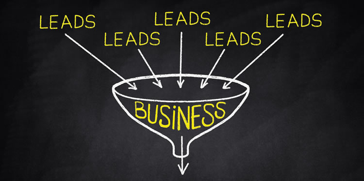
A Brief Word on Squeeze Pages
In the purest sense, a squeeze page is a highly optimized and focused lead generator catering to a specific niche; the top (aka “mouth”) of a high conversion traffic funnel.
The very best converting squeeze pages are the ones that never attempt to be ‘all things to everyone.’
They excel at catering to unique problems and concerns of one specific niche. Think of your squeeze page as your rapport-building mini “solutions provider” that never sleeps and is willing to tirelessly serve your prospects 24/7.
Done right, your visitor is practically salivating to get in on the action.
And unless you have a damn good reason for doing so, your squeeze page should never, ever ask for more personally identifiable info than just an email address and, at the very most, a first name.
Numerous marketing studies over the years have shown that opt-in rates are directly related to the amount of information being collected. When split-tested, just an email address and nothing else generated the highest response.
Opt-in form conversions were discovered to rapidly decline on split tests requesting more than just an email and first name.
After your visitor submits their details, your autoresponder (i.e., Aweber, GetResponse, MailChimp, et al.) then automatically sends them an email shortly after that with an opt-in verification link (aka “double opt-in”).
Right after clicking on the verification link, they are then automatically sent a second email containing the access/download link to the promised goodies (depending on how you set your Traffic Funnel up).
Although there’s a wide variety of different squeeze page strategies, that’s the overall gist of a basic squeeze page.

Maximum Conversion Squeeze Page UX Tips
For maximum conversion, ensure that all of your squeeze pages:
- Serve the sole purpose of getting your visitor to take one very specific action: Subscribe.
- Address the “The Four Crucial Questions Landing Pages Must Answer” covered above.
- Are benefits bullet packed, with zero hype and zero unnecessary visual clutter or “click distractions” (i.e. irrelevant content, ads, etc.)
- Build trust every step of the way.
Aside from your squeeze page offers and premium offers themselves, the aesthetic appeal of your site can help turbo-boost your overall conversion across your entire traffic funnel.
The aesthetic elements I’ve found most effective when at all possible (in no particular order of importance) are:
- Familiar icons, logos and trust seals (i.e. “PayPal Verified” seal)
- Genuine end-user testimonials.
- Alluring eCover graphics.
- A crisp, clean, non-convoluted quick-scan-friendly layout (i.e. your sub-headlines and bulletpoints convey the most important elements of your story)
- A photo of you at the end of your squeeze page or sales page.
- A compact Johnson Box (or equivalent attention-grabber) and Value Statement up at the very top of your offer.
Closing Thoughts
For self-hosted WordPress users, I have found the free version of s2Member absolutely indispensable for creating password protected download pages and membership sites.
Although it does have a premium upgrade version, even just the free version is plenty robust in its own right.
Amongst numerous other highly desirable capabilities, s2Member can be configured to protect individual pages, posts, and downloadable files and limit total downloads to a certain number per day, week, etc.
It can also be configured to seamlessly integrate MailChimp’s autoresponder in the background as a single opt-in lead capture device.
In other words, it can be configured so that there’s no need for your subscriber to inconvenience themselves by having to click a ‘confirm subscription’ link in a secondary email. They simply log in with their credentials as they would with any typical WP site.
Then, once your visitor enters their credentials and logs in to download your awesome freebie offer, they would automatically be re-routed to your “Member Download Page” (automatically protected by s2Member).
Granted, it does take a bit of work to initially get everything set up right, but once you’ve done it as many times as I have, it flows like clockwork, thereby providing a remarkably smooth end-user experience.
Related Topics
Top