My friend is a steel structure engineer – his company has been involved in putting up enormous structures, like the iconic Gherkin in London. If he doesn’t get it right, and something is a few millimeters out, the building can be off kilter and the consequences could be huge. Does being a UX designer carry less pressure?
I definitely thought so. We used to discuss our respective careers, I was designing HR software back then, and I couldn’t see how any of my bad decisions could have any major impact. What’s the worst that can happen, right?
It really depends on which industry you’re in. Sometimes, bad UX decisions can have huge consequences. To prove it, here are five UX mistakes which have cost companies (and taxpayers) millions, and in the worst cases, ended in an entirely preventable loss of life.
1. Icons8 Lose Almost Half of Their Users with a Minimalist Redesign
Icons8 offer access to thousands of free downloadable icons. It’s a great idea, and you’d think they’d know a thing or two about UX – and they definitely do now. In their defense – they learned a lot from what happened…
When they changed their UI, they saw a 47% reduction in the number of people using their ‘icon request’ service. The service allows users to vote for icons to be designed, then the ones with the most votes are created the following day.
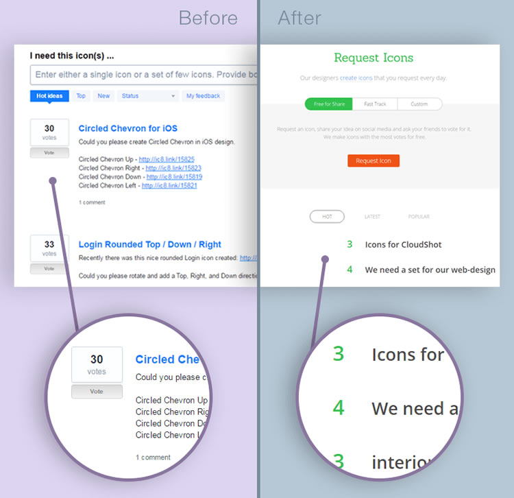
They introduced a new interface that was modern and clean, but actually less intuitive – the actual purpose of everything is less obvious. The original design was very clearly a voting system, showing how many votes there were so far, and where to click to vote. There were also tips on how to request the icon in the placeholder for the text field.
In the second design, all helpful text is hidden. Users have to select ‘request icon’ to see how to do it. Plus there is nothing about the green numbers for each icon to clearly communicate that they are voting buttons as well as numbers.
Finally, the comments for each requested icon are hidden, so users are less motivated to scroll down the screen, having fun by reading other people’s comments, so they are less likely to explore the different requested icons and vote for them.
Icons8 say they have used the experience as a learning curve – by trying to simplify the UI, they actually made it more complicated for users. They plan on finding a new way to indicate votes, will be adding back in the descriptions and will make the request icon service visible on the main page rather than hiding it away.
2. Walmart Loses $1.85m Due to Not Examining Customer Behavior
Following a survey where customers were asked if they wanted less ‘clutter’ in-store, Walmart listened to their customers and spent a lot of time and money radically reducing the amount of inventory and making the stores much more spacious. However, this is also resulted in store sales plummeting by an estimated $1.85m. The team working on the project were fired, and all changes made to the stores had to be reversed.
Although it is good that they were listening to their users, they were asking a leading question. Who would say ‘no’ to less clutter when they don’t know the context?
It’s not a good idea to come up with a hypothesis not based on user research, and then expect to be able to validate it with a yes / no question. Walmart should have examined consumer behavior instead, as they would have noticed, for example, how much people like bargains at the front of the store.
3. The UK Government Wastes £12billion on a Failed NHS Patient Records Management System
In 2002, the UK government embarked on an optimistic program to centralize the entire country’s patient records. Cited in many articles as the ultimate in government IT project failures, it was scrapped in 2011 because of failures to meet targets for usage, functionality, and benefits.

Health Secretary Andrew Lansley said the program ‘let down the National Health Service (NHS) and wasted taxpayers’ money by imposing a top-down IT system on the local NHS, which didn’t fit their needs’. It is unlikely that the required level of user research or testing had been done for a financial disaster this big – more scoping should have been done to make sure the design solution was completely fit-for-purpose.
Hopefully, the UK government have learned from their mistakes. Since 2011 the Government Digital Service (GDS) has been working to transform the relationship between citizen and state and put users first.
I actually went on a UX tour of the GDS offices back in 2015 and was really impressed with the work they are doing. Their usability lab was designed by an expert in the field, Kate Towsey – if anyone was going to encourage people to take UX seriously, it would be her!
4. Nuclear Plant User Bad Interface Design Results in Partial Meltdown
The accident at Three Mile Island Nuclear Generating System on March 28th, 1979 was rated a five out of seven on the International Nuclear Events Scale: Accident With Wider Consequences. There were mechanical failures but these were exacerbated by plant operators not recognizing the situation due to a lack of training and poor UI design.
Coolant escaped the nuclear reactor because a valve was stuck in the open position – this led to the reactor overheating and the release of radioactive gases.
By the time the plant operator raised the alarm, nearly half the uranium had melted. Luckily no lives were lost, but 140,000 people within a 20-mile zone were evacuated due to the radioactive xenon-135 and krypton-85 gases which were released.
So what was the main catalyst of this horrendous incident? It came down to a light on a control panel. The light showed the status of the relief valve. If the light was on, the valve was open and if the light was off, the valve was shut.
At least that was what the employees thought. Unfortunately, the light went out as soon as the computer sent the signal to the valve, telling it to close. The fact that the valve was stuck open wasn’t indicated on the interface, meaning that employees weren’t alerted to the fact that there was a problem with the valve.
So this large scale incident would not have happened if the designer had thought of the context of how this light would be used and had made sure it only went out when the valve was properly shut.
5. Hospital Patient Records System Fails to Highlight Urgent Information
In this case, shared here on Medium, a young girl who had been battling cancer had a relapse and was admitted to hospital. She was given a strong chemotherapy treatment that required hydration for three days with IV fluid.

Three different nurses were looking after her, using charting software which told them what they needed to administer. The software UI was not clear and easy-to-read, and the nurses missed the information about IV hydration, meaning she tragically died of toxicity and dehydration.
It is inconstruable to believe that this girl died just because a user interface was too complicated to read. There are options that can be used to alert people to important information, e.g. different color codes, flags, warning messages, or possibly even a step-by-step wizard to make all instructions are followed correctly. As the second example of poor UX coming from the healthcare industry, it certainly seems like an area that needs our help as UX designers.
Conclusion
So considering the severity of these stories, what can UX designers do to learn from these mistakes?
If you only do three things:
- Ensure user research is thorough – never assume that you know how something needs to be used. Make sure you know the full context – backup quantitative data such as surveys and your assumptions with qualitative research such as user interviews and field studies. Observing for yourself first hand is the best possible type of user research. Read more on user research here.
- Look for pain points in existing user journeys and throughout the design process. It is unlikely that any idea will be perfect first time so be prepared to iterate. Talk through ideas with the whole team using personas to make sure solutions work for everyone.
- Perform usability testing in natural surroundings, including ideally a pilot with a small number of people. Are there any areas that people just don’t get or are there any recurring issues that can be eradicated? If tempted to cut corners to make it easier for the development team or to save costs, remember these cautionary tales, think about how the interface will hold under stress, and think about the gravity of the consequences if things go wrong.
Related Topics
Top