Think of your favorite song. In all likelihood the sound rises and falls throughout, the pace quickens and slows, and the rhythm and melody lead you to hear chords and notes that are about to be played. Music has a flow that guides you from one moment to the next. This flow can impart different emotions and have you feeling different things at different parts of the song.
In fact, without that flow, there is no music.
Visual design has a flow as well. You have something to communicate and you want your audience to take in different parts of your page. Some elements of the design are more important and you want to make sure they’re seen right away, and some elements of the design are best seen after having first seen a different part of the design.
You also want to do what you can to keep people inside your design and not let their eyes fall of the page or screen. Just like a river carries what’s in it along it’s path, you want your design to carry your audience through it and guide them where you want them to go.
What is Design Flow?

Design flow (also referred to as movement or direction) is the way the eye moves or is led through a composition. It’s a way for you to control where someone viewing your design looks first and a way to guide their eye where to look second and third. It gives you a mechanism for making sure key information is seen.
Typically in a design you’ll create what’s known as an entry point. Something that stands out from everything else so that most people looks at it first. From there you’ll create lesser focal points that stand out, though not as much as the entry point. These points will be the most important information in your design and through different techniques you lead people from entry point to focal point to the next focal point.
Done well your audience will flow from point to point with a momentary rest to absorb your key information.
How to Control Flow in Design
Our design elements offer visual cues about the direction the eye should follow. Some of these cues are obvious. It’s hard to see an arrow and not look in the direction it’s pointing. Some of these cues are not so obvious. Repetition in color, shape, and size create a path that can pull you to move in a certain direction.
Some obvious directional cues include:
- Arrows – again it’s difficult not to visually follow the direction an arrow points
- People/Faces looking in one direction – similar to arrows when we see a person facing or looking in a given direction, we tend to also look to see what they’re looking at.
- Perspective – creates strong visual cues to follow. By it’s nature perspective creates a direction that begs to be followed. If all roads lead to Rome, you’re going to end up in Rome at some point.
Obvious directional cues don’t need much explaining. You want someone to look to the right you draw an arrowhead pointing to the right. You want someone to look at a certain spot you create a vanishing point in that spot.
Less obvious cues are more interesting and you’ll need to use them. You can only use so many arrows or have so many images of faces on a page.
Let’s start with the idea of creating a hierarchy of focal points with an entry point sitting at the top of the hierarchy. Consider Kandinsky’s Composition VIII seen below. The large black circle in the upper left is the entry point into the painting. It’s the first thing you notice.
It’s larger and darker than anything else on the page. It holds more visual weight than any other element in the painting.

Your eye possibly moved on to the circle in the lower left and from there started following some of the other circles along the bottom. These smaller circles carry less weight than the dark one we started at, but they still carry more weight than many of the individual elements in the painting. They pull you toward them and once there your eye rests momentarily before moving on to the next.
Lines and curves are another way to lead the eye. Look at the green circle in the lower right of the painting. There are a number of lines near it that pull your eye up through the painting. The long line to the right of the circle meets with other linear shapes that are parallel in direction. There’s a good chance they pull your eye to the top. Maybe to the point of the triangle.
To the left of the triangle near the top are two curved lines with some perspective. They lead your eye to the light blue mass between the triangle and our entry point circle. In fact the more you move around the painting you can find lines and curves that guide your eye from one element to the next.
I mentioned that repetition can create flow. We see repetition in the circular shapes and in blue, yellow, and green color. The repetition creates implied lines and curves between elements for your eye to follow.
One last point before we leave the painting. Another thing I mentioned above is the idea of keeping people inside your composition. Look anywhere along the edges of the painting and you’ll find something that leads your eye back into the painting. Kandinsky does a wonderful job of keeping us inside and moving from one area of the painting to the next. It’s a great example of compositional flow.
Using Space to Control Flow
Space can imply flow in a variety of ways. The space between elements creates paths of emptiness much like footpaths through a forest of garden. An element with visual weight calls for you to rest your eyes on it. Space gives you room to move around elements.
Active (asymmetrical) space is dynamic and creates motion and flow. The space emphasizes a direction. Your eye initially takes in the whole design and then is drawn toward the positive elements and away from the empty space. A single element in a sea of empty space sits in the foreground implying that the space recedes into the background creating a direction toward the back of the design.
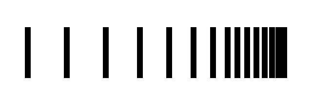
Varying the space between a series of elements can be used to create a rhythm and a motion in those objects. Consider the image below. The space between the lines implies a movement to the right where the lines begin to get closer to each other and come to rest.
Creating Harmony in Design Flow
It’s important that the flow of your design elements work together. You want the flow of individual elements to be in harmony to create a compositional flow throughout your design. If you want someone to see a block of text on the right you don’t want the elements around it flowing to the left.
Let’s look at a series of images, each with an obvious flow in direction and see how well the flow is in harmony across elements.

In the image above the flow of the elements is in disagreement. The arrows are pointing to the left, while the text is pulling us toward the right and the strongly aligned right edge.

We’ve improved things in this second image. The text is read from left to right and the arrows also point to the right. The elements clearly all flow to the right, however the strong flow in the arrows leads viewers off the page. They may or may not see the text at the bottom.

In this third image we’ve reversed the sides of the arrows and text blocks. The stronger flow from the arrows leads people into the text blocks and everything flows to the right. However, there’s still nothing to prevent viewers from leaving the page.

In this last image a simple vertical line has been added along the right. This line should keep people inside the page and more than likely the eye will flow down the page to the text at the bottom.
Examples of Flow in Web Design
We’ve looked mainly at a work of art in our discussion of flow, but since this is a post on design flow perhaps it would be a good idea to look at the design flow of some websites. Each of the sites below uses flow in some way to direct you toward the important information that needs to be communicated.
Zoran Perin

The first thing you notice in Zoran Perin’s design is the large red shape. It’s perfect for an entry point as it serves as the background for the designer’s name and what he does. The triangle on the right side of the shape works as an arrowhead directing your eye to the right where it will come to rest on the photo of Zoran.
I might have reversed the photo to have Zoran looking to the left since after momentarily resting on the image your eye would follow Zoran’s eye back into the content. The design attempts to pull you back to the left with the red background behind the word trivia passing through the content.
Old Guard

If you can look at Tom Johnson’s site and not land on the large green circle I don’t know what to say or what else you’d possibly land on. Your next stop should be the welcome text to the right. It’s the largest text on the page and the company name is the same green as the circle. From there you move down through all the ways to contact Tom on your way to the circles in the lower right.
Notice the words “Say Hi,” which make sense after having moved through the contact info. From the lower right your eye should be pulled back up and to the left toward green circle allowing your eye to find and read the content.
Alec Soth

Alec Soth’s site is a good example of how whitespace creates direction. All the space to the right leads you to the left and the content. The ragged right edge to the text along with the horizontal line at the top also gives the impression everything is moving left, further drawing your eye in that direction. Alec’s name is the most likely entry point and from there the strong vertical left edge and the repetition of the color red pulls your eye down through the content.
Definium

There might not seem to be a flow to Definium’s site on first glance, but there certainly is a flow to the design. We have two elements near each other which might serve as an entry point. The dark black rectangles or the red circle below. Both compete for attention creating tension. Your eye will move quickly to that area and settle on the black rectangles.
There may not be an automatic direction you follow at this point, but the design does flow between elements and keeps you within the design. You might look up toward the upper left corner passing through the company name and tag line. If so you’ll be stopped at the corner and directed back toward the black rectangles.
The rectangles also lead your eye to the right falling on the latest blog post excerpt and the navigation. At this point the red circle comes back into play drawing you to the left and through the content on the page.
I am Docto

Victor Toyenz’s site has two possible entry points, being the two circles at the opposite corners. The darker mass and the position of the one in the upper left is the more likely entry point. From there you move horizontally through the welcome message before moving down to the circle in the lower right.
The curves of the circle give it motion. Your eye probably follows it around clockwise and leaves the circle to move back over the content.
Zachary Pullman

There’s a nice horizontal flow to Zachary Pullman’s site. From the logo (the entry point) to the welcome message and repeated in the strong horizontal line and the 4 columns below. Your eye moves left to right and down to the next row, finally coming to rest on the call to action and contact information in the lower right.
Summary
Our goal as web designers is to communicate. While we want our viewers to read and notice everything on the page, it’s most important to make sure they see and absorb our main message. Flow can help ensure your visitor passes through the elements that impart this key information.
Ideally we’ll create an entry point leading people to the most important information on the page and then create a flow and motion through our design that leads them to rest on the next most important information and then the next most important information after that.
Even if no one ever reads the prose on the page you can still communicate the message that needs to be communicated. Those that are interested will read your main content. Those that aren’t will leave, but not before they know what your page and site is about.
Think about what your page needs to communicate before designing and use focal points and flow to communicate your message to your audience.
Related Topics
Top