Nothing gets the creative juices flowing quite like redesigning a popular, well-known site. Reimagining how a site, app, or brand identity would look can help to show the product in a different light, and can help get you thinking about why certain design decisions are made.
While unsolicited redesigns can sometimes bring controversy, they can help to show how a design can be made more user-friendly, intuitive, and useful.
Of course, it’s hugely important to mention that there are many, many reasons why a design ends up looking the way it does. A site that may appear to be awkward to use may look like that because the company has other requirements other than usability.
Perhaps they need to display adverts in order to keep up their service, or need to encourage user sign-ups – and promoting that may be more important to them than quicker access to content.
In either case, unsolicited redesigns need to be sympathetic to the idea that the current design looks the way it does because of a lot of different factors.
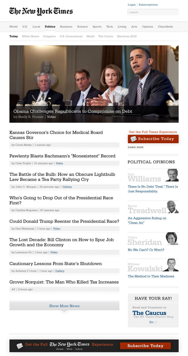
New York Times Redesign by Andy Rutledge
Andy Rutledge recently courted quite a lot of controversy over his unsolicited redesign of The New York Times site. He may have been somewhat brash with his statement that “news was broken”, but his redesign does show an interesting, user-friendly take on what the New York Times could look like if it was to focus heavily on usability.
The Redesign
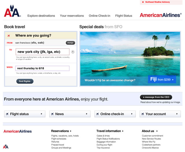
American Airlines Redesign by Dustin Curtis
One of the most famous unsolicited redesigns is that of the American Airlines site by Dustin Curtis. Fed up with the hard-to-use site, Dustin offered a much cleaner and simpler site. I especially love the “wouldn’t Fiji be an awesome change?” box, which is suitable for people who just want some inspiration as to where to go.
The Redesign
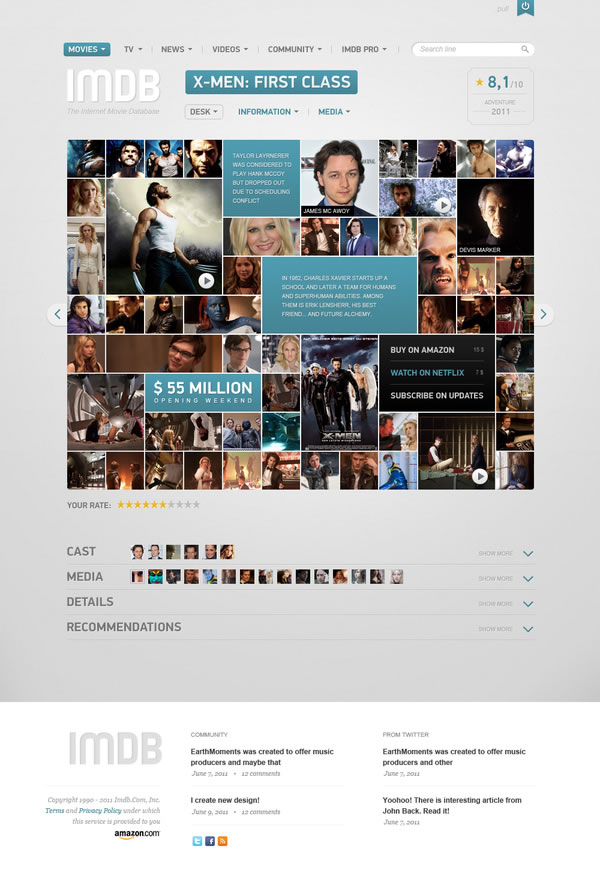
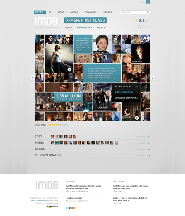
IMDB Redesign by Vladimir Kudinov
This unsolicited concept by Vladimir Kudinov for what the IMDB could look like is a huge change from the current site. It’s hard to say whether it’s more usable or not, but it’s certainly a striking change – key pieces of information stand out visually in a tiled display, similar to the new Windows phone interface, and more detail can be drilled down to.
The Redesign
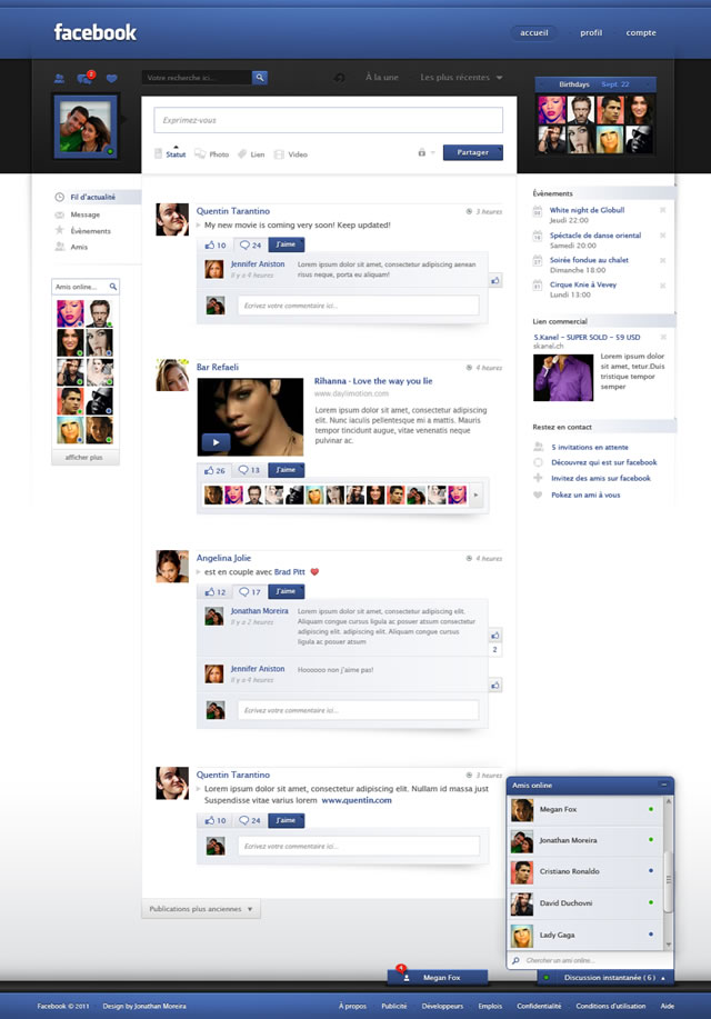
Facebook Redesign by Jonathan Moreira
This unsolicited redesign of Facebook by Jonathan Moreira is extremely elegant, clean & clear and helps to differentiate different pieces of content beautifully. For example, the birthdays on the top-right of the page really stand out, the search bar is given more prominence and a greater use of white-space helps to separate out the news feed in a clear, comfortable way to help give the content more room to breathe.
The Redesign
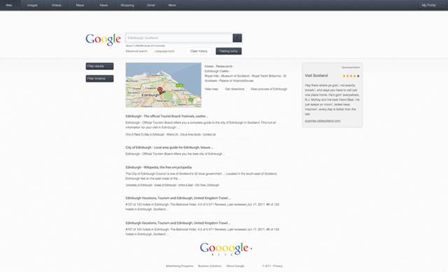
Google Search Redesign by Craig Reville
Craig Reville’s re-imagining of the Google homepage and search results pages offers a cleaner, more minimalist take on the current search engine. While not everyone may agree with the redesign (I’m personally not a fan of the font color being the same for everything in the search listing), it does offer a nice, uncluttered interface which could potentially be more usable.
The Redesign
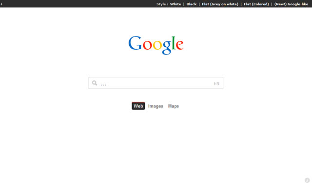
Google Redesign by Frenchlabs
Now is probably a good time to also mention the impressive live redesign of Google’s homepage by Frenchlabs. Try hovering over the logo to switch to other search engines, like Wikipedia and Amazon.
The Redesign
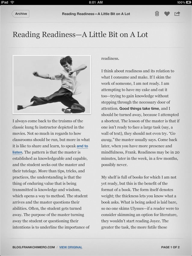
Instapaper iPad App Redesign by Tim Van Damme
It’s not just websites that attract unsolicited redesigns – Tim Van Damme’s interpretation of the Instapaper iPad app is particularly impressive, with more space separating the content out, and having the content fed into a two-column layout so that it appears more similar to a newspaper article. It’s important to mention that, while this design looks fantastic, it may not be technically feasible to determine how to split that content into two columns automatically (amongst other things).
The Redesign
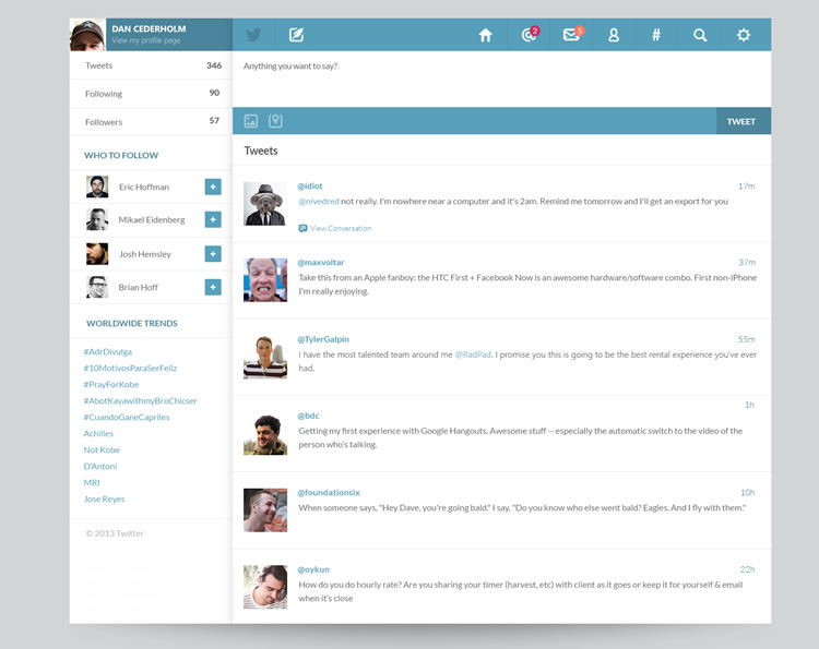
Twitter Redesign by Bluroon
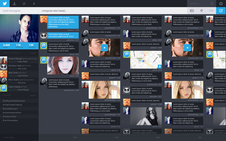
Twitter Redesign Concept by Zsolt Hutvagner
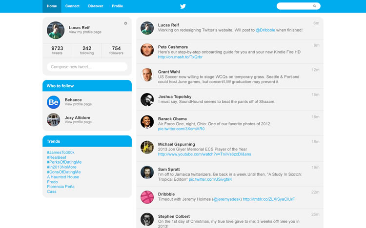
Twitter Redesign Concept by Lucas Reif
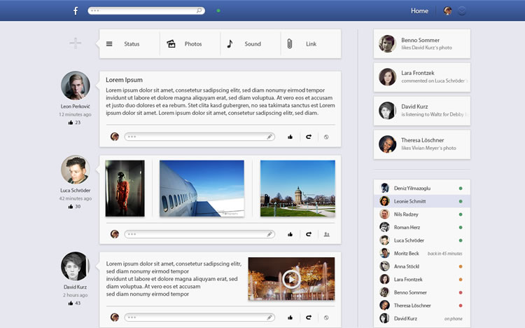
Facebook Redesign by David Samuel Einenkel
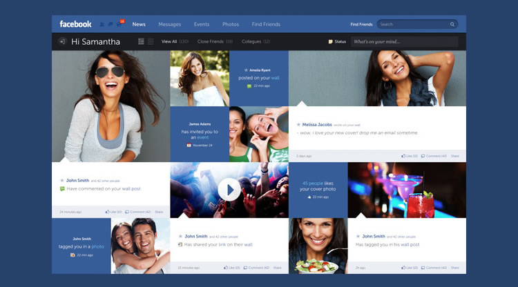
Facebook – New Look & Concept by Fred Nerby
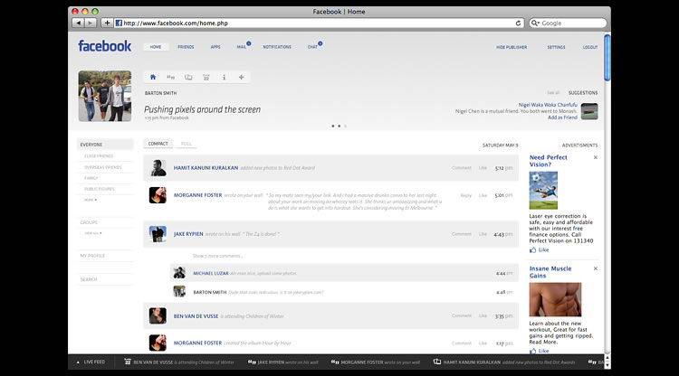
Facebook Facelift by Barton Smith
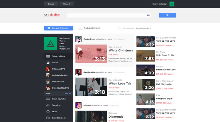
Youtube Redesign by Alex Tapein
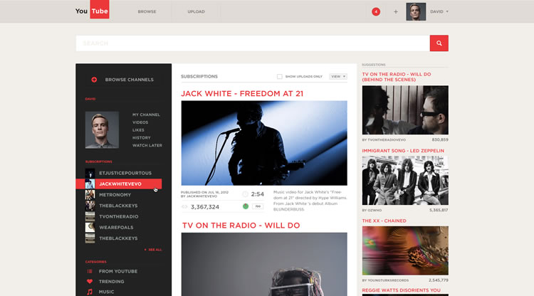
Youtube Redesign by Charlie via Issland
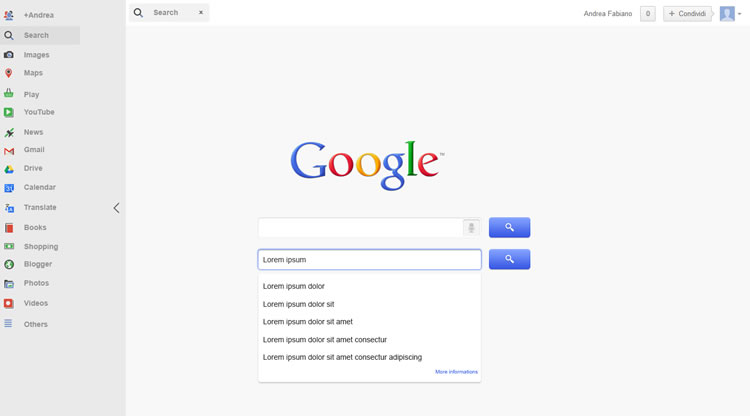
Google Redesign V2 by Andrea Fabiano
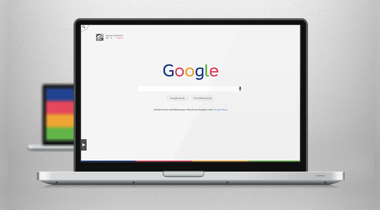
Google Redesign Concept by Ayman Shaltoni
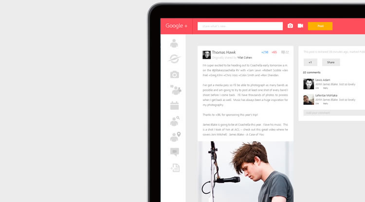
Google+ Redesigned by Shadman Ahmed
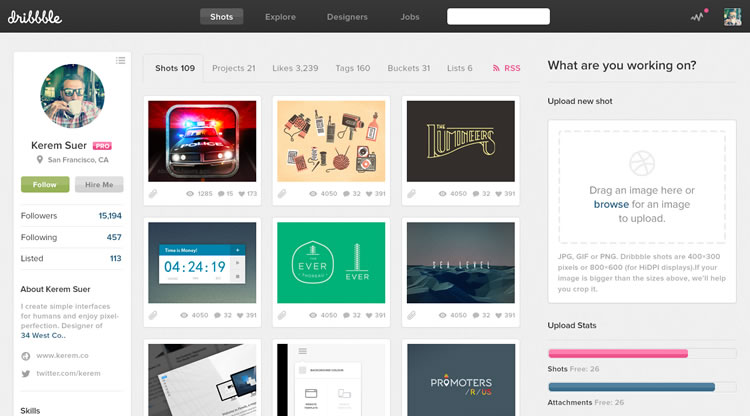
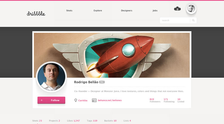
Dribbble Redesign by Paresh Khatri
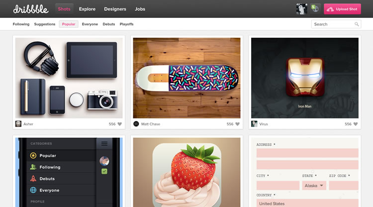
Dribbble Simplified by Kuba Stanek
Dribbble Profile Redesign by Jan
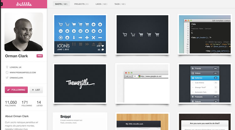
Dribbble Redesign by Felipe Mendes
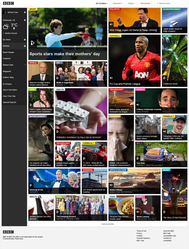
BBC Website Redesign by Michael Coyle
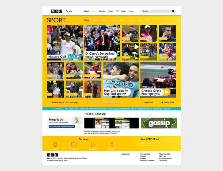
BBC Sport Re-Imagined by Jesse Payne
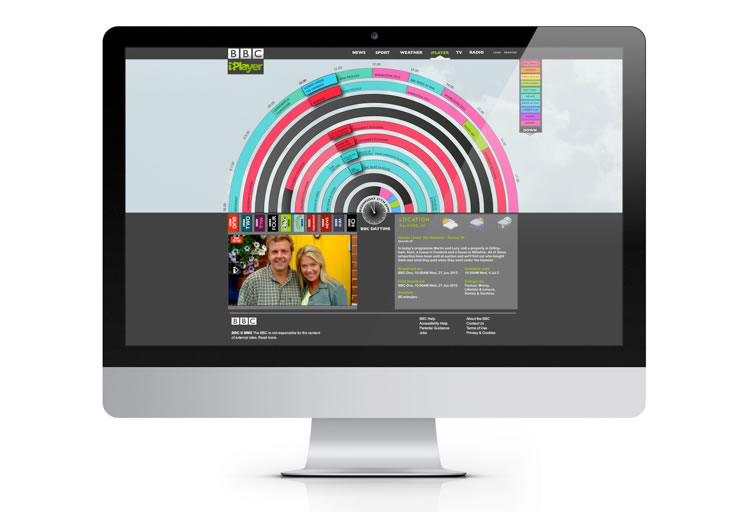
BBC iPlayer Redesign by Steven Harding
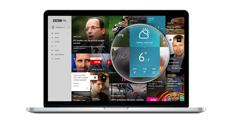
BBC Me Concept by Dmitrij Paškevic
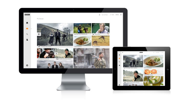
BBC Suitcase by Joshua Ogden
IMDB Filmpage Concept by Vladimir Kudinov
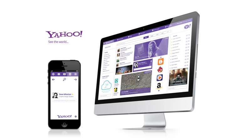
Yahoo! Redesign by Dave Wharton
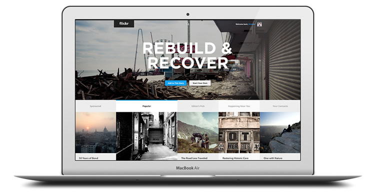
Flickr Redesign by Dickson Fong
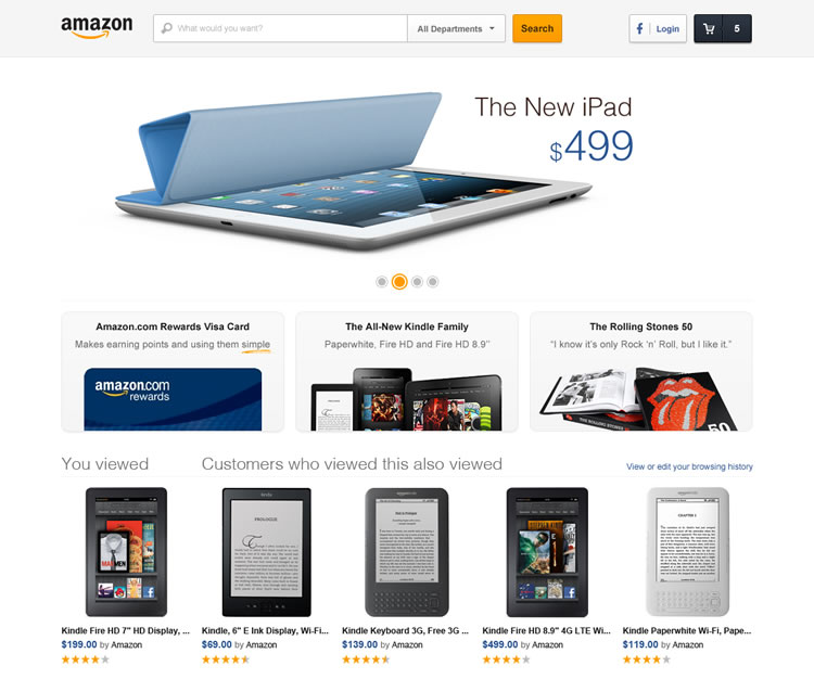
Amazon Concept Redesign by Altay Suna
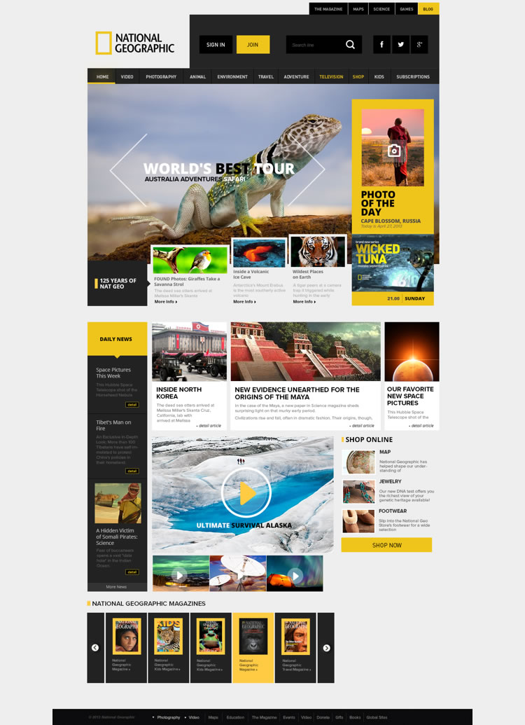
National Geographic Redesign by Enes Danis
Conclusion
Ultimately, unsolicited redesigns shouldn’t necessarily be seen as criticism for the original design – don’t forget that there are countless (non-usability) reasons that a design may look the way it does – but there’s nothing stopping designers from sharpening skills and being creative by redesigning and reimagining famous sites, apps, logos & icons.
Related Topics
Top