Content sites, such as blogs, article directories, image galleries, video galleries, etc. are a major category of sites and if you haven’t designed such a site until now, you can be sure that sooner or later you will. Designing a content site is in many aspects easier than designing a corporate site but it has its specifics.
Most of the usability rules for content sites might seem obvious but if you have designed mainly corporate sites, the switch might be an uneasy one. In order to assist you in the transition, here are some rules to bear in mind. These rules are not arranged in order of importance because if they were, there would have been 3 or 4 Number 1 positions, 4 or 5 Number 2 positions, etc.
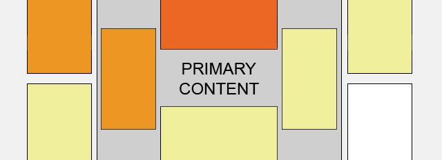
1. The Content Is the Centerpiece
This rule sounds just like common sense but since we seem to (sometimes) miss it, let’s start with it. Basically, it means that your content, be it articles, images, videos, etc., is in the very center of the page (above the fold, of course) and is the first thing users see when they land on your site. Some webmasters are tempted to place ads in this place because this presumably increases their earnings but since content is the reason why users come to a site, I doubt this strategy works well in the long term.
 Image Credit: Word collage on black on ShutterStock.
Content sites usually have hundreds or even thousands of pages and if the site navigation is inconsistent, it is very easy to get lost. This is why you need to be consistent in
your navigation. For instance, always include a Home link. It is even better, if you include one Home link in the menu at the top and one more somewhere at the bottom of the page.
Consistency in navigation also means to have the same navigation items in the same place on each page – i.e. to page specific menus or menus that change their place on different pages. Additionally, always use the same menu items on each page. In those cases, when you use section-specific menus (i.e. an expandable second-level menu with items specific for the particular section), make these consistent (i.e. use the same menu items for all the pages in that section), too.
 Image Credit: Compass on ShutterStock.
3. Make the Text Readable
Another common mistake I’ve noticed way too often, especially with content sites with a lot of text, is the use of small font sizes. It is true that 8px or 10px font size allows
to accommodate lots of text on one page but this is at the expense of readability. At such small sizes, the text is barely readable and for long chunks of text, it becomes a huge strain on the eyes. Of course, you can’t please everybody but if you give users the option to resize the text as per their liking, this is enough.
Long lines of text are another readability nightmare. If necessary, use two columns of text, but don’t have wide columns because they are harder to read, especially with smaller font sizes. On the other hand, two columns, when they are longish and require vertical scrolling aren’t better, so you need to avoid this as well. Fortunately, in addition to your main content, you usually have other items on page, for instance one or two columns with ads. These also take space and basically the content space gets limited anyway, so there might be no need to use two columns for text.
 Image Credit:Lupa.
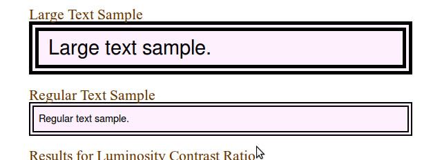
4. Pick a Good Contrast Color Scheme
In addition to font sizes, the color contrast also affects text readability. Low contrast text could do for headlines but for body text, it is totally unacceptable. This contrast calculator is an indispensable helper when wondering if the color scheme you plan to use provides enough contrast or not.
5. Always Show Related/Similar Items
As a rule, on a content site, there are many similar and/or related items. No matter how good your navigation is, don’t leave it to users to search for them the conventional way. Always show related/similar items for a content piece. For instance, if you have an image gallery and the user is on a page with palms, you can show other tropical paradise photos. Similar/related items not only ease the user but they also increases pageviews as well, so it is a win-win.
6. Test Cross-Browser
Cross-browser issues are a problem with content sites, too. While it is best if your content site displays perfectly in every browser you can imagine, very often the effort is
not worth the reward. Therefore, it might make no sense to strive for perfection but always make sure that at least the major functionalities display properly. For instance, if the thumbnails don’t display in a major browser, or the Resize Text gadget doesn’t work, this is unacceptable and you need to fix it.
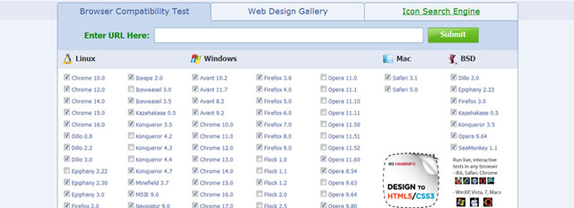
One good tool you can use for cross-browser testing is Browser Shots. This tool will give you an idea how your site looks across various browsers and operating systems but you can’t test functionality here – i.e. if JavaScript is not working in some browser you won’t know it from this tool.
7. For Images, Use Thumbnails
Another rule that usually goes in the common sense category is to use thumbnails for images. However, when I say thumbnails, don’t take it literally. A thumbnail the size of a
thumb nail is basically useless because it doesn’t show clearly what the image is about. Use large thumbnails – this is what helps. For instance, Morgue File is one of my favorite stock photo sites but it used to have really tiny thumbnails (or maybe they are still using the same size but I simply got used to it?) where I couldn’t see what the picture is about. When a photo has lots of objects, you won’t see much detail in a thumbnail anyway but when you can’t see what the image is about, then what’s the use?
8. Optimize Your Pages to Load Fast
Most of us have fast Internet and fast computers but this doesn’t mean we enjoy a page that loads forever. For article pages, load times are usually less of a problem simply
because all equal articles are text and unless there are dozens of images or videos in the article, it loads more or less in seconds. Sometimes the load times are slow because of the load times for ads and in this case you might have to switch to an ad network that can serve fast.
However, with images and especially videos, it is a different story. Even when the image/video itself is small and/or compressed, when there are dozens of them on a page, this leads to slow load times. One approach is to manipulate the images/videos themselves, so that they are optimized for fast loading. Another approach (in addition to, not instead of the first) is to allow the user to choose how many images/videos per page to be displayed. This way users with fast Internet/PC, will be able to load more images at once rather than scroll through numerous pages, while users with slow Internet/PC won’t have to wait for ages for a single page to load.
9. Take Ads into Account
The presence of ads is another huge difference between a company site and a content site. Unlike company sites, content sites are usually monetized, so no matter if we like it or not, ads are here to stay. It is not an exception, though it is hardly admirable, for ads to take half or more of the space on a page. What is more, they usually take some of the best spots because there they are more visible and the revenue is higher. Additionally, as I already mentioned, ads take time to load and you can’t neglect this either when you think about the usability of your content site.
10. Don’t Forget to Include a Good Search Functionality
One more item that is more or less mandatory for a content site is a good search functionality. While it is common to have search functionality, it is even more common to have bad search functionality. In 2012 it is still way too frequent to find sites with poor search functionality – i.e. the search results you get are totally irrelevant. This is not only irritating but it also makes you lose visitors.
Of course, many users know they can use Google to search for results from a particular site only but don’t rely on this alone. Yesterday I was trying to find something on a site I used to frequent in the past but their search returned unusable results. To make things worse, the pages they had indexed in Google weren’t an option either because when clicked, they were redirecting to the homepage of the site. I guess this was something to do with the URLs they used, or with poor redirection but the result is that I couldn’t find what I wanted even with Google.
The site I was browsing was mainly an article site and still it was pretty depressing. I guess with images/videos the task is even harder because their contents doesn’t get indexed by Google directly. This means the site master must provide meaningful text descriptions of images/videos to be used for searches. I agree this is extra work but if you care about your users, don’t skip it.

11. Make Your Site Mobile-friendly
Finally, since we live in 2012, you can’t afford to miss mobile users. While it is best to have a separate mobile version of your site, in many cases it is not worth the effort. But if you do have lots of mobile traffic, or your site is in a niche that is popular with mobile users – i.e. news, stock quotes, ring tones, etc. – go the extra mile and make it mobile-friendly, or even better, create and maintain a separate mobile version.
Rounding-Up
Usability and user experience is something we frequently forget about but they are even more important than astonishing designs. Of course, you can never make all your users happy, even if your site is a usability masterpiece but if you don’t stick to the basic rules at least, then you certainly aren’t doing a great job. I am perfectly aware that there is much more to know about how to make a content site usable but I hope that even this small bunch of usability tips will help you make your sites more usable and more professional.
Related Topics
Top