We’ve all been in that position where we know what we want our text to look like, but just can’t seem to find a font that matches what’s in our heads.
Maybe you want a particular look for the title of your new novel. Or you think that your grandfather’s handwriting would be perfect for that family tree you’re creating. Whatever the reason, you need those unique letters that just don’t seem to exist as a font choice.
Well, stop clicking through all those pre-made fonts right now and start paying attention, because this post aims to show you how you can make your own. And don’t worry if you’re not the most technologically-capable person in the world. This step-by-step tutorial will make everything quick, clear, and easy.
Your Font Utility Belt
Just like Batman loads his utility belt up with the perfect gadgets for each mission, you’re going to want a couple of different “gadgets” of your own to do this right. Some of the items on this list can be a bit pricey, but there are ways to avoid the cost if that’s an issue. Just remember that there’s always a tradeoff, and “free” doesn’t necessarily mean “easy.”
Let’s start with the one and only thing you absolutely have to have to create your own fonts: font-making software. Several very good programs can be purchased that are quite user-friendly and simple to use.
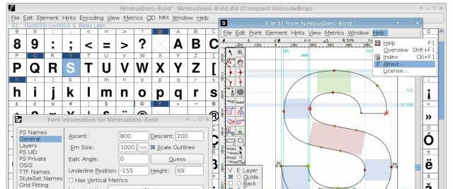
Of course, you can immediately see the drawback in these programs – they aren’t cheap! But I said that there was a way to avoid the cost, and there is. For those who are more technically inclined, there’s a wonderful piece of freeware called FontForge that’s available for download from their website.
On the same site, you can find instructions on how to install the program on Mac, Linux, or Windows (PC users should take special notice of the Windows how-to, because it’s not as straightforward as you’d think), as well as a tutorial on using the program once it’s up and running. If you decide to go with FontForge because of the price tag (or lack thereof), I highly advise you to check out the install procedures and the tutorial – it will save you lots of time!
Besides a font-creation program, there are two other pieces of equipment that can be helpful when creating fonts. Both are optional, though, depending on the method by which you want to create your fonts.
The first of these optional pieces of equipment is some kind of professional design software – or, rather, two different kinds of professional design software. Why two kinds? Because raster graphics software like GIMP and Photoshop is useful for image editing, and programs like Inkscape and Illustrator work in vector graphics software for the actual creation of the letters in your font.
Finally, you will need to have a scanner handy if you want to draw the font by hand and import it into a digital file to turn into a font. The reason this is optional is that you don’t have to draw the font by hand – it can be created completely inside of your font-creation program by drawing the Bézier curves yourself. This makes it faster, but doing this isn’t easy, so it’s not recommended for beginners.
And since this is all about teaching beginners how to make their own fonts, I’m going to assume that most people will be drawing the fonts first and scanning them in, so that’s where we’ll start with the guide.
Step 1 – Draw
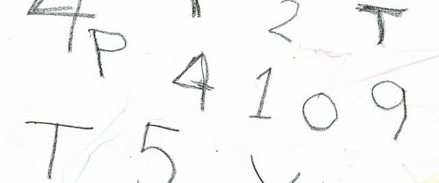
You’re going to want to use a piece of white paper and a black marker when drawing the letters for your font. Most people want to just dive right in and go in alphabetical order, but there’s a little-known trick by font makers to create the letters H-A-M-B-U-R-G-E-V-O-N-S first and then move on to the rest.

Why? Because every other letter can be adapted from those letters, so it makes their job easier. For example, H easily becomes I, two Vs equal a W, and removing some of Es appendages quickly turns it into an F or an L.
And don’t stop at the typical 26-letter alphabet. If you want, go ahead and draw unique numbers, punctuation marks, and accents so they fit in with your font.
Step 1a – Steal
Okay, don’t steal, but there are public domain alphabets out there (Dover Books are a great source) that you can take and adapt to fit your needs. For those who aren’t exactly artistically inclined, this is a great way to get around the hardest parts of that hurdle and still get the font you want.
Oh, and remember grandpa’s handwriting you wanted to use? Just find an example of every letter of the alphabet in his writing. You can either trace each letter to put them on the same piece of paper or scan them in from the original document.
Step 2 – Get scanning
The best scanner settings for fonts are bitmap or grayscale at a 200% zoom (or higher) and a DPI of at least 300. Once you’ve digitized the alphabet and can work with it on your computer, use GIMP or Photoshop to smooth out any mistakes or rough lines and generally just make everything look cleaner and crisper.

Image Source
Step 3 – Vectorize
After you’ve cleaned up your alphabet to the best of your abilities, you’re going to need to convert the shapes to vector graphics. There are two possible ways to do this in Photoshop, but neither one will be preferable or easy for most people.
The first method requires you to have an older version of Photoshop that will allow you to make paths around your letters with the Magic Wand and then Export Paths to Illustrator. The second method is to use Photoshop’s Path feature and manually draw curves in with the Pen tool. While this method does give you the best results, it is also incredibly time-consuming, and probably not worth it for most people.
So, what if you don’t have the right version of Photoshop and can’t use it – does that make your job harder? On the contrary; in this case, it’s actually easier. Just open Illustrator version CS2 or higher and utilize the Object > Live Trace tool, and you’ll be done in no time.
Step 4 – Cut & Paste
Now we’ve finally gotten to the point where you can start using your font-creation program. The first thing you need to do is cut and paste the vectors you created in either Inkscape or Illustrator. That’s it – your font is now in the program and on its way to being created.
Remember, it’s also possible to skip the other steps and design your font in one of these programs – the problem, as mentioned earlier, is that drawing those Bézier curves in by hand is not easy.
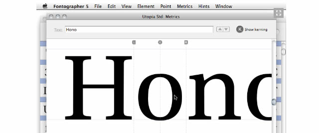
Step 5 – Define the Spacing
How far apart should your “A” and “W” be? What about your “B” and “Z”? In typography, the process of deciding what the spacing between letters should be is called kerning.

In general, your goal should be maximum readability, and unfortunately, there are no hard and fast rules saying what this spacing should be because it’s different for different fonts. The easiest way to figure it out is to simply engage in some trial and error and see what looks best. Some programs have an “auto kern” function, but I recommend that you still double-check it if you use this feature in order to make sure you’re happy with the results.
Step 6 – Format & Export
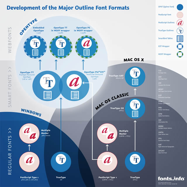
Before you can export your font, you’ll need to choose a format. The standard in the industry is OpenType, and unlike some older formats, it works on pretty much everything – Windows, Linux, and Mac platforms. Most of the time, this is the one you should choose, but it’s up to you.
Step 7 – Install it, Use it, Love it!
The only thing left to do is install the font. If you’re not sure how to do that, here’s a how-to for Windows and one for Linux – Mac OS X has native support for OpenType fonts.
Related Topics
Top