A growing trend in web and UI design lately has been the use of “flat design,” and it’s clearly a hot topic at the moment – full of lively discussion and plenty to learn about.
I’ve always been drawn to minimalism, so the flat design is an aesthetic that has inspired me, especially while working on the recent redesign of QuoteRobot, the proposal writing app I co-founded back in 2010.
In this article, I’m going to talk about what flat design is, review what other designers are saying about it, and offer some tips on how to achieve it in your own designs.
What Is Flat Design?
In practical terms, flat design means designing without the usual gradients, pixel-perfect shadows, and skeuomorphism that’s been rampant in recent years (more on this later) to achieve what appears to be a “flat” interface.

Allen Grinshtein of Layervault may have coined the term “flat design” originally. In an article that trended on HackerNews, he said…
“Well-loved products on the web share a similar design aesthetic, with roughly the same kinds of bevels, inset shadows, and drop shadows. For designers, achieving this level of “lickable” interface is a point of pride. For us, and for a minority of UI designers out there, it feels wrong.” ~ Allan Grinshtein (Layervault)
If you take a look at Layervault, it’s beautifully designed in its simplicity, even without the use of extra design details that we, as designers, often work so hard to achieve.
It’s interesting to learn and look at the gradients and styles we apply as a current trend in UI design, one that is potentially changing.
Examples of Flat Design
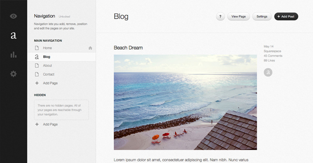
With the new version of Squarespace, they’ve opted for an almost completely flat interface. You can really tell the time they spent wireframing and working out the UI. It’s quite complex but still easy to navigate.
Although I haven’t used LayerVault myself, from what I’ve seen, the new flat UI looks really simple and easy to use.
Facebook has almost always embraced a flat design aesthetic – only lately introducing some slight bevels.
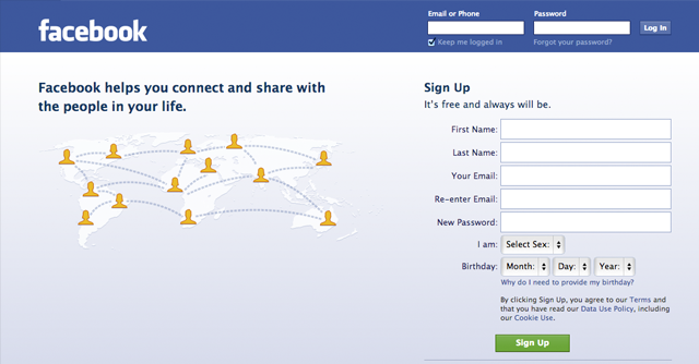
“Facebook is the perfect example of interface trending towards flatness. Their major actions buttons still have a slight bevel, but lots and lots of the secondary actions are completely flat. And judging by the fact that they haven’t changed their interface style, it must be working.” ~ Ian Storm Taylor (Segment.io)
Even though they’ve been criticized over the years for making many changes to the interface, it’s one of the most used websites on the internet, and hey, millions of people can’t be wrong.
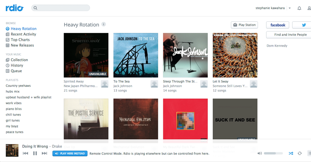
The latest Rdio interface is so flat and minimalist. It’s almost completely without shadows, gradients, or even colors.
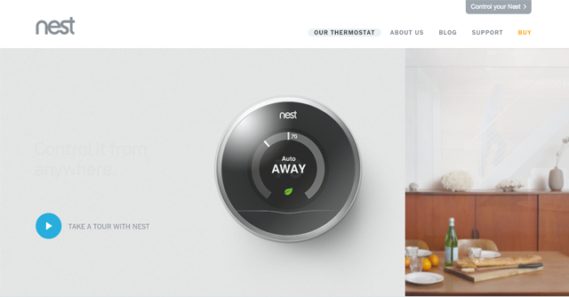
I had the pleasure of making a very small contribution to Nest’s front-end code prior to its launch, and I was completely enamored with the flat aesthetic it rolled out. The designers who embrace flat design are really passionate about it.
“…as interactive designers—we should embrace the medium with which we work, and steadily reject the skeumorphic, dropshadow-y hellhole we’ve found ourselves in.” ~ Daniel Howell (Howells)
A Backlash Against Skeumorphism
Like the minimalist movement in architecture in the 20th century, there was a backlash against the over-ornamentation of architecture in previous centuries.
The flat design aesthetic may be a backlash against the over-designed or overly ornamented websites and interfaces that have been produced for years now. A common example is the overuse of skeuomorphism, which people have been criticizing Apple over lately.
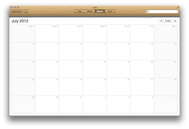
Apple received a lot of criticism from designers for the unnecessary use of leather texture on their calendar app.
Wikipedia defines skeuomorphism as a design element of a product that imitates design elements that were functionally necessary for the original product design, but which have become ornamental in the new design.
For example, we often apply gradients and drop shadows to elements that are meant to be buttons because buttons in the real world have these features, even though they are unnecessary in the setting of a computer user interface.
“So a weather app with a picture of a glass thermometer is skeuomorphic: the glass was necessary in the original (the real-world thermometer) but becomes purely ornamental in the new design.” ~ Sacha Greif
Was it really necessary to put a leather texture on the calendar app? In the same vein, is it really necessary to make our buttons with gradients and 3d edges, or do users know to click them anyway? How much ornamentation is necessary? Is any?
“In real life, when a button is pushed, you can feel its give and its bounce, but on a phone or on the screen, there is a lack of that physical feedback. A physicality that your mind knows exists but in skeuomorphic reality it doesn’t. So for me at least, it becomes one of those moments where reality doesn’t meet expectations and that disappoints me.” ~ Allan Yu (supply / eBay)
So, flat design could be a backlash against the overuse of ornamentation in interface design, similar to minimalism, which was a backlash against the gaudy imperialist architecture of the past.
Form Follows Function, Embracing Flatness
That same 20th-century minimalist movement in architecture yielded some great design quotes like “form follows function” and “less is more” that we still talk about today. Similarly, I love this quote from sculptor Michaelangelo when asked about how he created the iconic David statue.
“It is easy. You just chip away the stone that doesn’t look like David.” ~ Michaelangelo
In user interface design, it’s often stripping away things that really bring an interface to life. The team at 37signals is notorious (and very successful) as a result of applying this principle to their products, like Basecamp. In the world of flat design, less really is more.
In order to achieve the flat design aesthetic, we designers must focus on what things do rather than what they will look like. This is key, and the reason why wireframing is so important to the design process.
Aesthetics are a Matter Of Opinion
In my research for this article, I hardly found any scientific research backing up whether buttons on the screen that look like buttons are actually more clickable.
There’s plenty of evidence backing up contrast, color theory, and hierarchy, but I’d be willing to bet that a flat orange button is just as effective as a beveled orange button when set in an appropriate context. Here are a few opinions of other designers.
“It’s no different than runway fashion– everybody starts doing the same thing; when it’s everywhere, to stand out as a designer, you have to do the exact opposite.” ~ Cemre Güngör (Branch)
“Saying that “skeuomorphism is bad design” would be like saying that “purple is an ugly color” or “ellipses have no place in web apps.” It simply doesn’t mean anything.” ~ Sacha Greif
“Why promote a certain design aesthetic over something else without proof that what you are promoting is actually better? Is making something aesthetically more pleasing worth a potential drop in usability?” ~ Geoff Stearns (formerly YouTube)
Good Design is Good Design, Regardless of Aesthetic
So, if bevels, gradients, and shadows are a matter of opinion, then what makes a good design? Whether you’re going to use a flat aesthetic or not, user interface design is about planning.
I believe flat design simply makes it easier to recognize a great design since there’s less clutter between the design and how it works.
Here are some tips for great user interface design:
Consistency: By using common UI elements and styles, you help users know what to expect, therefore making it easier to use your application.
Contrast: Clickable elements should contrast elements that aren’t clickable. This can be done with color, size, positioning, and, yes, style too.
Layout: Using a grid-based layout like 960gs is a great way to establish some visual guidelines for your design. The eye will naturally follow lines and ratios established by content, so understanding and using a grid is a great way to reinforce visual balance.
Hierarchy: I like to think about this as “user actions.” I could write an entire article about this, but making the most common user actions (sometimes referred to as use cases) easily found while burying less common actions is a great way to simplify an interface and make it easier to use. As a general rule, what’s most important should be more visible than what’s less important.
“My experience is that flat or “realistic” doesn’t matter. What matters is that hierarchy is evident at a quick scan and that users can find their way to the next actionable item easily.” ~ Caroline Keem (writer)
Target Audience: Some target audiences will gravitate toward different aesthetic styles. Architects, designers, and fashion-conscious audiences might embrace flat design, while children, clowns, and some others might enjoy playful textures and colors.
Feedback: When clicks occur, immediate and clear feedback is necessary. Animation is a common way to provide visual feedback, for example, by spinning loader images after clicking something. Also related to feedback is the need for engaging and informative help and status messages at appropriate times.
Remove Friction: In general, removing the number of steps to let a user reach their goal creates a more fluid experience. Any interruptions or extra steps will decrease conversion rates.
Encourage Exploration: Once a user gets past the most basic uses of your interface, it’s good to reward their Exploration with expected results when they venture further.
Wireframing: If you want to pull off an effective flat design, I can’t stress the importance of wireframing and planning enough. Figure out the common use cases, write them down, and rework your wireframes until everything makes sense. I like to do this on paper, but there are a number of great wireframing tools available as well.
“Flat design certainly has it’s place in the world but it’s important to keep in mind that ultimately it’s just another aesthetic. Distressed, Glossy, Flat, Matte, Woodsy, etc, these are all just styles that lay on top of what is good information architecture and interaction design.”
~ Mike Cuesta (care cloud)
Related Topics
Top