A great deal of digital ink has been spilled of late regarding the relative merits of Flat or Skeuomorphic design. On one side of the spectrum, both Microsoft and Yahoo! are embracing elements of Flat Design, while Apple famously incorporates facets of so-called skeuomorphic design across its application portfolio.
I’ve been thinking about this quite a bit recently while working on a new app project for an e-commerce provider. I kicked off the visual design process by mood-boarding a spectrum of styles from sites like Pinterest, Dribbble, and Designspiration.
The point of this process is to determine what style appropriately conveys the attitude and personality of the app itself. The intended impacts of each theme are not mutually exclusive—in fact, the Hybrid direction we ultimately recommended deliberately borrows meaningful aspects of each.

Literal
This theme takes the sense of layering and space a step further, depicting specific physical objects with three-dimensional relationships to their environment.
Objects may be rendered with photo-realistic shading and texture effects, implying depth of space and physicality. These effects convey interactivity and evoke a sense of immersion and delight.
Minimalist
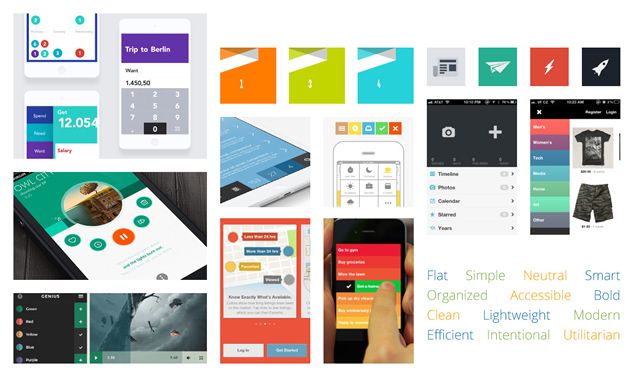
The opposite extreme is the flat design aesthetic, reducing elements to their simplest essence. Space and relationships are defined by blocks of color or negative space, with big target areas for actions.
Eliminating the embellishment of the UI elements allows the tool to fade into the background. This allows the emphasis and emotional weight to shift to meaningful, user-driven content.
This got me thinking about the classic Handbook of Usability Testing by Rubin and Chisnell, in which they describe usability as a combination of:
- Usefulness
- Efficiency
- Effectiveness
- Learnability
- Accessibility
- Satisfaction
As a visual designer, my role extends beyond basic functionality to also address aspects of confidence, perceived value, delight, and emotional engagement: The “Satisfaction” piece of the Usability equation.
The goal of visual design should always be to facilitate usability, which could be qualitatively measured through research (but usually isn’t). Beyond mere functionality, though, the presentation layer serves intangible, instinctual, and emotional functions as well.
The chosen design style is an aesthetic choice, not a functional choice. It is meant to communicate something deeper about the character of the product. We’re talking art, not science. What is personality? What does it feel like? What memories or cultural experiences does it evoke?
Consider these two houses. They each perform the same function equally well. They both keep us dry, have a place to watch TV with our loved ones, and let us sleep well at night. I prefer the modern one, while others would be more comfortable in the ugly one. Both are acceptable solutions, but they are undeniably different.

Don’t get me wrong: I am not advocating or defending the popular ‘skeuomorphism.’ My point—and one that most dialogue about the issue misses—is that Flat or 3D styles are an aesthetic choice for emotional reasons, not an accessibility choice for functional reasons.
Yes, in some cases, a physical, real-world metaphor may help novice users grok what the thing is. Apple has long pushed physical simulacrum, from the original Mac desktop, files, and folders, to the infamously ripped notebook pages and leather stitching. The primary intention, though, is an emotional appeal. As Steve Jobs himself put it in Fortune magazine:
“In most people’s vocabularies, design means veneer… to me, nothing could be further from the meaning of design. Design is the fundamental soul of a man-made creation that ends up expressing itself in successive outer layers of the product or service.“
People have rightly called them out for illusions that are inappropriate or too literal, and it’s encouraging that a growing portion of the internet-commenting public has become so UI literate that many of these flourishes have become superfluous.
Overdoing it to the point of ridiculousness, though, doesn’t discredit the concept of visually implying depth, space, or tactile material. These qualities often do enhance usability by creating a sense of order and hierarchy. What is “in front,” which bits are clickable vs. read-only, what is most important on the screen, etc.?
Appropriate use of visual metaphors and dimensional effects can both enhance usability and convey mood and attitude. Sure, the “authentically digital” flat style is en vogue, but extreme reduction by itself doesn’t alleviate usability issues and may introduce new ones.
Categorically abandoning visual cues and the tools of visual language for the sake of authenticity or current trends is dogma, not design.
It may suit the particular goals of your application, but it doesn’t necessarily further the ultimate objective of usability.
Some suggested guidelines for deciding if a design style is appropriate:
- Does it help or hurt usability (Usefulness, Efficiency, Effectiveness, Learnability, Accessibility, or Satisfaction)?
- Does it highlight or distract from the important content or workflow?
- Does the style communicate something important about the brand?
- Will it hold up over time? Will it look dated in a year?
- Do you have to make exceptions to the metaphor to make it work (i.e., scrolling on paper book pages)?
- What else in the world shares that style? Does that association say what you intended?
Neither is Better
My overall point is that neither flat or skeuomorphic is inherently “better” or more usable. It depends entirely on how these styles are used and if they serve the goals of the work.
It’s a nuanced and subjective question that depends on the intent and the implementation. There is no absolute answer, so every design needs to be tested individually to determine how it performs.
The user experience is about more than simple usability: it’s about how the user feels about what they are using. Visual design is a powerful tool for guiding that aspect of the experience.
Related Topics
Top