No matter how you slice it, the crux of the fast food industry is cheap, unhealthy food served fast. Marketing campaigns have been launched to convince patrons to wait a bit longer, to order salads instead of burgers, and to pay a little extra for a special dish, but it’s safe to say that fast food is the “quick-and-dirty” of the culinary world. It’s also safe to say that companies like McDonalds, Burger King, and Taco Bell have deep pockets to spend on making incredible websites. User experience and graphic design should be like ketchup and mustard on the proverbial hamburger of fast food web experience, but instead few fast food homepages have made an attempt to be interactive, innovative, or even interesting.
There are three major user experiences that fast food homepages provide. First, as might be expected, most fast food websites place an emphasis on their food. These sites offer users a kind of extension to their television advertising campaigns. “You saw the thirty-second clip on TV, now check it out at your leisure.” These sites can be divided in to two categories: promotional and general. Promotional sites are pushing a specific product, while general sites highlight the connection between the brand and the food. One major trend seen in almost all fast food websites is the use of a slider, and nowhere is this more ubiquitous than in the sites that are menu focused, because it offers a way to introduce multiple menu items without adding any extra noise to the overall layout.
Next, some fast food homepages place an emphasis on their physical locations. Unlike major brands like Nike, Apple, and Target, fast food websites don’t deliver. Even if a user sees a particular promotion that captures their interest, they still must make an effort to go to the actual restaurant. Finding the restaurant, then, is as important to some fast food websites as the food or promotion.
Finally, a few fast food restaurants emphasize social media as a way to connect their product with their users. These sites are the most innovative and forward thinking. Rather than place the emphasis on the physical location or the product, these sites consider the user story. How does our restaurant fit in with the day-to-day life of our customers? These sites, while rare, offer a user experience that is interactive, innovative, and, at times, quite interesting.
Whetting the Appetite
McDonalds
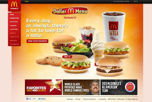
McDonalds’ website is the most general and basic of all fast food websites. The site shown is McDonalds’ American website, but their international websites follow a similar trend toward highlighting the entire McDonalds menu. The site has links to promotions, and indeed features the “Dollar Menu”, but the “Dollar Menu” itself has a wide variety of options. The site thus focuses on the general connection between the McDonalds brand and their menu.
Wendy’s
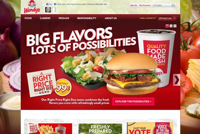
Like McDonalds, Wendy’s website also tries to make the direct connection between brand and menu. The site avoids specific promotions, specific names of menu items, or even specific prices since the only price mentioned is an introductory price.
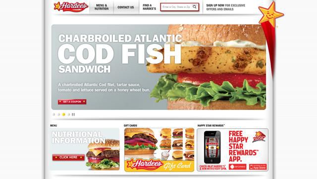
Burger King, Jack In The Box, and Hardee’s
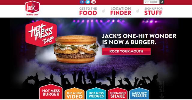

These three sites are all promotional sites, and extensions of advertising campaigns for specific products. Even Jack In The Box, which has a one-pager-esque style, still has a slider. The slider, as noted, is a commonplace design element on restaurant websites, but in particular fast food websites. In these examples it is especially important, because they are concerned with pushing specific products. Most fast food restaurants have more than one specialty promotion in order to capture multiple demographics. The goal of these sites is to give the user the desire to try a new product, rather than to reinforce the connection between the entire menu and the brand.
Long John Silver’s
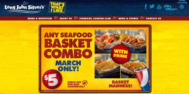
Long John Silver’s website is also a promotional site, but rather than focusing on a specific product, the site focuses on a specific sale. This is an important distinction. Burger King’s website, for example, focuses on the menu and new products, while Long John Silver’s site focuses on price. The reinforcement of LJS with price as opposed to product sets their site apart from the others. Additionally, they are one of the few fast food homepages to not use a slider.
Location, Location, Location…
Dairy Queen and Subway
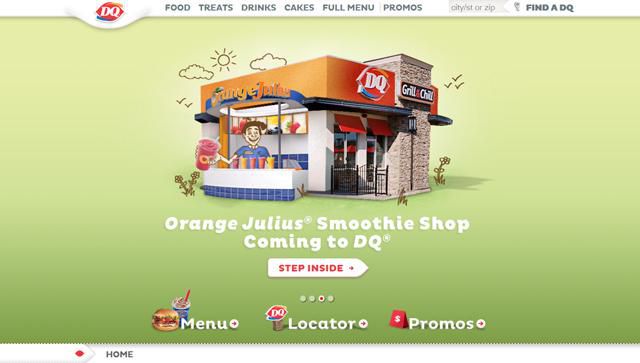
Dairy Queen and Subway both feature a mix of options on their homepages, but in both cases location is critical. Dairy Queen recommends finding their nearest location as the main option of their site, while Subway’s site encourages future franchise owners to open a new location. Subway’s website is by far the most confusing of all the fast food homepages. The site seems to try to do a little bit of everything, but since they are the only homepage that has an element geared toward future franchise owners, they can be grouped, at least in part, as a location based site.
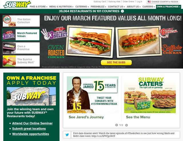
Additionally, the main headline on their homepage lists the number of locations and number of countries currently operating a Subway franchise. Dairy Queen’s image of a brick-and-mortar as well as their “Step Inside” call to action and “Locator” button encourage users to visit their nearest Dairy Queen.
Getting Together
White Castle & Taco Bell
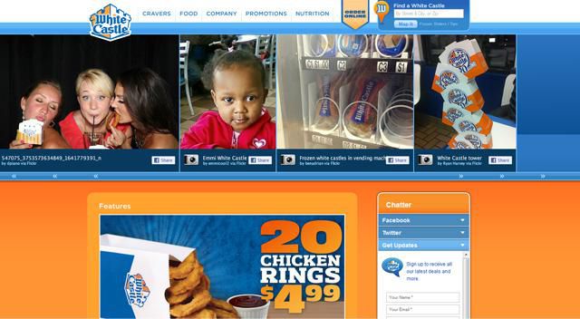
White Castle and Taco Bell are the only fast food homepages that take into consideration the connection between their users, their food, and their physical locations. These two sites are the most innovative of all the fast food homepages. Taco Bell encourages users not only to try their new special, but to tweet about it too. They have well placed social media buttons at the bottom of the page as well as a “Social” section in the header. They are also the only one to encourage users to check out their mobile sites as well. While the layout of the Taco Bell website isn’t anything new – header, slider, three sections, footer – they are certainly trying to facilitate a connection between their products and their users.

White Castle is also trying to facilitate this connection, but their layout is a bit more innovative. The social media strip at the top of the White Castle homepage contains videos, Instagram pictures, and other social connections. The site also has a share button linked to Facebook for each of their social media links. Not only can users see other people enjoying White Castle, they can also shout it out to their friends on Facebook. Rather than put the emphasis on food, promotions, or location, these two sites put the focus on people.
Bon Appetite!
Fast food homepages are as sleek as they are greasy. These sites have big budgets and big names, so the design layouts, color choices, and imagery is sleek and stylish, but most of these homepages are also problematic in that they aren’t sticky. “Greasy” in this case should indicate that these sites are largely forgettable. Television advertising may be sticky because it’s repetitive, but without a connection to users, websites can easily become forgettable.
Only Taco Bell and White Castle have made any true effort to break the third plane and speak directly to their customers. Hopefully, as media becomes more and more user-centered, other sites will follow suit and let their users sell their products. Only then will user experience and graphic design become more than condiments in the bloated world of the online fast food experience.
Related Topics
Top