It is this crucial aspect that many designers forget to consider when designing for print. There are a number of problems that may pop up which can make your final product look different than what you intended. Here are just a few things to keep in mind if you want to be successful.
Nearly every design begins as a digital file, whether it ends up on the web or in print. However, when creating printed materials from digital files, the essence of your design can become lost in translation. This is because what you see on your computer screen is a two-dimensional image created with color and light, while printed ads are three-dimensional objects created with paper, ink and good old fashioned elbow grease.
Hand Placement
Many designers tend to forget that print is a physical medium and the designs you create won’t be viewed on a screen-they’ll be held in someone’s hands. When designing for branded presentation products, you need to be aware of where your audience is going to put their hands so that important information isn’t accidentally covered up.
Presentation folders, for example, are typically held near the left third of the front cover, so this area should be clear of any vital details.
You’ll also want to make sure these areas are pleasing to the touch – you don’t want sharp or jagged die-cut elements here, because they will be uncomfortable to hold onto.
Not Accounting for Texture
Since printed designs are physical, they have to feel as good as they look. Your choice in stock, imprint method and coating can all affect the way your final product feels.
Thick stock feels expensive and authoritative, while thin stock feels flimsy and weak. Textured stock can create a pleasurable tactile sensation that audiences take notice of.
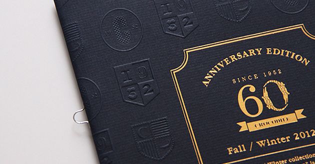
Embossing is an imprint method that creates a textured relief in the stock itself, similar to an official seal. It’s a good way to combine texture with specific text, shapes or logos. Using special coatings like soft-touch or vinyl can also give your printed design a unique textural identity.
Printing on Colored Stock
When you print using the four-color process, there is an unmentioned fifth color in play-that being the white from the paper stock. In fact, it is impossible to create white tones using CMYK ink. Many designers make the mistake of printing their designs on colored stock, which ends up distorting the ink colors and makes the design hard to see.
If you’re worried your design doesn’t have enough color, you can use ink as a substitute for color stock – but be aware that doing so can lead to another set of problems…
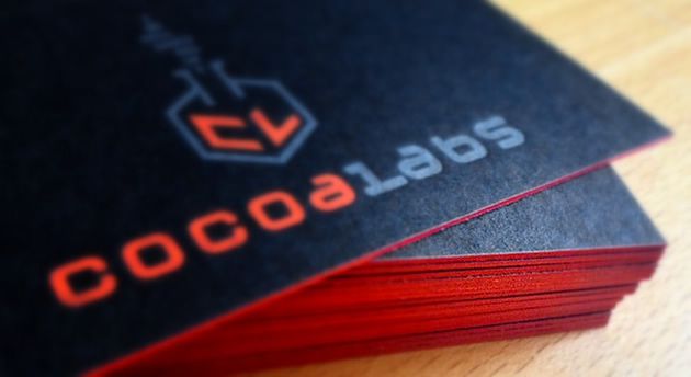
White Edges when Printing a Color Background
When you use ink in lieu of colored stock, the color will only be noticeable on the surfaces that have been imprinted. It’s impossible to print on the edges, which means that the white from the stock underneath will show through wherever the final product has been cut.
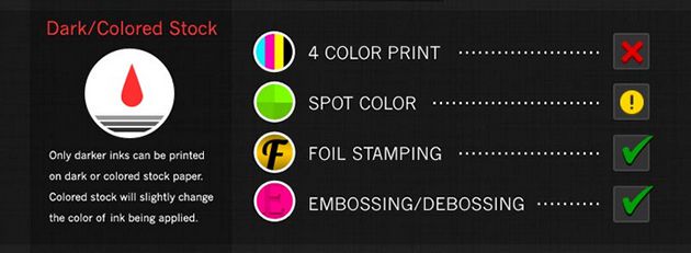
This is unavoidable in certain cases, such as when you need to print in CMYK, but some imprint methods like embossing and foil stamping are fully compatible with colored stock. Likewise, if your only printed elements are embossed or foil stamped, then it is more cost effective to use colored stock than to print a colored background onto white stock.
Proper spacing around logo
![]()
This is one of many common logo design mistakes that come up in print. Companies often have a stipulation in their branding guidelines requiring a certain amount of space around any printed logo-and with good reason. Not only does the practice help the brand’s identity stand out in your design, it also prevents the logo from becoming accidentally distorted due to printing errors such as ink bleeds.
Check to see if the brand you are working for has any stipulations in their logo guidelines-if not, it’s best to leave a gap in proportion to the size of the logo. Leave a space about half the height of the logo or the size of one of the lowercase letters between the logo and any other graphical elements.
Color Conflicts with Printing Methods
When you print with colored ink, there are two different methods you have to choose from-four color process or PMS (Spot Color) printing. Four color process uses a combination of CMYK tones to reproduce full-color images, photos and graphics. However, not all tones are available with four color process.
PMS inks are pre-mixed, which means their colors are standardized and will never look distorted. However, each PMS color must be applied separately, which means there is a limit to how many colors you can use at once.
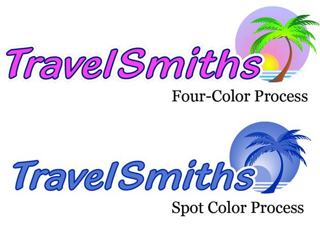
Here’s a handy way to figure out whether or not your project needs four color process or PMS printing:
Four Color Process:
- Only option for full color photography, not recommended for black-and-white photography.
- Cost-effective option for any design that uses four or more colors.
- Cannot faithfully reproduce metallic or neon colors, oranges, navy or some grey tones.
- May cause color inconsistencies when printing logos.
PMS (Spot Color) Printing
- Best option for black-and-white photography. Cannot accurately reproduce color photography.
- Best option for monochromatic designs. Not recommended for designs that use more than three colors.
- Can faithfully reproduce most tones, including neon colors and metallic colors.
- Best option for printing color-accurate logos.
If you need the versatility of four color process but the accuracy of PMS printing for branded elements, your best option is to print in four color and spot print the branded elements in PMS ink.
Difference Between One-Sided and Two-Sided Printing
For single page print projects, the difference between one-sided and two-sided printing seems pretty obvious – however, multipage and folded projects can be trickier to figure out. These types of projects are printed flat and then assembled afterwards, meaning one-sided printing can often refer to elements on the interior as well as the exterior.
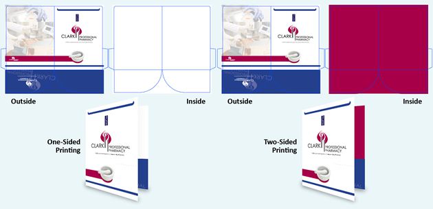
For example, when designing a custom pocket folder, the interior pockets are on the “first side” along with the front and back cover, since the pockets are folded inside after printing. The only areas on the “second side” of the folder are the inside panels, and those are typically covered up by the folder’s contents.
Related Topics
Top