In this tutorial, I will show you how to create revealing content overlays with CSS3 transitions, allowing you to minimise content clutter and provide a neat user experience.
Introduction
I’ll introduce this tutorial by presenting a very suitable use case. Imagine your company offered a bunch of different services, and on your website’s services section, they were listed. Each service had its own description, but you didn’t want to occupy a whole lot of page real estate. You present a bunch of attractive links or buttons instead, prompting and allowing users to click on the links to view more. Each service might not warrant a whole new page, so instead, you reveal content overlays with CSS3 transitions.
They animate into view above the page, and can be closed off easily without ever having to traverse different pages. Pretty neat, huh? Let’s dig in a little!
The Markup
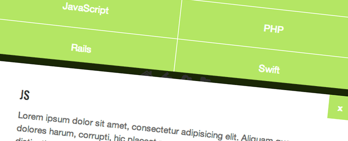
The markup is fairly standard. We have a navigation, and a bunch of corresponding content-containing sections. Each navigation item is referenced to a particular section via matching href‘s and id‘s. Here’s the markup:
<nav class="cmn-overlays-nav">
  <ul class="clearfix">
    <li><a href="#html">HTML</a></li>
    <li><a href="#css">CSS</a></li>
    <li><a href="#js">JavaScript</a></li>
    <li><a href="#php">PHP</a></li>
    <li><a href="#rails">Rails</a></li>
    <li><a href="#swift">Swift</a></li>
  </ul>
</nav><!-- /nav.cmn-overlays-nav -->

<section id="html">
  <div class="content">
    <article>
      <h2>HTML</h2>
    </article>
    <a href="#" class="close">x</a>
  </div><!-- /.content -->
</section><!-- /section#html -->

<section id="css">
  <div class="content">
    ...
  </div><!-- /.content -->
</section><!-- /section#css -->

<section id="js">
  <div class="content">
    ...
  </div><!-- /.content -->
</section><!-- /section#js -->

<section id="php">
  <div class="content">
    ...
  </div><!-- /.content -->
</section><!-- /section#php -->

<section id="rails">
  <div class="content">
    ...
  </div><!-- /.content -->
</section><!-- /section#rails -->

<section id="swift">
  <div class="content">
    ...
  </div><!-- /.content -->
</section><!-- /section#swift -->
Digging Into The CSS
First things first – I’m using box-sizing: border-box across my entire document, and the CSS below is not prefixed. Make sure you prefix yours where necessary (i.e. the transitions/transforms). We’ll tackle the CSS in two parts –
- The navigation items, which we’ll make responsive
- The sections, which are initially hidden off screen and transition into view when a navigation item is clicked
The aesthetic of the navigation is trivial to this system being functional. for simplicity’s sake, I just styled them as good ol’ block elements that shifted to two per row at a breakpoint. Here’s the CSS:
nav.cmn-overlays-nav ul {
  list-style: none;
  margin: 0;
  padding: 0;
  text-align: center;
}
nav.cmn-overlays-nav li {
  display: block;
  margin: 0 0 1px 0;
}
nav.cmn-overlays-nav a {
  display: block;
  padding: 20px;
  color: #fff;
  background-color: #b4e664;
  text-align: center;
}
nav.cmn-overlays-nav a:hover {
  background-color: #85c420;
}

@media all and (min-width: 600px) {
  nav.cmn-overlays-nav ul {
    padding-left: 1px;
  }
  nav.cmn-overlays-nav li {
    float: left;
    width: 50%;
  }
  nav.cmn-overlays-nav li:nth-child(2n+1) {
    margin: 0 1px 1px -1px;
  }
}
The CSS for the content sections requires a bit more thought processing. Initially, all sections are hidden and out of sight. When a navigation item is clicked, the corresponding section comes into view. A semi-transparent black overlay fades in above everything, then a white square with content slides in from the left. These transitions will take place when an .active class is added to a section. There will also be a “close” button to close off the overlay, which was denoted in the HTMl above.
So to recap quickly –
- A user presses a navigation button, and the corresponding section transitions into view
- A black overlay (mask) fades in for 0.2 seconds
- After that transition is complete, a white box containing all the content slides in from the left
- A user can close the current section by either clicking a close button, or the mask
Here’s the CSS:
section {
  position: fixed;
  top: -9999px;
  left: -9999px;
  visibilty: hidden;
  opacity: 0;
  background: rgba(0, 0, 0, 0.8);
  transition: opacity 0.2s;
}
section.active {
  top: 0;
  bottom: 0;
  left: 0;
  right: 0;
  visibilty: visible;
  opacity: 0;
  opacity: 1;
}

section .content {
  position: absolute;
  top: 20px;
  bottom: 20px;
  left: 20px;
  right: 20px;
  margin: 0 auto;
  max-width: 600px;
  padding: 40px;
  background-color: #fff;
  overflow-y: scroll;
  opacity: 0;
  transform: translateX(-100%);
  transition: opacity 0.2s, transform 0.2s;
  transition-delay: 0.2s;
}
section .content a.close {
  display: block;
  position: absolute;
  top: 0;
  right: 0;
  width: 40px;
  height: 40px;
  background-color: #b4e664;
  color: #fff;
  font-weight: 700;
  line-height: 40px;
  text-align: center;
}
section .content a.close:hover {
  background-color: #85c420;
}

section.active .content {
  opacity: 1;
  transform: translateX(0);
}
Making It Work With JavaScript
This is all useless if JavaScript doesn’t handle the situation accordingly. We need to listen for clicks on our navigation items, and show the correct section by adding the .active class. We also need to listen for clicks on the close button and mask which will hide the currently active section by removing the .active class. I’m using classie.js for class addition/removal/checking helper functions, and all JS is run in a self-executing function right before the closing boy tag. Here’s the JavaScript:
(function(){

  // handle the swanky navigation/section stuff
  ////////////////////////////////////////////////////////////

  var nav_links = document.querySelectorAll("nav.cmn-overlays-nav a");

  /* loop through all nav links */
  [].slice.call(nav_links).forEach(function(el, i) {

    /* fetch vars */
    var href = el.getAttribute("href"),
        id = href.substr(1),
        section = document.querySelector(href),
        close = section.querySelector("a.close");

    /* listen for nav clicks */
    el.addEventListener("click", function(e) {
      e.preventDefault();
      if (!classie.has(section, "active")) {
        classie.add(section, "active");
      }
    });

    /* listen for close clicks on the mask */
    section.addEventListener("click", function(e) {
      e.preventDefault();
      if (e.target.tagName == "SECTION") {
        if (classie.has(section, "active")) {
          classie.remove(section, "active");
        }
      }
    });

    /* listen for close clicks on the close button */
    close.addEventListener("click", function(e) {
      e.preventDefault();
      if (classie.has(section, "active")) {
        classie.remove(section, "active");
      }
    });

  });

})();
Wrap Up
And that’s a wrap! We’ve tackled a really nice solution to a common situation. We’ve prevented an overload of information all at once, and given users an option to click on some attractive links to gather more information. Revealing content overlays are a great way to include a lot of information on one page without too much clutter. Some awesome CSS3 transitions give users a smooth and modern experience too. Feel free to try different combinations of transitions too!
Thanks for reading, and I hope you enjoyed this tutorial. Feel free to leave any comments, feedback, or questions below, and don’t forget you can download the source and view the demo by clicking the links below.
Related Topics
Top