In this 3 part tutorial (I wanted to break it into more digestible chunks) well be creating screens for a fictional, ‘Pay It Forward*’ iOS App called ‘Piece’.
If you missed Part 1, you can view it here. Ok, lets make a start on Part 2…
If you haven’t already, grab these required elements to follow along with this tutorial…
- Sketch (Stating the obvious here).
- Iconjar.
- San Francisco Fonts.
- Icon Set.
- Unsplash It Sketch (Plugin).
- Content Generator for Sketch (Plugin) (Plugin).
Walkthrough

Let’s concentrate on the walkthrough screen for our app.
For this screen, lets swap out the background image (Something well be doing on the later screens also).
Select both the overlay, and background image on the last Artboard we created, and then hold Alt and drag across those two layers to your new Artboard.
Like before, make sure both layers are set at 0 on the X, and Y axis.
Of course, the background image, which we need to edit, is hidden below the overlay. How did we fix this?
Let me show you a few ways to get to a layer that is below another…
- The obvious way is to select the background image layer in the Layers List (I think you knew that one already).
- With neither of the layers selected, hover your cursor over the Artboard, and then holding Alt, click to select the layer below.
- Right-Click on the layers, and choose Pick Layer to choose your background image layer from there.

Go ahead and choose a new image Unsplash It Sketch > Unsplash It or Shift + Cmd + U
Now, lets get the navigation arrow, and title into place.
Duplicate across the arrow icon we added to our previous screen, and position it 20px from the left, and 30px from the top of the Artboard.

Then, using the Text Style we created previously, add a new title, then change the wording to ‘Walkthrough’, and position it correctly on the Artboard.

We will now concentrate on the slides for our ‘walkthrough’.
Draw out a Rectangle (R), 300px wide, and 400px high, with a border radius of 4. Give the rectangle a Fill color of #6C56B7.
Holding Alt, duplicate the layer, and then with it still selected apply the following settings…
- Width: 20px.
- Height: 380px.
- Fill Color Opacity: 40%.
You will have noticed that we have all 4 corners set with a border radius still? As this new layer is sitting flush with the edge of our Artboard lets quickly tweak the Radius setting in the Inspector Panel.
So in the Radius field, replace 4, with 0/4/4/0 so only the top right, and bottom right corners are affected.

Duplicate this new layer, Flip it horizontally, and sit it to the far right of the Artboard.

Then, with all 3 shape layers selected, use Align Vertically in the Inspector Panel. Boom!

Lets go ‘Big Icon’ style!
From Iconjar, grab the touch icon, and drag this onto your Artboard.
With the icon selected, increase its width to 150px, and change the color to #FFFFFF.

Insert a Text Layer (T), modify the copy to something like ‘Easily navigate through your daily Pay It Forward deeds’, then add the following settings…
- Typeface: SF UI Display.
- Weight: UltraLight.
- Color: #FFFFFF.
- Size: 15.
- Alignment: Center.
- Character Spacing: 1.5.
Use the Alignment tools in the Inspector Panel to tighten things up.

Time to add some Bullet Navigation for our slides.

Draw out a circle with the Oval Tool (O), 10px x 10px. Remove the Fill Color, and change the Border Color to #FFFFFF.
Duplicate this layer 2 times. Keeping one with the same settings as the original, and adjust the circle (that will sit in the middle) with a Fill, and Border Color of #6C56B7.
With all shapes selected, align them correctly below the slide you created earlier.

And thats our Walkthrough screen complete. Oh yes indeedy!!
Daily Deeds

Onto the Daily Deeds screen. Lets show folks how generous weve been these past 24 hours!
Like the Walkthrough screen before, we will be adjusting the background image here, and using the gradient overlay again.
Up until now we have been copying & pasting across our gradient overlay from one screen to the next (and you can happily stick with this method if you want), but lets try another approach, and one that is much more suited when working on bigger projects.
So, on the Walkthrough screen, select the gradient layer, and then choose Create New Shared Style from the Inspector Panel.

You will now see our Shared Style available in the Inspector Panel.

If you want, quickly go back to the overlay layers on the screens you created previously, and attach this Shared Style to them. This just means that if you decide to change the gradient colors (or go with a solid color) that the changes will be instantly reflected across all your screens. A timesaver all day, every day!
Back to our Daily Deeds screen.
Draw out a Rectangle (R), 375px wide, and 667px high, which covers the Artboard. Run the Unsplash It plugin to choose a suitable image.

Draw out another Rectangle (R), with the same dimensions as the one you just created, and then choose your gradient Shared Style from the Inspector Panel.

Lets add the Menu, and Search icons to the control bar area.
From Iconjar, drag, and drop in the hamburger menu, and magnifying glass icons.
Change the color of both icons to #FFFFFF. Leave the hamburger menu size as is, but Scale down the magnifying glass icon to 25px.
Select both icons, use Align Vertically, and then hold Alt to show you the measure guides, and align it evenly on the Artboard.

With both icons selected, group them together via Cmd + G (label the group something like Menu + Search), and then convert that group to a Symbol.
Drop in your Text Style, and change the wording to ‘Good Morning’, then align correctly on the Artboard.

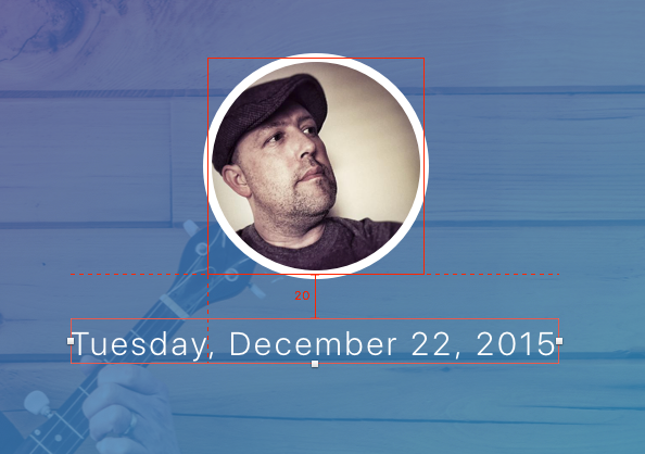
Time for the user Avatar, and to put the Content Generator plugin to work.
Draw a circle (O), 100px x 100px, give it a Border of 4 (with the color of #FFFFFF).
With the layer selected, navigate to Plugins > Content Generator Sketch Plugin > Persona > Photos > Female/Male/Neutral

Insert a new Text Layer (T), adjust the wording to something like ‘Tuesday, December 22, 2015’, and give it the following settings…
- Typeface: SF UI Display.
- Weight: Light.
- Color: #FFFFFF.
- Size: 15.
- Alignment: Center.
- Character Spacing: 1.5.
Then align this text layer correctly on the Artboard.
Now for the Tasks Counter (Yup. Thats what Im calling it).
Draw 2 circles (O). The first at 100px x 100px, with the Fill Color of #6C56B7, and the second at 50px x 50px with the Fill Color of #8C72E3.
Position these similar to the image below…

Then add 2 Text Layers (T).
For the Task Count layer use the following settings…
- Typeface: SF UI Display.
- Weight: Regular.
- Color: #FFFFFF.
- Size: 66.
- Alignment: Center.
And for the Percentage layer, use these settings…
- Typeface: SF UI Display.
- Weight: Regular.
- Color: #FFFFFF.
- Size: 12.
- Alignment: Center.
- Character Spacing: 1.5.
Then align both text layers correctly inside of the circles, so you have something like the following…

Insert a new Text Layer (T), and change the wording to something like ‘Youve already completed 4 Pay It Forward deeds today. Nice work buddy!’
Add these settings for the text layer…
- Typeface: SF UI Display.
- Weight: UltraLight.
- Color: #FFFFFF.
- Size: 15.
- Alignment: Center.
- Character Spacing: 1.5.
For the ‘Pay It Forward’ portion of the text, change the Weight to Light.
Then align this text layer correctly on your Artboard.

Insert a new Text Layer (T), and change the wording to something like ‘View PIF deeds for today.’ Keep the same settings as the text layer you inserted before, but reduce the font size down to 13.
To finish up this screen, drop in the arrow left in circle icon from Iconjar.
Scale it down to 35px, give it the color #FFFFFF, and then set it to -90 in the Rotate settings.

And that finishes up our Daily Deeds screen. Nice work!
Deed Example

For the background image, we will be sticking with the image that we used on the Daily Deeds screen. So duplicate that image across to your empty Artboard, and reduce the height to 315px.

Then draw out a Rectangle (R) to cover the image, and apply the gradient Shared Style you created earlier.

Insert the Menu + Search Symbol you created before, and align this correctly on the Artboard.

Drop in your Text Style, and change the wording to ‘1st Deed of the day’, then align correctly on the Artboard.

Draw out a circle (O), 100px x 100px with a Fill Color of #8C72E3.
Then, from Iconjar, drop in the shopping bag icon. Keep the size as is, and change the color to #FFFFFF. Align the icon correctly within the circle.

Insert a Text Layer (T), and change the wording to something like ‘At 10.36am’, then apply the following settings…
- Typeface: SF UI Display.
- Weight: UltraLight (For the actual time change it to Light).
- Color: #FFFFFF.
- Size: 20.
- Alignment: Center.
- Character Spacing: 2.

Add a new Text Layer (T), change the wording to something along the lines of ‘Paid an old ladys grocery bill at the local convenience store. Felt real good about it!’, then apply the following settings…
- Typeface: SF UI Display.
- Weight: UltraLight.
- Color: #303030.
- Size: 24.
- Alignment: Center.
- Character Spacing: 2.5.

To finish up this screen, well add in a plus (+) icon for where a user of this app could easily add a new Deed (because they are that darn good-hearted!)
Draw in a circle (O), 60px x 60px, with a Fill Color of #6C56B7.
From Iconjar, select the plus symbol icon, and drop this onto the circle you created. Keep the size as is, and change the color to #FFFFFF.

Do you know what? Ill let you go ahead and create the 2nd Deed example screen!
Just remember what Ive shown you in the last section. Choose a new icon from Iconjar, and use the image below as reference if needed. Go for it!

And thats the second part of this tutorial complete.
In the final part, well be creating screens for the Monthly Planner, Settings, and Navigation.
Related Topics
Top