We live surrounded by millennials that are growing up with extensive access to mobile devices and laptops. It is a common thought that millennials are not brand loyal. Nonsense!
In fact, they are the most brand-loyal generation, but it’s hard to capture their attention. They are drowning in the abundance of data that every brand tries to pour over them. They jump from one site to another, opening tabs and closing them without a single thought. So, there is still one question: how do you get millennials to spend more time on your site?
Millennials don’t want to waste time trying to find a “treasured button”. They don’t want to spend time attempting to understand how something works. They need the features of a website to be simple and ready-to-go.
We’ve taken a quick look at some of the design principles of simplicity that you should consider implementing into your workflow. They will hopefully help to make your website simpler for the next generation of users to use.
You might also like: The 10 Golden Rules of Simple, Clean Design.
Occam’s Razor
This principle is used in many different fields to cut down all redundant information. It’s named after the medieval philosopher William of Occam.
Here is how Occam’s razor can be applied to web design. If a user can reach the target in two ways, for example, through actions A-B-C and A-B-C-D, the action D needs to be cut off. This principle is obvious, but still often violated.
It is also relevant to the content. If a customer does not need additional information to make a decision, is it necessary to include that information at all? Is this piece of information super-critical? If not – cut it away. If in doubt – cut it away.

Keep what is super-critical and cut away everything else.
The KISS Principle
The KISS principle holds simplicity in its name (Keep it simple stupid).
Simplicity equals sanity. With all of the unnecessary parts cut away by Occam’s razor, it’s time to simplify the things that survived. Simple things often succeed just because they are easy to understand.
The best example is the iPhone. When it launched, there was nothing that the iPhone could do that its competitors could not. The original iPhone was not great when it came to features. What it did was simplify things: it made most of the decisions by itself.

Simplicity equals sanity.
How to apply the KISS principle to UX design:
- Do not ask the user to make a decision, if it is not super-critical.
- Avoid creating non-self-explaining elements.
- Avoid creating unusual or complicated page structures.
- Hide information and elements that probably are not needed at this very moment.
- Limit your color scheme.
Check out John Maeda’s book The Art of Simplicity for a thorough mediation on the subject.
As an example, take a look at the website of the water delivery service Clear Water, produced by Vintage web production.
The new website raised the conversion rate of orders by 900%. So, how did this happen?
They researched the target audience. They tracked the purchase journey and discovered what clients needed to know about the product before buying.
They cut down all unnecessary information. The old website was 40 pages deep. Visitors got lost in such a volume of information. Potential buyers trying to decide between different types of water read about the manufacturing process and chemical properties, and eventually, they were overloaded with content and postponed their final purchase decision. They ended up buying bottled water from competitors.
The original website was eventually simplified to 8 pages. The unnecessary information was removed, the available types of water and delivery options were decreased.
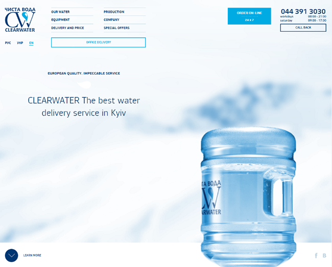
The simplified version of the Clear Water web site.
The simplified design shifted the visitors’ attention to the factors that they could directly experience – the taste of the water and fast delivery. And that worked! With conversion raised by 900%, this confirmed that simplicity is the best choice.
The YAGNI Principle
The YAGNI Principle is a process and a principle of design with the primary objective and/or value to not add functionality that is not of immediate use.
According to the adherents of the principles of YAGNI, the desire to write code that is not needed right now – but may be needed in the future – leads to the following undesirable consequences:
- Waste of time that could be spent on testing and improving the necessary functionality.
- New functionality must be established, documented, and maintained.
- While functionality is not really necessary, it is difficult to fully predict what it can do, and to test it. If the new functionality is not thoroughly tested, it may not work properly when it is needed later.
- Leads to the fact that the software becomes more complex.
- If all the functionality is not documented, it may remain unknown to users.
- Adding new features can lead to even more desirable new functionality, resulting in a snowball effect.
Thus, if you create a new product, review all the functions carefully and leave only the code that is critical and is immediately required.

Creating one unnecessary feature is starting an avalanche.
The Worse is Better
The worse is better is a model of software development, that states that the ease of implementation and interface are more important than any other system property. This principle was originally conceived by Richard P. Gabriel in his essay the «Lisp: Good News, Bad News, How to Win Big» under The Rise of ‘Worse is Better’.
Gabriel describes the approach this way:
- Ease: the implementation and the interface should be simple. Being easy to implement is even more important than the interface simplicity.
- Correctness: the design must be correct in all visible manifestations. Simple design is slightly better than the right.
- Consistency: the design should not be illogical. The user needs to understand how he got there and what to do next.
- Completeness: the design must cover as many important situations as possible. Completeness can be sacrificed in favor of other qualities and should necessarily be sacrificed if it interferes with simplicity.
- Don’t repeat yourself (source).
If you are trying to explain the same information a few times, your interlocutor begins to think that you think they’re stupid. It humiliates them, and they start to despise you.
You’re probably wondering what this principle has to do with simplicity. It complements the theory. Your information needs to be not only simple but unique as well.
How to apply this principle to design:
- Avoid situations where users have to go through the same process twice.
- Do not create two ways to do one thing.
- Do not present similar pieces of information twice (exception could be done for CTAs).
The easiest way to benefit from these principles is to simply apply them!
Related Topics
Top