Few professions demand greater talent, experience, and flexibility than web design. Not only do you have to deal with constantly evolving customer demands, you have to deal with constantly evolving aesthetic norms and design standards. What was popular six months back may already be falling out of favor.
Web layouts, once standardized and scarcely trifled with, are now the focus of extensive experimentation. While it helps to break the mold, in a time of creative crisis you can always turn to these 10 evergreen website layouts that will never let you down:
1. Two Column, Wide Header
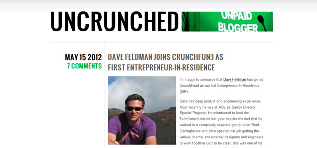
This is easily the most common layout design on the internet, standardized since the beginning of the ‘classic’ web. A wide header, usually at least 960px long is followed by two columns – one wide, one narrow. The narrow column serves as the navigation pane and can be placed either to the left or right of the wider column.
Conventionally, blogs place the navigation column to the right of the wide column, while static sites place it to the left.
Example: Uncrunched.
2. Three Column, Wide Header
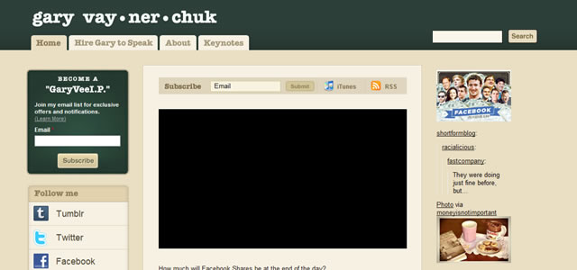
Popularized by Blogger and WordPress, this alternative to the above layout includes three columns – one wide column flanked by two narrow columns. The narrow columns hold navigational elements, while the central column serves as the primary content repository. A wide header is draped across all the three columns. The cumulative effect is a highly usable, if busy layout. The two columns are sometimes clubbed together and kept on the same side.
Example: Gary Vaynerchuk.
3. Four Boxes
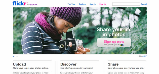
Common on product and news blogs, this simple layout includes a site-wide header, which is followed by a large header-width box, and three smaller boxes that take up a third of the larger box’s screen realestate each. The number of smaller boxes can range from 2 to 5.
The large box can be used to showcase products or articles/stories; the smaller boxes can offer further information on the product or secondary stories. The end result is an easily navigable and visually dramatic layout.
Example: Flickr.
4. Undefined Grid
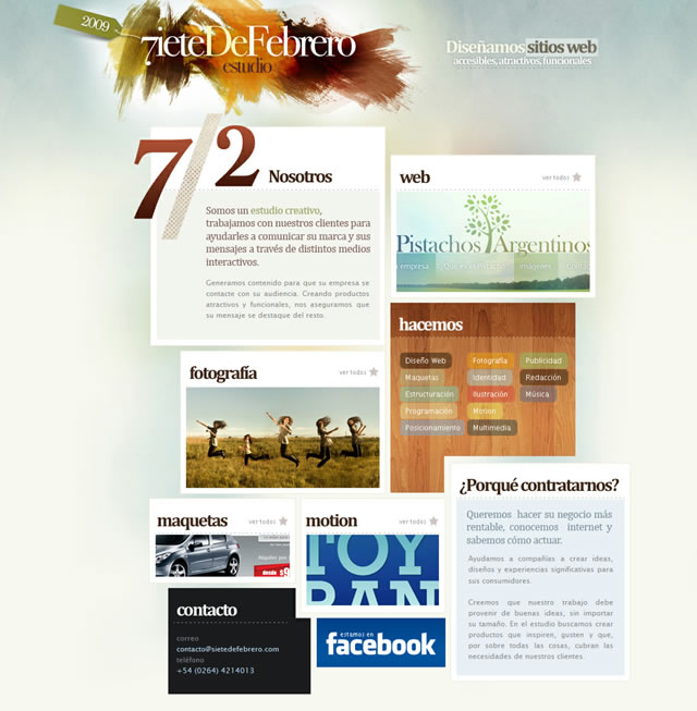
The undefined grid layout borrows heavily from the conventional grid based layout and turns it askew. Navigational elements follow a site-width header, and are placed in undefined boxes spread across the width of the site. The height and width of these boxes can vary, which adds visual energy to the layout.
This effect is difficult to achieve technically and usability remains an issue, but it can serve as the base for more creative explorations.
Example: Siete De Febrero.
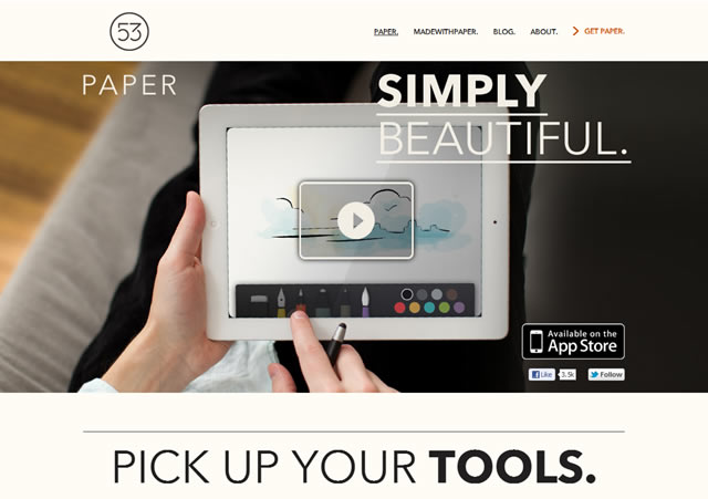
5. Large Screenshot
Appropriate for web applications and software, this layout places a large, site-width screenshot of the app directly below the header. With high-resolution images, the effect can be dramatic. Designers often incorporate 3D screenshots, drop shadows, and sliders into the screenshot space to add another layer of complexity to this rather simple layout. The large screenshot is usually followed by multiple (usually 2, at most 4) grid-based boxes giving further information on the product/application.
Example: Paper.
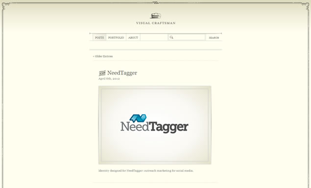
6. Single Column
Eschewing the left/right navigation pane for a wide header, navigation menu, and a single content column, this layout finds application in many personal blogs based on minimalistic design principles. The single, central column is typically kept narrow – under 640px in width – and is followed by a footer that includes additional navigational elements. This layout is most common in microblogs such as Tumblr.
The effect is a sparse, minimalistic design that can be somewhat difficult to navigate and is best for microsites; it is best avoided on larger sites.
Example: Visual Craftsman.
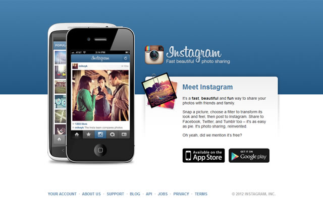
7. Featured Image/Graphic
This layout has found a lot of favor with smartphone app developers. A large featured image or graphic is placed either to the left or right of the page, with a single column of content next to it. The header is usually minimalistic or absent; the footer points visitors to the relevant download page, besides including company information and disclaimers/privacy policies.
Example: Instagram.
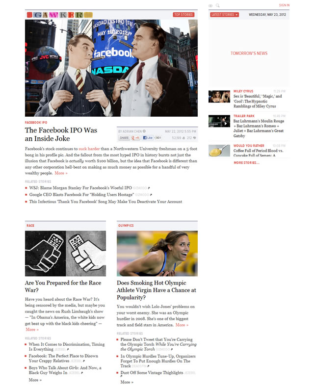
8. Fixed Sidebar
Made (in)famous by Gawker.com, this layout includes a fixed sidebar that houses all the navigation elements, while the primary column hosts all content and is scrollable. The fixed-sidebar makes navigation easier, but impacts usability negatively.
Example: Gawker.
9. Grid Based Gallery
Popular among photographers and designers, this layout is ideal for visual portfolio sites. In the conventional layout structure, the header is followed by a heading, which is followed by a grid based photo gallery. The gallery can range from 2 to 6 columns with as many rows as needed. The effect is highly visual with a lot of room for creative maneuvering.
Example: YourNeighbors.de.

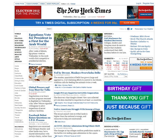
10. Advanced Grid/Magazine Style Layout
The advanced grid layout borrows heavily from the conventional grid layout to create a rich, visuallydense design. There are few rules to follow in this layout and the designer has a considerably large canvas to experiment with navigational elements.
Typically, information is organized by freshness and/ or priority, with the most important content showcased right below the header in the largest box, followed by secondary stories/articles in smaller boxes, and tertiary content in even smaller post boxes. The advanced grid usually includes two columns, though many layouts incorporate an additional third column.
The sheer complexity of this layout impacts usability but allows for a lot of information to be packed into relatively compact screen space, making it perfect for news sites and online magazines.
Example: NY Times.
Related Topics
Top