The history of design is deep and long, but the field of graphic design is a much more recent phenomenon.
Sure, there was art, design, and illustration in centuries past, but the modern method of marketing products and advertising has truly allowed for whole new creative avenues that didn’t exist before the 20th century.
With each, whether it’s been the launch of an iconic, era-defining studio, the release of a game-changing piece of software, or a seminal project that sent ripples through the industry, certain moments in the history of modern graphic design have truly helped drive the discipline forward.
Simple Can be Iconic
Founded in 1976, the first Apple logo was Isaac Newton sitting under an apple tree. Shortly thereafter, the first rainbow Apple logo was created. Ever since then, it’s had some slight changes, including changes in coloration, but mostly it has stayed the same and pretty much everyone knows who’s logo that is when they see it on a device or an ad.
![]()
The same is true for the Nike Swoosh, which hasn’t changed much since 1971. When you have a great logo, it can stand the test of time.
Repetition is Key
For years, you could instantly recognize an ad for the iconic Absolut vodka. They made their simply shaped bottle the hero of all of their ads, usually bathed in a white spotlight with a black vignette around it. Most notably, they used work games to play with their name. A bottle of their Absolut Citron made out of orange peels accompanied by the phrase “Absolut Appeal” is one example.
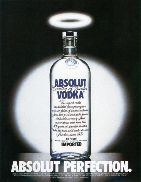
Another ad had a bottle with a halo above it and the copy “Absolut Perfection.” They were fun, short, and most importantly, memorable. Now they’ve changed their ad campaigns, but the copy is still short and sweet with the same font, making them easy to instantly identify.
Change Can be Traumatic
With such repetition, people get used to seeing certain symbols and colors associated with certain brands. People can become attached to these familiar icons, and when there can be backlash if there is a drastic change. In 2010, retailer Gap introduced a new logo and then quickly rolled it back a few days later after consumer backlash reached fever-pitch heights.
![]()
In reality, they should have known this was coming because they’re a “logo brand” – part of what encourages their customer base to buy is the status that the Gap logo provides them. The reversal of the colors in the new logo was probably part of why it was too big of a change.
Check the Temperature
Gap might have been able to avoid the drama if it would have properly tested its logo before actually rolling it out. Brands like to think they have control, but it’s been proven time and again that customers will speak up if they don’t like the changes a business makes.
![]()
In 2013, Yahoo had a brilliant idea for their redesign process. They introduced a new version of their logo every day for a month. This let people know that changes were coming, instead of abruptly remaking themselves out of the blue. Not only did it soften the blow when the changes were made, it let people warm up to the idea that Yahoo was going to look different soon.
Subtle Changes are Mostly Safe
In the 1980s and 1990s, America started really waking up to how unhealthy fast food could be, particularly foods cooked in oils. Needless to say, Kentucky Fried Chicken felt a bit like it was in the cross-hairs with a newly-demonized cooking method literally being their middle name.
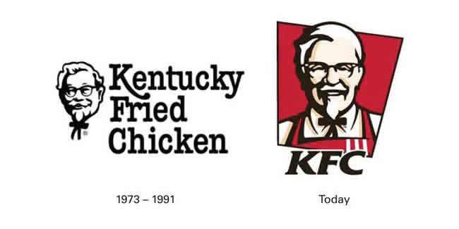
But when they made the change to KFC, it barely made ripples. People had already been calling it KFC, and Kentucky fried chicken was still the primary product they sold. It did help, though, that the logo and imagery was still very similar to the original branding, with swooping fonts, red and white colors, and of course, Colonel Sanders face.
Concluding
These are just a few of the design lessons from the modern marketing era. If you’re a graphic designer, keep these tips in mind should you have to work on a rebranding project soon, as the advice could come in handy.
If you’re a marketing professional or small business owner, take the experiences of the brands listed above into account should you start your own branding or rebranding task.
Related Topics
Top