Everybody has their design pet peeves. Some of them are pretty universal. We have all cringed when opening the website of an otherwise respectable company only to find that the entire thing is in comic sans or papyrus. We’re also beginning to feel the same way about Lobster.
Unfortunately, there are many design elements that are overused, outdated, offensive, or ineffective that designers still insist on using. Sure, sometimes these poorly thought out design choices are the result of clients pushing for them, but the truth is many designers use these elements voluntarily.
If you are guilty of using, or overusing any of the following design elements, please consider retiring them as soon as possible. Web users everywhere will thank you.
Insulting Pop-Ups
There is nothing inherently wrong with using pop-ups as long as you don’t continually pester your visitors with pop ups that crop up over and over again, and as long as you don’t design your pop ups so it is nearly impossible to click out of them. After all, somebody is coming to your website or reading your blog to view valuable content that you are providing for free.

There’s no shame in popping up a request that they sign up for your newsletter, download your eBook, or take some other action. The problem comes when you decide to insult them for opting out. People don’t need to be made to agree that they:
- Don’t care about learning new ways to generate leads
- Aren’t willing to go the extra mile
- Would rather not lead a healthier life
- Like paying too much for beauty products
- Would rather not see the world become a better place
It’s not cute or clever. It’s just offensive. Besides, the average website visitor is smart enough that they won’t be fooled into opting in. If you want to add a clever message for users who opt out of your call to action, do it by designing proper content strategy and saying something that doesn’t make them the butt of your joke.
Skeuomorphic Design
Skeuomorphism is a design style that involves making digital images resemble real life images as much as possible. It can be used in background textures. You’ve probably seen websites with backgrounds that looked like wood grain, leather, or brick. It can also be used in designing icons and buttons.
For example, if you want to make a phone call, the button you tap on your smartphone might look like an actual phone from the 1980s. Skeuomorphism is also used in the function of buttons. If you’ve been on a website and pressed a button and the button appeared to physically move up and down, that’s another example of skeuomorphism.
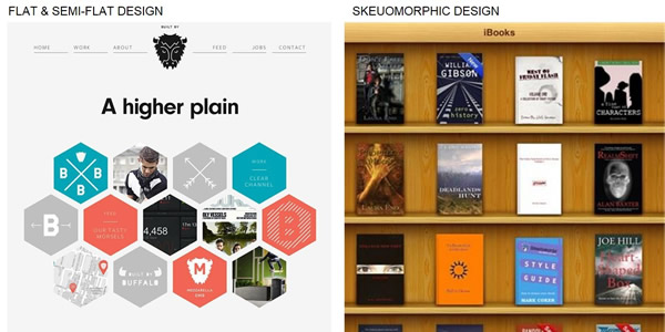
At one time, skeuomorphism design added value. It gave people who were new to using computers the representation of a real life object to help them understand the function of a particular button. That’s no longer needed. There are also better ways to design web pages than using realistic background textures to create a certain ‘atmosphere’.
Today, skeuomorphism just seems clunky and outdated. Recent web design trends seem to indicate that it is going out of style. Hopefully that is the case.
Sound & Video That Auto-play
There may not be a single web design element that is more widely hated than the practice of playing sound or video when a visitor enters a website. In fact, you could gather a group of people with starkly opposing political, religious, and cultural values, and they would all agree that this practice is irritating and offensive.
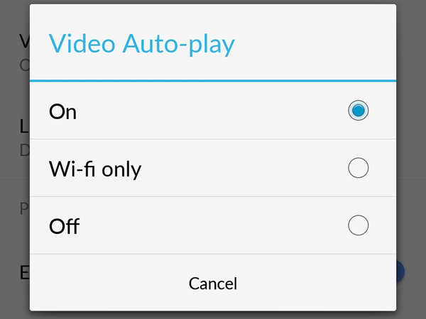
Auto-playing sound and video isn’t just rude and intrusive to the person visiting a website. It is also rude and intrusive to everybody around them. The practice also chews up bandwith that visitors may not have to spare. If there is something that visitors really must see or hear, offer it to them with compelling copy, and then let them decide when and if they want to hit play.
Using Sliders
Unlike other items on this list, sliders don’t stand out as being particularly offensive, clunky, or outdated. They are, however distracting an ineffective. They take away the viewer’s focus from what is important (what you can do for them), by getting them to focus on the images in your slider.
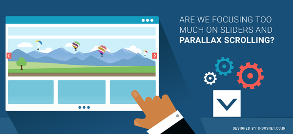
[Image Source]
This is not to say that what you are communicating in your slider is not relevant. It’s just that it is not relevant to the visitor who has come to your page in search of specific information. At best, website visitors will ignore the slider altogether and simply complete the action they came to do in the first place. At worst, they will become distracted by the slider and end up taking no action whatsoever. The chances of a visitor consuming all of the images and messages included in a slider, and then answering the CTA that they were led to take to begin with is pretty low.
There are also technical issues that can be problematic when using sliders. The large images and JavaScript used to create sliders can result in slow loading time. For mobile users, this can be a real problem. Since most visitors are mobile users, at least some of the time, it makes sense not of irritate them.
Separate Mobile Web Sites
These are problematic for a number of reasons. First of all, they waste time and bug users, especially if you have to ask them if they are using a mobile device. Second, if you use responsive web design, Google will reward you with better search engine results page rankings.
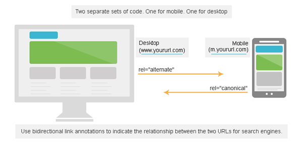
If you design a separate website for mobile users, not only will you lose that reward, you may also be penalized under Google’s new rules against duplicate content. Finally, mobile-only websites are a turn off to visitors because they associate them with lack of functionality and design that is less than intuitive.
Related Topics
Top