The hot topic in web design nowadays is undoubtedly responsive layouts. Responsive design lets you provide an optimized screen size that caters to the device (mobile, tablet…) used by visitors. Although Media Queries are typically used to resize the overall layout, individual elements such as navigation, forms, images, sliders, and carousels need to be optimized too.
That’s where this post can help. It showcases 25 jQuery plugins that will aid you in optimizing and resizing these tricky web elements. With these plugins, you can ensure that your page not only looks great on all devices but also offers a seamless user experience.
Response.js

Response JS is a lightweight plugin that gives you the tools for producing performance-optimized, mobile-first responsive websites. It provides easy-to-use action hooks for dynamically swapping code blocks based on screen sizes and semantic methods for progressively serving media via HTML5 data attributes.
Responsly
The Responsly plugin is a set of simple responsive widgets written using CSS3 transformations. It is best used with a responsive CSS framework like 1140px or 320plus, and currently, there is only a slideshow and accordion widget available, but with much more to come soon.
Responsly Download Page
Menu to a Dropdown for Small Screens
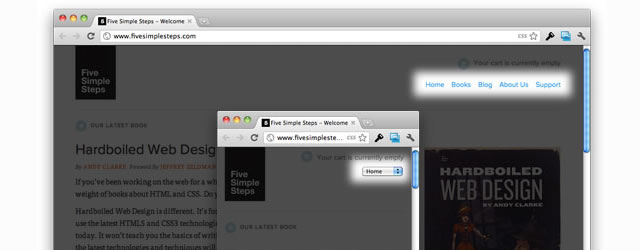
The Five Simple Steps website has a responsive design with a neat feature. When the browser window is narrow, the menu in the upper right converts from typical menu links into a dropdown menu. Using jQuery, this tutorial will show you how to recreate it.
Menu to a Dropdown Download Page
Responsive Menu
Not unlike the technique used above, this simple plugin converts menus into a select element for mobile devices and low browser widths.
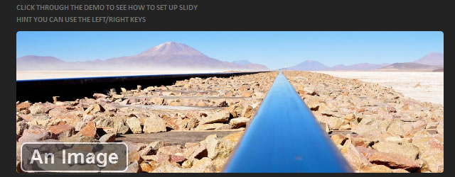
Doubletake
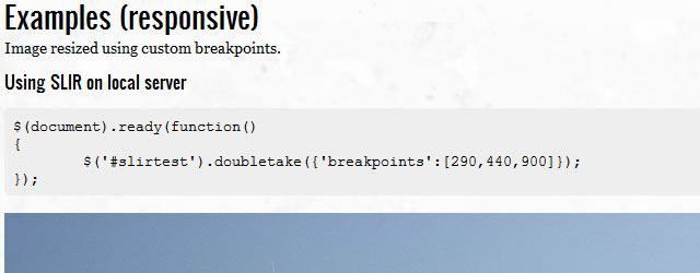
Intended to be a proof of concept, Doubletake is a plugin that dynamically updates the src of your images based on the browser width. You start with a small, mobile-friendly image in your HTML. Doubletake will then use a defined set of breakpoints to update image SRCs when necessary.
FitText
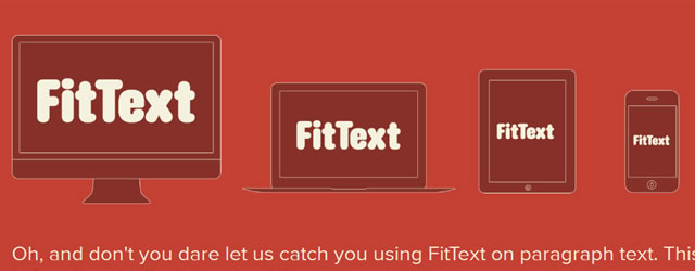
FitText is a plugin for inflating web type. It makes font sizes flexible. Use FitText on your fluid or responsive layout to achieve scalable headlines that fill the width of a parent element.
Elastislide
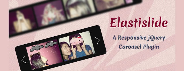
Elastislide is a responsive jQuery carousel that will adapt its size and its behavior in order to work on any screen size. Inserting the carousel’s structure into a container with a fluid width will also make the carousel fluid.
wmuSlider

PhotoSwipe

PhotoSwipe is an HTML/CSS/JavaScript-based image gallery specifically targeting mobile and touch devices. All modern mobile and touch devices, as well as desktops and laptops, are supported. PhotoSwipe provides your visitors with a familiar and intuitive interface, allowing them to interact with images on your mobile website.
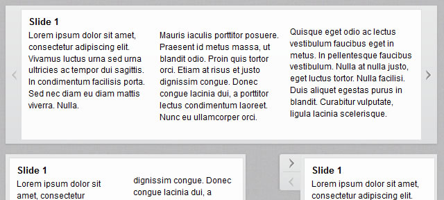
FlexSlider
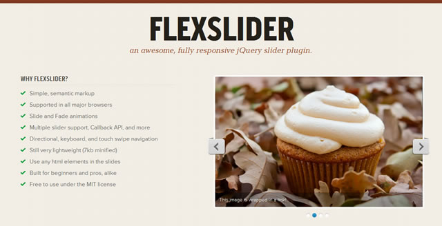
Flexslider is a lightweight, fully responsive jQuery slider plugin. It has simple, semantic markup, slide, and fade animations and is supported by all major browsers, so you won’t have any compatibility issues. Flexslider is built for beginners and pros alike.
FlexSlider Download Page
Responsive jQuery Slideshow
Responsive jQuery Slideshow Download Page
Responsive Image Gallery with Thumbnail Carousel
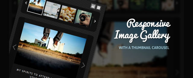
Using the Elastislide plugin (above), this technique will show you how to implement a responsive gallery that adapts to the view-port width. The gallery will have a view switch that allows you to view it with the thumbnail carousel or without. It also supports keyboard navigation.
Responsive Image Gallery with Thumbnail Carousel Download Page
rlightbox – A jQuery UI mediabox
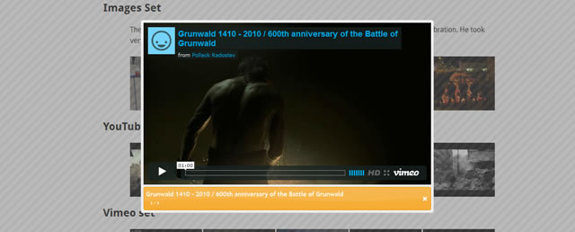
rlightbox is a jQuery UI media box that can display many types of content, such as images, YouTube, and Vimeo videos. It has many unique features like Panorama and Live Resize, and like other jQuery UI widgets, it is ThemeRoller ready.
rlightbox – A jQuery UI mediabox Download Page
AdaptiveMedia
AdaptiveMediaDemo Download Page →
Dynamic Carousel
Dynamic Carousel is a carousel plugin built for responsive layouts.
Dynamic Carousel Download Page
FitVids.JS
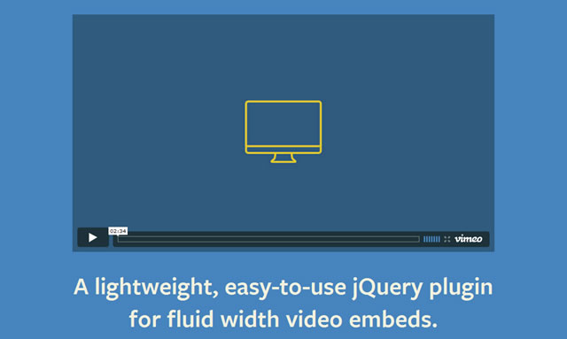
FitVids.JS is a lightweight, easy-to-use jQuery plugin for responsive width video embeds. It automates the Intrinsic Ratio Method by Thierry Koblentz to achieve fluid-width videos in your responsive web design.
FitVids.JSResponsyGs Download Page →
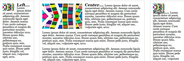
jQuery Masonry
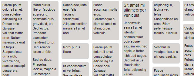
Masonry is a dynamic grid layout plugin for jQuery. Whereas floating arranges elements horizontally and then vertically, Masonry arranges elements vertically, positioning each element in the next open spot in the grid. The result minimizes vertical gaps between elements of varying height, just like a mason fitting stones in a wall.
Isotope
Isotope is a jQuery plugin for intelligent, dynamic layouts that can’t be achieved with CSS alone. You can hide and reveal item elements easily with jQuery selectors and re-order item elements with sorting.
Isotope’s animation engine takes advantage of the best browser features when available — CSS transitions and transforms, GPU acceleration — but will also fall back to JavaScript animation for lesser browsers.
The Heads-Up Grid
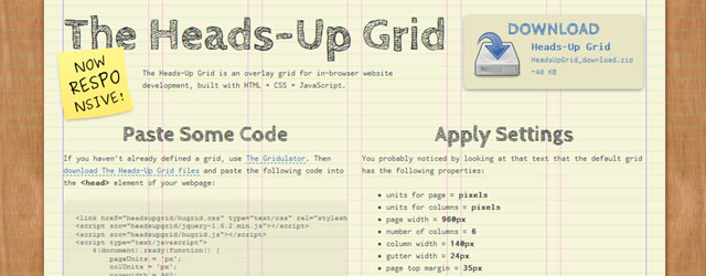
Built with HTML, CSS & JavaScript, The Heads-Up Grid is a responsive overlay grid for in-browser website development. It has been created to make it relatively easy to adapt to the needs of responsive web design. You can quickly and easily define as many different grids as you need by way of basic JavaScript conditional statements.
The Heads-Up Grid Download Page
Adaptive Images in HTML
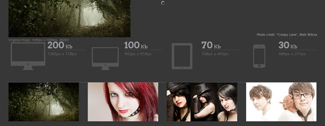
OK, this is not a jQuery plugin, but still, it’s worthy of mention. Adaptive Images, intended to be used with responsive and fluid layout techniques, is a solution that will automatically create, cache, and deliver device-appropriate (it detects the resolution of the visitor’s screen) your website’s content images. No need to change your markup. It manages its own image resizing and will work on any CMS or even on flat HTML pages.
Adaptive Images in HTML Download Page
Related Topics
Top