If you’re not a 20th-century Dutch art enthusiast, you might not be familiar with the concept of De Stijl. You’ve probably been exposed to many of its principles without realizing it. While few people are familiar with De Stijl, this Dutch art concept still has a strong impact on modern web design.
De Stijl simply means “the style” in Dutch, and is also known as neoplasticism. The art movement started in the Netherlands in 1917 and has since made a worldwide impact on art, architecture, and design – or more specifically, digital design. The pioneer of the movement was Theo van Doesburg, who died in 1931. Other artists involved in the movement were Piet Mondrian, and architect Gerrit Reitveld.
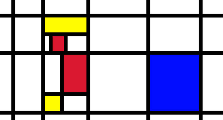
De Stijl has affected modern web design in terms of favoring a simplified, minimalistic approach. This movement was launched partly as a reaction to the dramatic art deco style that was also popular during that time period.
The De Stijl movement was a proponent of extreme simplicity in design. Through these simple designs, supporters of the movement believed that it expressed the utopian ideal of harmony and order. The major principles that were promoted by De Stijl artists include:
- Simplified visual compositions to the vertical and horizontal directions.
- The use of only primary colors, together with black and white.
A great example of De Stijl principles still in use today is Google’s homage. Take a look at the clean design with the use of primary colors on a white background. This design by Google’s team would have made any of the De Stijl artists proud. Although minimal, it is powerful, easily recognizable, and universally appealing.

De Stijl emphasizes the importance of minimalism. Although it only actively existed as a thriving art style for a short time, it laid an important foundation for the minimalist movement that would occur later.
Simple, minimalistic designs have withstood the tests of time and are still a popular trend. While minimalism certainly isn’t an extravagant design technique, there is still a great amount of thought that goes into it. Placement, contrast, boldness, and cleanliness are more important and make much more profound statements in visual design than garish (and often unnecessary) details.
Minimalism applies to the arts, literature, and all forms of design. To think like a minimalist, ask yourself how much “fluff” you can take away from a design without having it lose its purpose. Good minimalist design only relies on the base essentials and creates interest through placement, movement, and contrast instead of extravagance.
Removing the excess and focusing on the barest essentials is what leads to more user-friendly websites and graphic designs. Minimalism in web design and development naturally leads to more intuitive and enjoyable user experiences.
The principles of both De Stijl and minimalism can teach us a lot about how to streamline our graphic designs and make them more visually appealing. Here are a few principles from De Stijl that are easy to incorporate into your graphic design:
Less is More
Visitors don’t want crowded web pages. When a new visitor sees a website, too much content can be overwhelming. They’re often left unsure of where to go and end up simply clicking off the page out of confusion and frustration. To avoid this fate, keep your design simple but meaningful. Make sure the important elements of your site are easily defined so that visitors aren’t left guessing.
Once again, Google’s homepage is a perfect example. The site is clean with just the Google logo and a search bar. Users coming to that page know exactly what to do, and the search engine quickly becomes their go-to search tool because it is so easy to use. Stripping down your website design helps users focus on what is really important, such as the products you are trying to sell. The more distracted they are by design, the less likely they will be to make a purchase.
Keep a Neutral Color Palette
The color palette you choose is another important part of your website design. Colors that are too loud can create unintended emotions in viewers, so it’s best to keep things neutral. If your logo already includes bright colors, keep the rest of the color scheme very simple.
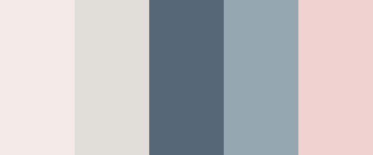
Craigslist is a great example of a site that uses an extremely simply color scheme. Now, Craigslist probably isn’t the first site you would think of when looking for design examples, but it actually is a great example of minimalistic style at work. It only uses a few colors, mainly white, gray and blue. Users go to the site and immediately know right where to click because everything is laid out clearly in front of them. There’s no crazy color scheme or distracting fonts.
Make Content the King
There’s a common expression in marketing that “content is king.” This means that the focus of your website should always be on the content, not the design.
Content is also one of the most powerful tools you can use to drive awareness and engagement with your brand. Keep things clean and simple and really let your message to potential customers shine through. The design of a website should simply make it a vehicle to deliver information to the customer; the design shouldn’t be the star of the show.
Make Your Design Timeless
One of the benefits of minimalist designs is that they never seem to age. The De Stijl movement started more than 100 hundred years ago, yet we are still talking about how relevant it is today.
If you’re looking for a site design that won’t need to be updated every year, stick with a sleek, minimalist design. When brainstorming your design, steer clear of any trends or fads that could quickly fade. While these might appeal to customers right now, you will have to update your site constantly to keep up with the hot trends.
Make it Beautiful
When all is said and done, it’s you who will have to live with your website and work with it day in and day out. It’s important that you truly appreciate the website and think it’s beautiful.
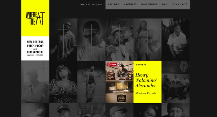
If not, it’s time to go back to the drawing board. It’s certainly true that your website should exist to offer fantastic experiences to your customers, but if you don’t like the design yourself, it isn’t an honest reflection of you. Modern consumers are extremely discerning, and authenticity is valued. Remember this and it will help you stand out from your competitors.
Keep Everything Balanced
One of the trickiest elements of minimalism is making sure that everything on your page looks balanced. Take a look at your designs and make sure there isn’t too much going on in one area.
Before you start your next design project, keep the De Stijl principles discussed in this article in mind. This minimalist approach to design will help you create more user-friendly websites and better user experiences.
Remember that the simplicity of your design should be reflected in its mechanics. Make sure your users can easily navigate and use your site. Functionality should never give way to fashion, so make sure your site performs well and then tweak your design as necessary.
Related Topics
Top